OUGD504 - Studio brief 02 - Adobe XD
This brief has introduced me to new software which is the Adobe XD beta, through using this software I was able to design and prototype the web app within the same software which is incredibly useful. As this brief asks for prototypes that are working, animated or navigable, XD allows me to effortlessly prototype the web app unlike After Effects would, even though Ive had a number of useful AE workshops for this brief which have helped further my knowledge of AE; it doesn't offer the same ease and appropriateness of XD.
As XD is a beta its still being developed so it isn't the finished product and this provides difficulties sometimes when using it, for example resizing images can be strenuous at times and the type tool can often be annoying but other than that its a rather simple software to use, the easiest Adobe software to navigate in my opinion. Using this software has created enjoyment throughout the design process as I was both new to this software but also digital design, it created enthusiasm for digital design as I believe being able to prototype the work at any time was beneficial to both me as designer and the process. Comparing this to design for print, in which prototyping work can be time consuming and costly like studio brief 01.
Thursday, 29 December 2016
Friday, 23 December 2016
OUGD504 - Studio brief 02 - Design compositions
Before designing started, considerations about the compostions such as colour and typography had to be considered. A helpful start to consider these elements was a small lecture we had in class, in which we were introduced to key aspects to think about when deciding upon colour or type for instance.
To start with colour, when it came to the process of deciding upon colour I found it easy I chose colours that are commonly found inside the Baltic and the website already. These colours will help bring life to a stripped back design and with bold colours that will make the web app engaging, and the tight colour palette will create comfort because these are colours that feature throughout the visit to the Baltic.
Brand personality can come across extremely well with the right type choice. Some want to shout, some want to speak quietly all this can be achieved with well-considered typography. For the web app type choice I chose Din as the primary typeface as it the most similar to Nygren's custom typeface for the Baltic, the differences are that Nygren's design is more rounded unlike Din. Nevertheless Din's legibility make it a perfect choice for the primary typeface for the web app as it'll be used for titling and headers. The secondary typeface choice is Helvetica Neue which is the second most common typeface used on the web behind Arial, I chose Helvetica because it a steady choice for digital design. It's readability and legibilty will make it useable for target audience yet have a strong aesthetic which pairs well with Din. It will be used for body copy mainly so the most used type in the web app.

Thursday, 22 December 2016
OUGD504 - Studio brief 02 - Icon design
Icons have a big role within the web app, they allow the user to quickly navigate throughout pages and are relevant to all users as a form of communication. After wireframes it was clear which icons I would need to have in the web app, which are:


Icons have a big role within the web app, they allow the user to quickly navigate throughout pages and are relevant to all users as a form of communication. After wireframes it was clear which icons I would need to have in the web app, which are:
- Home
- Navigation
- Social media
- Shop
- Cafe
- Archive
- Play option and audio option for video


To start with I sketched the icons in pen to get range of ideas then from feedback selected the most relevant. For feedback I asked both a young and older audience, as my dad guessed all the icons correctly it was proof that the icons can be identified by all ages and serve their purpose. In illustrator I created the icons which come together as a cohesive set.
OUGD504 - Studio brief 02 - Idea inspiration
Before starting compostions of the web app and designing it I wanted to look at UI and UX that inspires me and makes me revisit the site because the experience engages me and creates enthusiasm.
https://www.teenageengineering.com/
Teenage engineering has a slick and easy to use interface that evokes me to visit it often as its flat design and use of mixed media like powerful photography creates enthusiasm whenever I scroll through.

Recently Ive been watching Black Mirror on netflix which is a television series created by Charlie Brooker that features speculative fiction with dark and satirical themes that examine modern society, particularly with regard to the unanticipated consequences of new technologies. The reason for this blog post is the utopian interfaces that feature throughout the series that have caught my eye, Some interfaces shout from the sides of vans, some sit flush on walls in future environments, and others ache out from within our own bodies. The one episode that stood out as a possible form of inspiration was series 2 episode one ‘Be right back’ which is about when a young man dies, his partner finds out that she can stay in touch with him by creating a virtual version of him through his online history. The interfaces that feature during the episode are subtle designs compared to other episodes but are ones that I can relate to the most, simplified flat designs are commonly used which at times look similar to many Windows interfaces that are around today.


Wednesday, 21 December 2016
OUGD504 - Studio brief 02 - Wireframes
This part of the digital design process was new to me as I've never done it before, at first I started sketching every page in my site map until my tutor informed me that wireframes are intended to be a visual guide that represent the skeletal framework of the website or app. And that I should only focus on sketching a select few as these would serve as templates. A wireframe depicts the page layout or arrangement of a website’s or apps content, including interface elements and navigational systems, and how they work together. Once I knew how to produce a wireframe properly I focused on what the screen does, not what it looks like as this would come along later in the design composition.
My wireframe sketches focus on:
Below is the first wireframe sketch I did of the web app but I felt i'd be able to communicate the functions of each page better through a digital option so I made numerous iterations of wireframes in illustrator.


Option one has a basic layout which relies on icons to help the user navigate the web app, bold type menu's also prompt a easy to use web app. The elements such as the home button are available on each page to help the user navigate back to the hub. This wireframe is stripped back for the audience yet has intricate functions such as the navigational bar in the tour which is intended to offer a more guided experience at the Baltic.

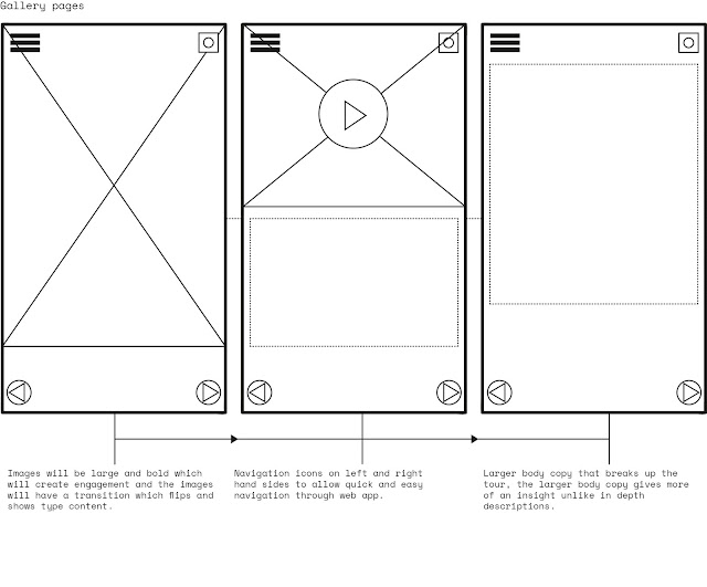 The second wireframe option is stripped back again and allows the user to navigate easily with large navigation elements. The main difference with this wireframe is that it has a larger images which can be selected to access pages, the scenarios can be applied to a number of pages as the large scale flat images can be interpreted to fit any content, whether that be video or body copy text. The home page and social media functions remain as they serve the exact same purpose in both wireframes.
This part of the digital design process was new to me as I've never done it before, at first I started sketching every page in my site map until my tutor informed me that wireframes are intended to be a visual guide that represent the skeletal framework of the website or app. And that I should only focus on sketching a select few as these would serve as templates. A wireframe depicts the page layout or arrangement of a website’s or apps content, including interface elements and navigational systems, and how they work together. Once I knew how to produce a wireframe properly I focused on what the screen does, not what it looks like as this would come along later in the design composition.
My wireframe sketches focus on:
- The range of functions available
- The relative priorities of the information and functions
- The rules for displaying certain kinds of information
- The effect of different scenarios on the display
Below is the first wireframe sketch I did of the web app but I felt i'd be able to communicate the functions of each page better through a digital option so I made numerous iterations of wireframes in illustrator.


Option one has a basic layout which relies on icons to help the user navigate the web app, bold type menu's also prompt a easy to use web app. The elements such as the home button are available on each page to help the user navigate back to the hub. This wireframe is stripped back for the audience yet has intricate functions such as the navigational bar in the tour which is intended to offer a more guided experience at the Baltic.
 The second wireframe option is stripped back again and allows the user to navigate easily with large navigation elements. The main difference with this wireframe is that it has a larger images which can be selected to access pages, the scenarios can be applied to a number of pages as the large scale flat images can be interpreted to fit any content, whether that be video or body copy text. The home page and social media functions remain as they serve the exact same purpose in both wireframes.
Feedback
I required feedback on my wireframes to gain an idea of what people like and dislike about the flow of the app. My peers selected a number of things from both wireframes which I could possibly bring together as one, such as mixing the first tour pages with the home and whats on pages of the second option. My peers liked the idea of having images on rotation, showed through the circles option 2 'whats on page'. From the feedback I realised I can make alterations to the wireframes when i'm developing the app, as long as I stick to some main concepts from the original designs.
Saturday, 17 December 2016
OUGD504 - Studio brief 02 - The processes and procedures involved in designing for screen
As a consideration for the brief it is crucial to look at the processes and procedures involved in designing for screen and as ive never designed for screen before, a lot of the terminology and rules to consider are new to me. For this part of the brief I looked at different elements that may inform my design descions for designing for screen such as typographical elements like font use and line length. Icons, colours and grids were also considerations I looked at.
Most of the time designers create a front page to their sites with a very limited amount of information and a strong emphasis on design and visual appeal. The user needs to click to move from the front page to the information pages where the text is more densely displayed.And this is where information is presented on screens in a dense and compact way , and if this is not done in a way that recognises the need for reduced screen densities, the busyness of the page and large amounts of resources and information can make the page difficult to read and browse. Therefore the designer needs to fully consider typographical elements like font use and line length to make the content legible for the viewer. Line length, generally speaking, shorter line lengths are better than longer line lengths and optimal lengths are given as 35 - 75 characters per line. In studies of legibility and line length, a number of inquiries have demonstrated that longer lines can provide better legibility than short lines while most tend to suggest that text is read more efficiently when presented in a compact and fashion. Most browsers, however, enable users to choose the length of the displayed line so readers are often able to create a line length that suits themselves.
The following guidelines provide some general rules about font and size for screen designers.
- Minimum 12 or 14 point size. For example, if the font has relatively small characters compared to other fonts of that size (e.g., Times), choose 14; if the characters are relatively large (e.g., Bookman),12 pt may be better;
- Use plain (roman) style, rather than bold, italic,outline, shadow, or other style sans-serif or with serifs that are not too fine to render well on-screen
- Use a proportional font (unless it is necessary to choose a non-proportional font for some reason)
- For headings and titles on-screen, a general guideline is to choose a font with the following characteristics:• 18-36 point size (assuming 12- or 14-point body text)
There are many options for colour in modern Web applications. Some designers recommend that screens should be designed in shades of gray, black and white first, with colour added later in a fashion, which adds to instructional effectivenessThe reasons for this are as follows:
- Many people suffer from some type of colour deficiency ranging from weakness in certain colours, mainly red and green, to full loss of colour (it is estimated that 8% of the population experience some type of colour deficiency)
- Older users can often have some problems discerning and perceiving colours
- The monitors that are used to access Web pages may have differing colour capabilities which can lead to unexpected variations in colours.
Grids and tables can be used to establish that certain areas of the screen are to be used for specific purposes (eg. navigation buttons or hyperlinks are found on the top, bottom or left side of the page, text information is placed in the centre half of the screen with white space found on either side). Since HTML makes no allowances for margins or white space, other means such as tables with invisible borders are used to provide designers with the means of implementing their ideas.
Icons can be very useful when designing navigation aids, advantages of icons include:
- To help users work smarter by improving productivity and reliability (road signs can read at twice the distance and half the time as word sign);
- To represent visual and spatial concepts such as shape, colour, position, angle, size, texture, and pattern
- To save space in crowded screen displays
- To speed search (we can recognise icons much more quickly that reading a list of words)
- For better recall and immediate recognition
- To allow illiterate or semi-literate users to function more easily
- To increase global access to a web page or multimedia product
OUGD504 - Studio brief 02 - Site maps
Organising the content of the web app was the next stage of the process, the hierarchy of the pages is crucial as it allows the user to see the information in a organised fashion. By sketching the site maps first it enables you to get a rough idea of the order of the webpage, then from this point you can make small changes and then digitalise the map.

Above is the site map of the web app, the landing page will appear once you sign into the wifi and will only include the Baltic's logo and an enter option. The home page will offer all the crucial information of the web app and presents the user with four options which are tour, archive, shop and cafe.
Below is the simplified and final site map which presents each page in an easier way to understand. The actual structure of the app is basic as it allows any user to find exactly what they want easily, the idea of having the web app stripped back comes from the target audience research which shows a varied audience so it has to be useable for everyone, and having a basic structure achieves this. The start tour page of the site map is the main focus, from here several pages will guide the user through the exhibition, these pages will be easily navigated and vary for each exhibition.

Tuesday, 13 December 2016
OUGD504 - Studio brief 02 - Idea development & Research
For development and further research into the idea I looked into web apps, this included interfaces, advantages and disadvantages. In computing, a web application or web app is a client server software application in which the client or user interface runs in a web browser. Common web applications include webmail, online retail sales, online auctions, wikis and instant messaging systems.
Interfaces
Through Java, JavaScript, DHTML, Flash, Silverlight and other technologies, application specific methods such as drawing on the screen, playing audio, and access to the keyboard and mouse are all possible. Many services have worked to combine all of these into a more familiar interface that adopts the appearance of an operating system. General purpose techniques such as drag and drop are also supported by these technologies. Web developers often use client side scripting to add functionality, especially to create an interactive experience that does not require page reloading. From this research I learnt that anything achievable on an ordinary app is achievable on web apps, this could allow games and the inclusion of features of Iphones and Android.
Advantages
- Easy to upgrade
- Performance
- Open source software
- Standards and maintenance
- Internet connectivity
- Cross browser compatibility
- Easy install
- A better user experience
Disadvantages
- Security
- Speed
- External dependancy ( Internet reliance)
OUGD504 - Studio brief 02 - Idea development
To develop the idea slightly further before I started sketching wireframes and compositions I wanted to answer some questions that are crucial to design process for screen which are Who, Why and What?
Who / this is to identify the user of the web app
Age range?
Age range is varied from 11-65 but the most common first time visitors are mainly 45-54 then most common age group of lapsed visitors are under 11 then regular visitors are aged 20-24.
Is the visitor a specialist in art?
From my target audience research it showed that first time, regular and lapsed visitors know general knowledge of art with first time and regular being considerably more specialist in art than lapsed with only 5% of lapsed visitors being specialist in art.
What devices does the visitor use?
Iphones, Androids and Tablet devices
Is the web app specific to a certain age group or users skill?
The web app will be stripped back and basic so a younger and older visitor could both use it, as they may struggle with a complicated design and user interface. The web app will allow any user to use it as it will be basic even if you have a basic level of using digital devices, yet will make a experienced user of digital devices enthusiastic while using it.
Why / why would the visitor use the web app
Are the users looking for general information or do they need to achieve a specific goal?
By using the web app it acts as being informative which offers information in a more consumer friendly and engaging manner. With the visitor using it, they don't need to achieve a specific goal but the Baltic hopes they achieve a goal with the visitor leaving with a greater understanding of art and a desire to return thanks to the web app.
Is there a specific goal, is it personal or professional?
The web app covers both goals as it is attempting to create a personal link between user and brand and this is a goal of both parties. Its achieving the professional goal by actively enhancing the digital presence in the gallery and reducing paper use by the Baltic.
Is spending time on the interface seen as essential or luxury?
For the visitor its seen as a luxury I believe as it gives another scope of the artwork and artist on show, another reason it is luxury is because it is accessible on your own device within the building. In many ways the web app can be essential but if the visitor chooses not to sign into the wifi and use the web app then it is okay. In the future the web app may develop even more to make it a essential built in part of the visit but at this early stage its an option to the visitor.
What / what information do the users need
Will the visitors be familiar with the brand or subject or do they need to be introduced to it?
Whilst it is retaining its audience, and continuing to be a major draw for tourists to the region, only 11% have been to Baltic before and are returning. What this means is that visitors to the building are far more likely to be either regulars or first timers, it does not tend to appeal to infrequent visitors, or to those who may have visited in the first few months of opening. This piece of information from my research shows that the Baltic doesn't have to be introduced through the web app.
What are the most important features of the web app?
The web app offers numerous important and useful features but the two most important are the personal tour and archive. The personal tour offers information that is bitesize which will be engaging and not too dense, with other content such as videos, interviews and other works by the artists. This will enable the user to interact (social media) and engage with the Baltic beyond norm. The archive offers an educational route for the visitor, through the archive they can access all the Baltic's past exhibitions and artists which will help the visitor learn a little bit about art and the Baltic itself.
How often will people engage with your interface?
During the visit if the visitor chooses to use the interface then the engagement will throughout the time spent in the Baltic. As its a web app it wont be downloaded on your which free's up space therefore you cant access the web app once you've left the wifi. The content will always refresh on the web app and offer new experiences therefore this will make the user visit more and engage with the interface.
OUGD504 - Studio brief 02 - Ideas
Following some research I sketched out rough site maps and wireframes to get an understanding of my ideas, this was helpful as it allowed me to gain feedback on which idea to take further. After feedback I'd be able to develop the site maps, wireframes etc further to enhance the idea.


Following some research I sketched out rough site maps and wireframes to get an understanding of my ideas, this was helpful as it allowed me to gain feedback on which idea to take further. After feedback I'd be able to develop the site maps, wireframes etc further to enhance the idea.

Above is the initial sketch for the web app idea which includes a site map and a selection of wireframes, creating the first site map for this idea was relatively easy as I knew from target audience research what I needed to include such as the shop and cafe as 1/3 of people who visit the Baltic attend the shop and cafe. The shop and cafe pages are accessed through the home page which is opened once you sign into the wifi, the option to either to shop online or view the cafe menu is available to the user as it offers quick and easy access to the facilities of the Baltic before they enter. This is helpful as a visitor may open the shop online page while in gallery two and find a product instantly, to then continue to the shop to pick the item up.
Another option from the home menu is the archive which lets visitors view past artists and exhibitions, firstly this allows first time visitors to get a introduction to the Baltics past work but also educates the visitor about other artwork. The brief states that the solution must educate and having access to the Baltic archive acts as a reference and inspiration hub for visitors, as research proved first timers are keen to learn more about art, 51% of first timers said that one of the reasons for visiting was to improve their knowledge of art and it is important for me to respond to this desire through the option of the archive. Archive will provide latest and A-Z options to view the content so it will let the user specifically choose what they want instead of imposing work onto them.
The most important part of the web app is the tour, the tour offers what the brief requires. It creates a digital presence in the gallery, which will actively enhance the visitors experience. The tour blends art, technology, design, and user experience, for its main intention to educate, inspire and be personal to the visitor and create a direct link between gallery and visitor. The tour creates enthusiasm throughout the gallery by keeping the visitor engaged through videos, interviews, games and continuos links to social media. In the site map it shows that after you visit the Tour page you are presented with whats on which leads onto events, calendar and all the galleries in use. This is where the visitor can access the personal tours of the exhibitions.
The basic wireframes I sketched were to give an insight into the stages of the web app when I presented the idea in a crit group, the sketches are intended to give a brief idea of the potential layout of template pages but at this stage they acted as a interoperation of the idea.

The second set of sketches I did apply to both the tv screens and projection mapping ideas as the video content will be the same for both. Unlike the first idea I didn't have to create a site map but wireframes and storyboards instead as its for motion. The motion will be a insight into the artwork on show and will aim to be brief and engaging, the composition layout of the content will be simple so it allows the video to flow throughout.
Feedback
I presented these more developed ideas to a crit group so I could take one solution further, I showed the basic sketches and notes I made about each idea which helped my peers understand my ideas more. The web app idea once again received good feedback as people linked it with the set brief and that it ticks off the requirements set, and has the most potential to develop in the future as technologies will only improve therefore the web app will have integrated technology within. One peer mentioned the possibility of including the tv idea within the web app idea, the two could work simultaneously together to actively enhance the visit even more, this was a helpful thought as once again it was thinking of the endless possibilities for the future of the web app; from feedback I realised that the idea with the chance to improve is the best option to take further.
During feedback I asked if any particular part of the ideas came across as the most 'cool' or 'created enthusiasm' and the response was mainly that people liked the sound of the personal tour, which helps navigate the visitor around the Baltic. People suggested that I look into Google Navigation as Google are developing an idea which lets you navigate within a small proximity, this is something that could instantly improve my idea as it allows a navigational map within the building and galleries.
Overall this crit helped me choose an idea to take further and I picked the web app solution as it received the most positive feedback and personally I believe in this idea more. The other ideas could still provide a digital experience in the Baltic but would struggle to create a link between visitor and gallery.
Monday, 12 December 2016
OUGD503 - Studio brief 01 - Development
After developing the ideas further I wanted feedback on each design so I could take two to further develop, my peers believed that the 7 items idea was engaging but wasn't suiting to the books style as it looked too much like a kids book, I agreed with this point as the book cover design looks like its targeted towards children due to the colours and playful illustrations but this is exactly what I was aiming for, the brief states that the response must have a point of difference to previous covers and my design fulfils this. People suggested to maybe play with the colours but I was sticking to the colours I chose as they had context as I constructed a 1930s palette, other problems people seen with this cover were the legibility of the type on the back of the book. Due to the overlapping illustrations it causes confusion when type is added so this effects the legibility of the book.
Feedback was positive on the the ideas about social class and hierachy in Maycomb as people liked the hidden yet obvious concept, the 30s pattern stylisation received good feedback but one peer said maybe to tone down the colour as its very bold. Overall people seemed to like this idea but most asked if there was another way to illustrate hierarchy and social class. Obvious responses I believe are ladders or family trees to show order so maybe this was something to consider for development. The last idea which is the ambiguous response which shows social class as well as the books setting, when people first seen this design they were drawn in by the complex line illustration but instantly questioned what it resembles.
Monday, 5 December 2016
OUGD504 - Studio brief 02 - Research
For research I looked into how digital experiences in shops, public spaces and how people engage with products, services etc through a digital platforms.
Audi City
Audi City London offers a unique experience, the impressive contemporary showroom format in Piccadilly, one of a handful in the World, uses state of the art technology to make clever use of precious Inner City space bringing customers even closer to the brand. The technology walls inside Audi City use Connect technology to put you in the driving seat. The friendly Audi Specialists will guide you through the entire Audi range using the touch screen tables, where you can build your own Audi in realistic 1:1 scale, being able to see every combination available, a truly unlimited experience. Once you have created your Audi you can view it on the customised connect screens where you can view your Audi in even more detail, being able to rotate the car and zoom in, seeing every aspect of your new Audi in exquisite detail. Audi City combines the best of both worlds, a digital product presentation and the personal contact the sales team. Researching into Audi City was evidence that you can offer a memorable experience without the customer consuming the brand, someone could simply visit the branch without buying a car but still feel fully emerged within the Audi experience. The technology offers a more relaxing and inviting experience as you view the cars at your own pace without a salesman hanging over your shoulder, maybe technology increases the enthusiasm of the customer and encourages them to buy. Personal touches like the smell of new leather inside the car and the feel of the interior once you take your first seat in the car are all evaded due to the digital experience but Audi comprises this with the latest technology to make it the ultimate car buying experience. The link below offers the online experience which gives a glimpse of the city branches.
https://microsites.audi.com/audi-city/en/

Tesco scan as you shop
This is concept is now appearing in some of the larger Tesco stores, and it can be very useful for the customer. The way it works is using your clubcard details, you pick up the handset and scan items, then scan as you add items to your trolley. This speeds the process up , keeps a running total of costs and can offer some sort of entertainment to food shopping. The UI used for the scanner is exactly the same as the ones used at the checkouts so isn't complicated for the user to use, and is available in 350 stores in the UK now so it must be proving to be successful.
Nike fuelstation
This interactive store in London's pop up Boxpark mall uses motion sensitive mirrors which display footage of local runners wearing products from the store as customers walk past them. Nike are hoping to change the retail experience as they see the shopping experience in the next 10 years to be all about the customers experience. The concept behind fuelstation is movement, technologies react to your movement to make you feel involved but the fuelstation isn't all digital. It combines technology and physical objects such as wooden walls and mirrors to not saturate the customer but offer them a experience they'll remember.

I found a helpful article on Forbes titled 'How Social And Digital Create The New Retail Experience', I took some key parts from the article for my research such as selling the experience as much as the product and using social media to mold unique customer experiences. Today the realisation is that experiences make people happier than physical objects, people spend more of their money on experiences such dining out, traveling, entertainment and less on possessions. So retailers have decided to focus a lot more on the experience as customer expectations, combined with advancements in technology, fuel the demand for a whole new kind of marketplace. Retailers need to connect with modern customer expectations and provide experiences that engage the consumer, or risk falling behind. Today this affecting retailers but soon it could harm other experiences such as sport or travelling as people demand more now that technology is advancing quicker than ever.
Social media is one of the best ways to connect with consumers and create a new kind of shopping experience. Retailers use Snapchat to reach customers with unique content, Snapchat stories can be especially effective; unlike regular snaps, stories allow brands to collect multiple images, short videos, and text, and share them for 24 hours with a group of followers. The advantage of Snapchat is that content is fresh, exclusive and essentially free. Brands can update content as quickly as trends arise, creating a real-time brand experience. One company that understands this is the clothing brand Free People. It uses Snapchat in a fun, experience-based way by offering sneak peaks of upcoming collections. The company also uses it to humanize its brand by having employees answer fun questions via Snapchat to provide a glimpse into the company’s culture.
Subscribe to:
Comments (Atom)