This part of the digital design process was new to me as I've never done it before, at first I started sketching every page in my site map until my tutor informed me that wireframes are intended to be a visual guide that represent the skeletal framework of the website or app. And that I should only focus on sketching a select few as these would serve as templates. A wireframe depicts the page layout or arrangement of a website’s or apps content, including interface elements and navigational systems, and how they work together. Once I knew how to produce a wireframe properly I focused on what the screen does, not what it looks like as this would come along later in the design composition.
My wireframe sketches focus on:
- The range of functions available
- The relative priorities of the information and functions
- The rules for displaying certain kinds of information
- The effect of different scenarios on the display
Below is the first wireframe sketch I did of the web app but I felt i'd be able to communicate the functions of each page better through a digital option so I made numerous iterations of wireframes in illustrator.


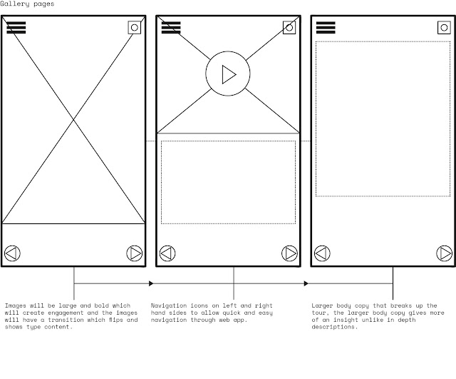
Option one has a basic layout which relies on icons to help the user navigate the web app, bold type menu's also prompt a easy to use web app. The elements such as the home button are available on each page to help the user navigate back to the hub. This wireframe is stripped back for the audience yet has intricate functions such as the navigational bar in the tour which is intended to offer a more guided experience at the Baltic.

 The second wireframe option is stripped back again and allows the user to navigate easily with large navigation elements. The main difference with this wireframe is that it has a larger images which can be selected to access pages, the scenarios can be applied to a number of pages as the large scale flat images can be interpreted to fit any content, whether that be video or body copy text. The home page and social media functions remain as they serve the exact same purpose in both wireframes.
Feedback
I required feedback on my wireframes to gain an idea of what people like and dislike about the flow of the app. My peers selected a number of things from both wireframes which I could possibly bring together as one, such as mixing the first tour pages with the home and whats on pages of the second option. My peers liked the idea of having images on rotation, showed through the circles option 2 'whats on page'. From the feedback I realised I can make alterations to the wireframes when i'm developing the app, as long as I stick to some main concepts from the original designs.
No comments:
Post a Comment