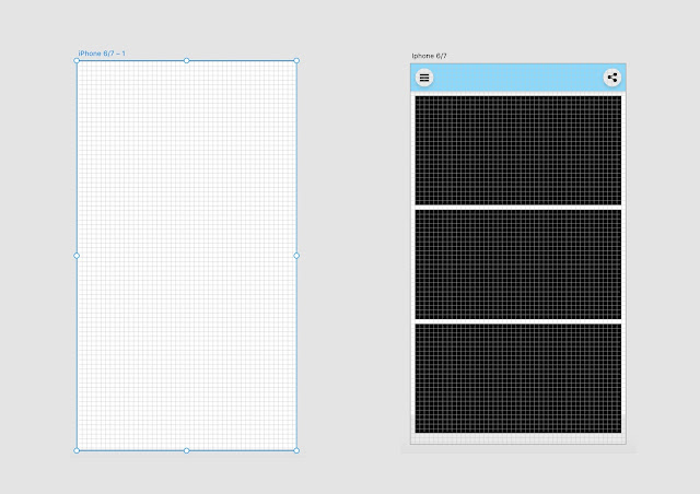
 Once I decided upon all the design components required for the brief developing the app begun, the first step was setting up a grid in XD which would provide consistency throughout each page of the web app along with improving the user experience as the grid allows me to see precisely where each component in the design is, for example an icon button. By using the grid I can understand size and spacing between each component which ultimately will lead to clean aesthetic but also a better experience for the user.
Once the grid was set up I started mocking up a few designs to get a rough idea of the overall style of the web app, it had to be stripped back for the target audience and aim not to distract from the artwork yet have a cohesive identity that is resembles the Baltic. I firstly used the bold colours I chose for the colour palette to construct a style, using boxes and imagery I designed a style similar to Windows 8 which has a basic yet striking style that allows the user to easily navigate. Along the way I made small tweaks such as text alignments and image layout, each image below shows a stage of the early developments that resulted in the final home page of the web app which sets the tone for the overall style. In the end, thanks to feedback I decided to use four images that show the four options of the web app, each colour coordinated to help the user to distinguish the page options. At this early point of development I noticed that the icons I designed prior would have to have alterations such as colour and outline colour, when the navigation arrows were placed onto a white element they weren't bold enough which could lead to bad user experience. Therefore I simply changed the colour which makes it more clear that its a icon button to access other pages in the web app.
Using the wireframes I previously sketched up and digitalised was useful for initial developments as it was a good reference point yet already I knew that I'd have to make some changes to the layouts of the web app that would sway away from the original wireframes. As I discussed this with peers and a tutor, it isn't necessarily a bad thing as it shows the app is developing along the way and as long as it doesn't come across detached from the original wireframes, then its no problem.

No comments:
Post a Comment