
Using Victorian sans as a starting point I developed my sketches into digital letterforms in illustrator. The type has a large x-height similar to other condensed types with rigid angles which create the cornice effect.


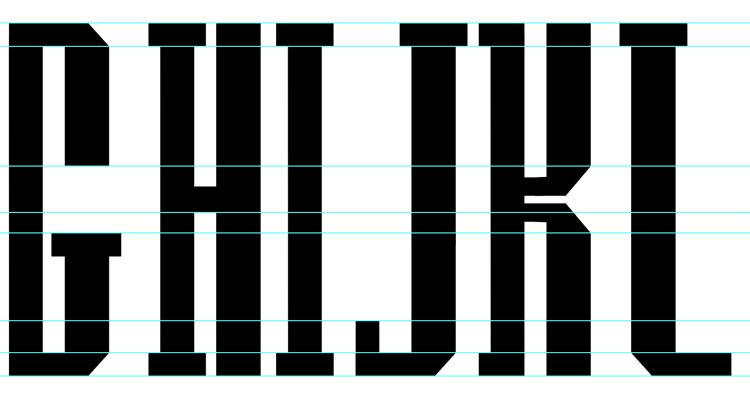
Using the pen tool to create the initial shape of the type I used mainly used the same angled serif and stems to create consistent counters. Two line strokes are used to create contrast but to represent different sized columns. Slabs are used in some letterforms to represent Stylobate/bases but not in all letterforms as the Doric Order doesnt always have them.

The negative space created from the letterforms create graphical shapes which can be perceived as being similar to the architecture. In the example in the top left the negative space looks like a column and cornice. Once I designed the first 6 letterforms I could use the framework of them to create the rest of the alphabet but sometimes the template letterforms wouldn't work, so I had to experiment with shapes which would fit into the style I already created.
Below are the experiments with different letterforms:


No comments:
Post a Comment