Sunday, 22 April 2018
OUGD603 - Left Bank Opera Festival - Evaluation
To conclude on Left Bank Opera Festival which has been a really enjoyable brief due to the fact its contrasted to the other briefs I have undertook this year. Contrasting in a number of ways such as working to a tighter deadline with no lenience. This was unusual for me as the majority of my briefs this year have enabled more leniency in terms of set deadlines. This is mainly due to having self initiated briefs and extended deadlines, but Left Bank Opera Festival gave me a quick turnaround which I believe enabled me to create more relevant and tailored work. Additionally, this made me seek more feedback and experiment with my ideas as normally creating self initiated work can create complacency in my practice. In terms of the final outcome I am pleased with my submission as it answers the brief and hopefully will attract audiences to the festival. However, what I am more pleased with is the process undertaken to achieve the final solution to the brief. It required refinement which in turn allowed me to mix up my process, as the main visual of the final piece is simply a spiralled piece of paper which I vectorised in Illustrator. To look back on this process, I believe it gives the solution more rigour and quality. So in terms of what went well, then I'd say the process was my most successful aspect of the brief, along with hitting the deadline much earlier than expected. However, for what didn't go so well then i'd say maybe extending the range of the idea would of been beneficial to me and the brief. Nonetheless, the brief was rather vague with them only requiring an image which can be used for the festival. Yet if I am lucky enough to be awarded the brief, then this would present me the opportunity to extend the range of the idea.
Saturday, 21 April 2018
OUGD603 - Left Bank Opera Festival - Final submission
As a part of submission for this brief I needed a pdf concept explaining the inspiration and concept behind the piece. The slides below highlight the main focuses of the idea and showcase the response in context with mockups.


Friday, 20 April 2018
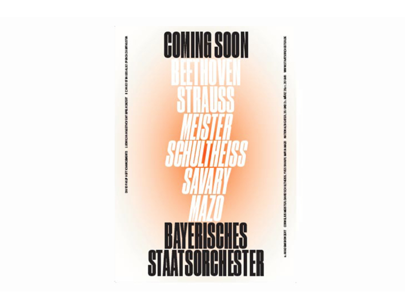
OUGD603 - Left Bank Opera Festival - Final developments
From feedback and personal preference I decided to pick the singular red and black spiral to further develop. For development I added content which would potentially be included with the image if the design was chose. This helps give the design context but also enhances the overall visual language of the design. I also experimented with different formats of the image, as the image needs to be adaptable for all aspects of promotion including Facebook banners, print banners, posters etc.
The content I've added can be altered and adjusted as I've only decided to give the image context through content to show the client the potential of my submission.

The addition of type gives the image structure and helps frame the references. The type used is Moderat which helps give the image a contemporary manner

When scaled to a different size the impact remains intact as the spiral is adjustable which gives the image modularity.
Thursday, 19 April 2018
OUGD603 - Left Bank Opera Festival - Development & additional feedback
For development I took my peers feedback on board to emphasise illusion more, and in doing so I was inspired by the famous Italian architect and graphic designer, Franco Grignani. He is best known for black and white graphics, particularly the Woolmark logo but his style is defined by illusion graphics.


Taking influence from Grignani I decided to create spiral shape which would contain the already existing imagery I created. Instead of creating the spiral in adobe software to begin with, I made the spiral with paper then took pictures of it. This allowed a more like life shape but also made it more easier for me to create the shape in illustrator, by simple using a pen tool to create the shapes.

I then clipping masked the images I previously made into the individual vectors to create the illusion.

Colour and pattern variations were explored due to peer feedback from the previous ideas.

From here I wanted further feedback on the ideas to this point, so I ran the ideas past Pat during a tutorial. Pat picked out his favourite which is the spiral shape in red but felt I should maybe add more spirals to the composition to make it more intricate. I took this feedback on board and repeated the process of making individuals spirals with paper and photographing them. I then scaled different sized spirals within the composition, but I felt the spirals loose their impact when scaled smaller.

Peers also agreed with this and felt the stand alone spirals grab your attention more than a collection of spirals do.
Wednesday, 18 April 2018
OUGD603 - Left Bank Opera Festival - Feedback
When receiving feedback from my peers they felt that the idea of illusion needed to fleshed out more and simply made more clearer through the design. Many felt the backbone of the idea was apparent but it needed to be brought into clear view of the viewer. Other than this, the ideas to this point were well received with people believing the mixture of elements and colour create a striking image. My peers also recommended to maybe experiment with different colour combinations that relate to my colour theory research, so this was something to take on board for further development along with emphasising illusion.
OUGD603 - Left Bank Opera Festival - Digital developments
In development I was inspired by Japonism which is a decision influenced by research into Camille Saint-Saens’ ‘The Yellow Princess’. The composer of the production, Camille Saint-Saëns like many French artists at this time, was influenced by the Japonism movement in Paris. Therefore, I looked into Japonism styles to influence my ideas further. I discovered a selection of art which mainly comprises of irregular shapes and colours. However, these images I found related heavily to my ideas of combining imagery of opera with illusions contained within shapes.


For a starting point I downloaded royalty free imagery of Asian opera performers from Flickr which I could use freely in my designs. I wanted to use imagery as it highlights the importance of the costumes and masks which celebrate the difference between east and west opera.

From here I began developing my ideas in photoshop with the combination of imagery and vectors of illusions and shapes I created in illustrator. The illusions I created were typical whirlpool illusions which can be crafted into any shape and maintain the illusion feel.

Initial digital development mash up elements and overlays create an image that allows all three influences and concepts to be seen. For a colour palette I chose red and black which was influenced by research into the theory behind masks. The red indicates a positive character and it can also mean prosperity, loyalty, courage, intelligence and heroism. While black represents neutrality, these two colours paired together contrast but also personify the event with the theory linked to Asian opera.

Continued developments explore shapes derived from both opera masks and Japonism art.

For a variations of ideas I stepped away from imagery when possible. Instead only using shape and illusion but this blurs the concept slightly, but the image remains aesthetically pleasing. I also played around with the image, by duo-toning it and combining it with patterned shapes representing masks and costumes.
Tuesday, 17 April 2018
OUGD603 - Left Bank Opera Festival - Idea development
For idea development I put some early ideas down in very rough sketch form to get a feel of where the idea is at. Additionally, I looked into colour theory surrounding Asian opera and how colour can play a part in the response.

The sketches explore the idea of combining imagery of opera with illusions contained within shapes. I felt this was the direction of the idea, keeping it simple and impactful with colour and clean shapes. In development I aim to create a library of vector shapes influenced from Asian opera masks which can be applied to a number of ideas. The shapes will most likely help to form illusions within the design but can also frame potential imagery used.
The colour theory I looked at is inspired by Chinese opera masks which each represent different personalities and characters. The masks themselves are a key characteristic which contrasts massively to western opera, so helps to communicate the tension between east and west opera. In Chinese opera colour takes the audience on a magical journey where it not only lights up the stage with an array of radiant hues, it also stirs up specific emotions and allows the audience to feel and understand the story being told.Colour is used to quickly connect the audience to each character’s traits. In fact, the audience often feels such an instant and intimate understanding that its said that the colours are the characters.The dominant colours used are red, purple, black, blue, green, yellow and white.
- Red is used for on masks to indicate a positive character and it can also mean prosperity, loyalty, courage, intelligence and heroism.
- Purple is sometimes used as a substitute for red. In its own right, purple can represent justice and sophistication.
- White and black means the character is neutral.
- Blue is also an indication of neutrality. In addition, blue can show stubbornness, sstuteness and fierceness.
- Green shows that the character is violent, impulsive and lacks restraint.
- Yellow tells the audience that the Character is cruel. Yellow can also mean evil, hypocritical, ambitious or sly.
Monday, 16 April 2018
OUGD603 - Left Bank Opera Festival - Initial ideas & inspiration
From research to this point a number of concepts were drawn up to best showcase the festival. As stated in the brief they preferred that the tension of east and west opera was reflected along with any visuals drawn from the three productions on show. From my research into east and west opera it seems the vast difference of the two is the mix of sounds which seem can sound strange to Western ears. But it is the costumes, variety of facial expressions, the actors' eye expressions and martial arts movements that mostly attract Western audiences, as they contrast massively to western opera. Therefore, I want to showcase these through colour and shapes which are common in Asian opera. Such as the vibrant costumes and detailed masks worn but I also want to combine other visuals I gathered from research. Such as deception, illusion and delusion and these are mainly drawn from looking into Raymond Yiu 'The Chinese Conjour'. The production shows magic but its more about deception and how far it can go, with the story being about William Ellsworth Robinson deceiving his crowds into an illusion. The vibrancy of Asian opera paired with illusion visuals helps evoke magic but also can portray the tension of east and west opera.


For inspiration I looked at Asian graphic design which often use bright colours and a mix of typography to influence the style. I also looked into pattern work which has similarities to the masks used in opera.

Sunday, 15 April 2018
OUGD603 - Research led brief - Evaluation
To firstly reflect on the research part of this brief which was an enjoyable body of research to undertake. I set out to look into the advancements/inventions/innovations of post war Japan and discover the reasons for Japan's economic rise following the war. Prior to researching further into this I had a longstanding interest in how the axis nations lost the war but managed to excel in technology and engineering, with both Japan and Germany being two of the most innovative nations. I briefly knew certain reasons for the growth but wanted more of a broader spectrum and understanding. From my broad research into topics such as post war, post occupied, economy, technology and design in Japan. I now have a rounded opinion of the reasons for the advancements/inventions/innovations of post war Japan. My research highlighted the main reasons such as the guidance of the US, the economic miracle, the quality control handbook and the Ministry of International Trade and Industry. From these findings they presented me with a number of avenues to explore in a practical piece of design, therefore I felt my research was a success.
Following research I constructed a brief which would help define my research but also give it more direction and a purpose for audiences. I chose to communicate the 'Economic Miracle' through a piece of graphic design, because this factor I believe covered a vast majority of everything to come out of Japan following the war, therefore giving my research more breadth. The direction of the brief was an editorial piece as I knew a physical piece of work would help celebrate my research. Additionally, I knew the scale of the Economic Miracle from research so knew I'd need something that can communicate it adequately. In terms of what I have produced in retaliation to my set brief, I am rather pleased with how I documented the Economic Miracle in a celebratory form. Everything from the design to the production is informed by research, with the two parts of the brief intertwining throughout.
What I really enjoyed from the research led brief is the possibility of extending the responses to the brief. As a part of submission I have submitted the book along with an accompanying poster, but these responses can be furthered. I can imagine 'Made in Japan (1945-1991) : Innovation in the Economic Miracle' as an exhibition which would further celebrate the innovations in physical and curation form. However, in the near future this brief is a possibility to be used as part of final show, with the idea of creating unique prints for each chapter of the book.
Saturday, 14 April 2018


Thursday, 12 April 2018
OUGD603 - Left Bank Opera Festival - Research
In the brief they highlight the importance to reflect an element of tension in the relationship between Western opera, and Asia. For further research I looked into this tension to see the comparsions between east and west opera.
The first big difference is that in the Western World opera polarizes opinion as its considered elitist (i.e., expensive, difficult, artificial or implausible) Enthusiastic devotees consider it the ultimate art but despite opera’s reputation for exclusivity in the west, it appears that attendance is on the rise in
Europe as well as in the US. I discovred one of the reasons for this is the introduction of Surtitles, which are translated or transcribed lyrics/dialogue projected above a stage or displayed on a screen.
Its made ipera more accessible to audiences who do not understand the source languages which is often Italian, French or German.
Then in contrast in the East, China, Japan and Korea have witnessed a decline in the number of opera house audiences but translation has been able to generate renewed interest in the traditional heritage.
Moreover, several Asian operatic forms, including musicals, have traveled in a more accessible way to the West in English translation. Also in Asia, many operatic forms strongly rely on costumes, colour, symbolism, make-up, themes on the stage and the dramatic atmosphere of the theatre. But
poetic lyrics are very important, and the Japanese haiku and tanka in relation to kabuki and noh performances are typical examples. Genres such as pansori in Korea, which are traditional manifestations of East Asian culture and aesthetics positioned halfway between opera and the musical, are comparable to Western operettas.
Chinese opera in particular is the most different to west opera. The main features include the spectacle of song and dance which, together with the colourful costumes, make-up, acrobats, jesters, storytellers, acting, poetry and martial arts combine to present the Opera in a very attractive way. In the 19th Century the Opera was dominated by a form called Peking Opera featuring colorful costumes, elaborate make up, facial expressions and was spoken and sung in Mandarin dialect. Other operatic forms also evolved using the dialects of different areas, such as Shanghai, Guangzhou, Chiuzhou and Suzhou. The plays come from legendary tales and some are interpretations of actual historical events such as "The Three Kingdoms" and the "Outlaws of the Marsh".
Face painting is used unlike western opera. And this is probably one of the most fascinating arts in connection with stage costumes as each painted face has a special meaning to knowledgeable theater-goers. The hero type characters are normally painted in relatively simple colors, whereas enemy, bandits, rebels and so on have more complicated designs on their faces. From my research it is clear Chinese opera has little in common with Western opera, as the screeching of the singers, the loud clacking of the clappers and the noisy banging of drums and cymbals can sound strange to Western ears. But it is the costumes, variety of facial expressions, the actors' eye expressions and martial arts movements that mostly attract Western audiences.
OUGD603 - Left Bank Opera Festival - Research
Looking into already existing examples of graphic designs relationship with opera and theatre was valuable inspiration. This research opened my eyes to the possibilities and ways in which to communicate opera to audiences today.
One frequent collaboration I came across was Munich based design studio Bureau Mirko Borsche and the Bavarian State Opera. Each year the studio creates a new campaign for the Opera, developing a concept given to them by the institution. The campaign I looked has the theme of 'What follows' and it is delivered across a series of posters and flags. The solution is a pure typographic result which refers to cinema intros, with the concept of not knowing what is going to happen next but being able to influence one’s situation with a single decision. The response shows that communicating Opera can be executed very simply with the right concept.

Another example was the Welsh National Opera who approached Hat Trick Design to emphasise the passionate and expressive nature of its productions. In the work produced they utilise a purposeful brusk-strokes in a rich colour palette and these marks appear throughout the identity, used across the programme and on the company’s own logotype.

Studio Feixen create a contemporary and dynamic identity for Luzern Theatre which is both raw and fresh yet it has fluid system running through posters and editorial. For me it's polar opposite to any theatre company identity I've ever seen, with simple symbols representing the productions and even simpler colour palettes.


One frequent collaboration I came across was Munich based design studio Bureau Mirko Borsche and the Bavarian State Opera. Each year the studio creates a new campaign for the Opera, developing a concept given to them by the institution. The campaign I looked has the theme of 'What follows' and it is delivered across a series of posters and flags. The solution is a pure typographic result which refers to cinema intros, with the concept of not knowing what is going to happen next but being able to influence one’s situation with a single decision. The response shows that communicating Opera can be executed very simply with the right concept.
Another example was the Welsh National Opera who approached Hat Trick Design to emphasise the passionate and expressive nature of its productions. In the work produced they utilise a purposeful brusk-strokes in a rich colour palette and these marks appear throughout the identity, used across the programme and on the company’s own logotype.

Studio Feixen create a contemporary and dynamic identity for Luzern Theatre which is both raw and fresh yet it has fluid system running through posters and editorial. For me it's polar opposite to any theatre company identity I've ever seen, with simple symbols representing the productions and even simpler colour palettes.

Looking at productions which interact with the target audience of Left Bank Opera Festival was crucial. As it was all good looking at contemporary theatre design which targets a more design and cultural savvy audience in Luzern and Munich. However, it was more appropriate looking at what is here in Leeds and already working for production companies. Opera North at the Howard Assembly Room, judging from their advertising output seem to be most reputable offering in the city. They also create a nice mixture of creative and commercial for the advertising of productions which gave me thought regarding what the audiences of Leeds expect and are used too. One example I found was 'Les Amazones d'Afrique' who use a highly stylised and striking image to represent the production. Its simple and can be applied in a number of ways as Ive seen the same images across different mediums across the city.

OUGD603 - Left Bank Opera Festival - Research
As the festival is concerned with opera’s long and often contentious relationship with Asia. With three works which each look at different facets of this relationship being shown during the festival. It is clear that they want the focus of the visuals to be this. Additionally in the brief they highlighted that maybe Raymond Yiu's 'The Original Chinese Conjour' might be the most visually stimulate option as it involves magic. Nevertheless, I took it upon myself to look into each individual production to seek inspiration.
Raymond Yiu's 'The Original Chinese Conjour'
From looking into this production I discovered it's all about deception, magic, illusion and delusion. It tells the story of the William Ellsworth Robinson who stole the identity of Chung Ling Soo, a famous magician. Robinson deceived his audience into believing he was Chinese, and enthralling his audience with Chung Ling Soo trademark tricks, including the Chinese Ring trick and several breathtaking feats of disappearance. Robinson eventually died on stage as a bullet trick went terribly wrong, with his secret being unveiled upon his death also as he shouted in clear English "I've been shot - bring down the curtain"
I found some really interesting posters from the victorian era when Robinson was deceiving his audiences. I really like the application of type on each example, with some type condensed while some is stretched, yet they all have a hand rendered aesthetic. I believe this can be a characteristic to represent Chinese opera for Left Bank Opera Festival.

Gustav Holst’s ‘Savitri’
This production is based on the episode of Savitri and Satyavan from the Mahābhārata, which was also included in Specimens of Old Indian Poetry (Ralph Griffiths) and Idylls from the Sanskrit. The opera features three solo singers, a wordless female chorus, and a chamber orchestra of 12 musicians (consisting of 2 Flutes, a Cor Anglais, 2 String Quartets and a Double Bass). Holst had made at least six earlier attempts at composing opera before arriving at Sāvitri.
The synopsis is as follows. Sāvitri, wife of the woodman Satyavān, hears the voice of Death calling to her. He has come to claim her husband. Satyavān arrives to find his wife in distress, but assures Sāvitri that her fears are but Māyā (illusion): "All is unreal, all is Māyā." Even so, at the arrival of Death, all strength leaves him and he falls to the ground. Sāvitri, now alone and desolate, welcomes Death. The latter, moved to compassion by her greeting, offers her a boon of anything but the return of Satyavān. Sāvitri asks for life in all its fullness. After Death grants her request, she informs him that life is impossible without Satyavān. Death, defeated, leaves her. Satyavān awakens. Even "Death is Māyā".
Camille Saint-Saens’ ‘The Yellow Princess’
Composer Camille Saint-Saëns like many French artists at this time, was influenced by the Japonism movement in Paris. He appealed to this public taste by choosing a story about a Japanese princess, although it is set in the Netherlands. The music is characterised by a "light and brisk" quality that uses pentatonic harmony to evoke an "oriental" sound. The story follows Kornélis, a student who is fascinated by all things Japanese, and his cousin Léna, who is in love with Kornélis. Kornélis, however, is too obsessed with his portrait of Ming, a Japanese girl, to notice his cousin's affections for him. In a fantastical dream caused by a potion, Kornélis is transported to Japan. At first enthralled, he eventually becomes disillusioned as he comes to the realization that he is in love with Léna.
OUGD603 - Left Bank Opera Festival - Research
Research into Northern Opera Group was crucial to understanding the group and its audience, additionally it allowed to look at visual examples they've used in the past. The groups principal artistic aim is to bring a wide range of productions and experiences to audiences, and in do so championing composers and operas that many may not have heard of before. They like to involve the community to take part in opera and discover its extraordinary variety, passion, and excitement. Past shows have included The Wandering Scholar by Gustav Holst and Clifford Bax and Cinderella by Pauline Viardot. For some visual reference to what style the Northern Opera Group normally use I looked at these productions promotional material.


Both are totally different in style but still shout theatre for me. Both have vector illustrations of characters along with custom type suited to the respected productions. From these examples it seems they have a preferred style which is commercial, so I'll take on board what they normally are accustomed to and see how I can adapt to that.

I looked into last years Left Bank Opera Festival which had The theme of 'Great British Opera'. The festival was concerned with what British opera is? and what are its distinctive characteristics?. From what I found they only seem to have one image to represent the festival on a whole, which is a distinctively medieval looking image. Its a striking image which is defined by the use of props and lighting which give it a dramatic look.
OUGD603 - Left Bank Opera Festival
Brief Name: Left Bank Opera Festival
Time Scale: 11 days
Deadlines: 23rd April
Background: The Left Bank Opera Festival is an annual event, drawing audiences from across the UK for a celebration of rare and wonderful operas. Our 2018 Left Bank Opera Festival is concerned with opera’s long (and often contentious) relationship with Asia. We will perform three works which each look at different facets of this relationship:
• Raymond Yiu’s ‘The Original Chinese Conjuror’; a comic opera which tells the true story
of an American magician who adopted the persona of a Chinese man to make his act
more exciting. The opera embraces the early 1900s setting of the story in its music,
and contains lots of on-stage magic (this may make for the most attractive marketing
image)
• Gustav Holst’s ‘Savitri’; a dark and dramatic adaptation of a traditional Indian folk story,
concerning the relationship between a woman, her husband and Death
• Camille Saint-Saens’ ‘The Yellow Princess’; the story of a man who is obsessed with the
drawing of a Geisha on the front of a cabinet, and his opium-induced hallucinations about
a mysterious and beguiling Japanese lady
There are some wonderful literal and figurative images that can be drawn from these
operas. What is most important to us is that the design reflects an element of tension in the
relationship between Western opera, and Asia, but is also an attractive image for potential
audiences to the Festival.
Brief: This year, they are looking for an artist or designer to create the image that will be used to
promote the Left Bank Opera Festival.This can be in any medium, as long as it works well when photographed or transferred to a digital image for use in print and online. The content of the design is open but consider the theme of the festival and the audience.
OUGD603 - Research led brief - Production
I outlined in the brief to maybe include a poster with the book, as I often find a book with an accompanying print creates more engagment as you see the title across two mediums. The design is a more detailed and distorted version of the front cover, with the title of the book and a circle glitched together. The poster is 40x26.5cm therefore it can slip into the inside cover of the book, and printed on 120gsm paper which allows it be folded twice to find into the inside cover.


The production of the book went smoothly with no hiccups but a final decision was required for the cover stock. Each stock came out differently in printing with the textured stocks creating unique results. As the printers at uni aren't accustomed to G.F Smith stocks the print results aren't always great but nevertheless it can create a desired effect some times.

The Takeo Tassel stock has a textured triangle pattern which makes the print more interactive. The Nomad stock both rough and smooth differ as the ink on the rough paper flakes while the smooth is fine. However, out of the three stocks I prefer the imperfect rough option as it gives the book a warn out look as well as giving it more tactility. My peers also agreed with me as they preferred the Nomad rough stock which creates a more distinctive cover. For the binding I chose Leeds University print bureau who use a black wire bind which costed £4.25 for A5. The bind worked well with the planned margins I had in place so the pages don't look uneven.

Tuesday, 10 April 2018
OUGD603 - Research led brief - Production methods
Once the final designs were finalised it was time to think more about production, and how the book will look and feel. From initial ideas as I was set on producing a book that had a handheld form and being influenced by Juran's Quality Control Handbook made me want to experiment with binds such as spiral, comb and wire. These binds offer flexibility but also add aesthetic to the spine of the book so I wanted to explore these more in production. A number of printers and university services offer the binds as they are commonly used for dissertations. I visited a selection including Leeds Uni print bureau and Saver Copier Centre to look more closely at the options and specifications of each.

From looking into each I decided to pick wire binding as it is the most durable option, but also I felt some of comb bindings option can cheapen the look of a book. Wire binding can also allow pages to be opened a full 360 degrees, which swayed my decision to use it.
For the stock of the book I chose a standard 120gsm Antalis matt coated stock for the main pages. This stock offers the best result with the printers available at uni, and the weight is perfect for allowing the book to flow. Additionally, I wanted the opening pages which include the contents and introduction to differ to the main pages in some way. Therefore, I decided to use a coloured stock which would contrast to the white pages. I opted for Colorplan Bright Red 135gsm with the influence being obviously the red of the Japanese flag. For the covers I wanted to experiment with a number of stocks in production but selected ones which offer tangibility. Textured stocks from G.F Smith including Nomad and Takeo Tassel were chose due to being a suitable pairing for bright red and white but also tactility.
Monday, 9 April 2018
OUGD603 - Research led brief - Feedback & additional changes
Receiving feedback from peers was crucial as getting a new set of eyes on the book and cover made me realise certain changes to make. On a whole feedback for the book was positive as peers believed the book had a uniform look, with the editorial not taking too much away from the images. The system I put in place created a consistency throughout with peers believing it wasn't fragmented, as this was a worry of mine prior to the feedback. This is due to the book covering a number of topics in one, so I was concerned with the flow of content. My peers felt with the help of an introduction and separate chapters for each stage of the 'economic miracle' the book is read in stages which help piece it together.
I wanted to also gather opinions of the covers I designed for the book. At this stage I felt my mind was already made up regarding the cover but required a fresh set of eyes to look over the work. I explained reasonings behind the cover and allowed my peers to make a decision based upon that and the mocked up cover. From who I asked everyone thought the idea of progression, with the front representing 1945 and the back 1991, was clever. People believed it also brought more clarity to the book as it shows that Japan was rebuilt, due to the content within the book. However, I was more concerned with which exact design stood out best. My peers believed the more obscured ideas were a test to the concept and the idea with the 'chaos' within the circle was better suited. I agreed with my peers as I felt this cover was less ambiguous than the others, due to the Japanese flag being more visible unlike the others.

To further the concept of the cover and assure more coherence I added a inside covers which show Japan 1945 and 1991 in photographic form. The front inside cover showing the devastation of Hiroshima following the war and the back inside cover showing a modern Tokyo bustling with life.


Sunday, 8 April 2018
OUGD603 - Research led brief - Test print
Test printing the book was crucial for checking type sizes, ragging, image quality and seeing the flow of the book in person rather than pdf file.


Subscribe to:
Comments (Atom)