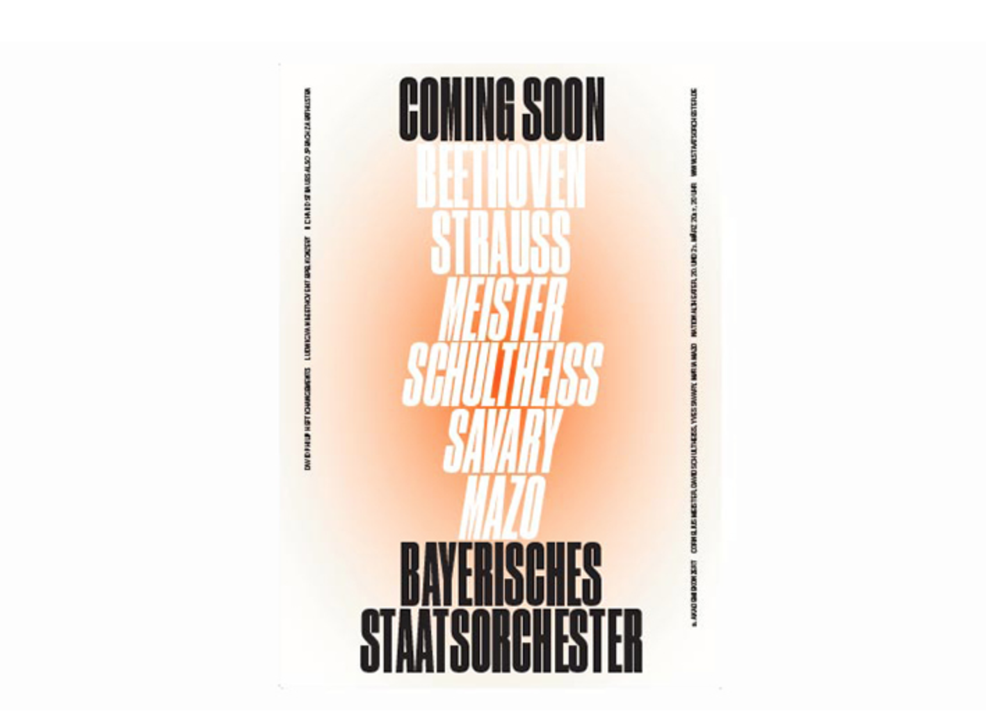
One frequent collaboration I came across was Munich based design studio Bureau Mirko Borsche and the Bavarian State Opera. Each year the studio creates a new campaign for the Opera, developing a concept given to them by the institution. The campaign I looked has the theme of 'What follows' and it is delivered across a series of posters and flags. The solution is a pure typographic result which refers to cinema intros, with the concept of not knowing what is going to happen next but being able to influence one’s situation with a single decision. The response shows that communicating Opera can be executed very simply with the right concept.
Another example was the Welsh National Opera who approached Hat Trick Design to emphasise the passionate and expressive nature of its productions. In the work produced they utilise a purposeful brusk-strokes in a rich colour palette and these marks appear throughout the identity, used across the programme and on the company’s own logotype.

Studio Feixen create a contemporary and dynamic identity for Luzern Theatre which is both raw and fresh yet it has fluid system running through posters and editorial. For me it's polar opposite to any theatre company identity I've ever seen, with simple symbols representing the productions and even simpler colour palettes.

Looking at productions which interact with the target audience of Left Bank Opera Festival was crucial. As it was all good looking at contemporary theatre design which targets a more design and cultural savvy audience in Luzern and Munich. However, it was more appropriate looking at what is here in Leeds and already working for production companies. Opera North at the Howard Assembly Room, judging from their advertising output seem to be most reputable offering in the city. They also create a nice mixture of creative and commercial for the advertising of productions which gave me thought regarding what the audiences of Leeds expect and are used too. One example I found was 'Les Amazones d'Afrique' who use a highly stylised and striking image to represent the production. Its simple and can be applied in a number of ways as Ive seen the same images across different mediums across the city.

No comments:
Post a Comment