Wednesday 28 October 2015

Illustrator Workshop

This workshop was focusing on learning on how to import your own work into the software and using the pen tool and image trace from there. Even though I was aware of the skills being taught, the workshop was helpful as it was relevant to the current brief which is typeface design. For one of the tasks we had to use the pen tool to illustrate over each letter to digitalise them. 


The task was rather simple but once I completed it, I took it further by changing the line style and weight to achieve a style I thought was similar the one Peter Saville achieved for a Lacoste project. 


Once the class had a basic grasp of tracing over work etc, we were able to transform some of our own work into digital vectors. I decided to do a small sketch of the architecture of LCA.


OUGD403
Studio brief 02
Typeface design

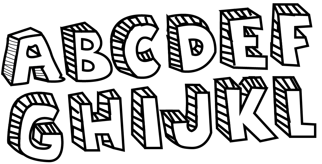
The latest brief has been set and the task is to create our own bespoke typeface, which should effectively communicate my given adjective which is 'Light'. The typeface has to be based on Müeller-Brockmanns classic and lead typefaces, so the selection is Garamond, Caslon, Baskerville, Bodoni, Clarendon, Berthold, Times, Helvetica and Univers. Basically I have to repurpose certains shapes/letterforms to symbolise 'Light'. 


To start this brief I looked into Josef Müeller-Brockmann in more detail, he was a Swiss graphic designer and teacher. He studied architecture, design and history of art at University. He is recognised for his simple designs and his clean use of typography, shapes and colours which inspire many graphic designers in the 21st century. He often used the word ‘anonymous’ in connection with type.

By this he meant neutral, rational typography like western typefaces that are based on the universal shapes of circle, square and triangle. That makes them rational and gives them an elegance that is recognisable by all cultures. His personal favourite typeface was Berthold’s Akzidenz Grotesk but he believed in nine classic typefaces that we should use and this was the second research task I undertook, I wanted more knowledge on each typeface so I explored each one of them. 
Garamond
Garamond is the name given to many old style serif typefaces, named after the 16th-century punch cutter Claude Garamont, similar to all old-style designs, variation in stroke is restrained so that it resembles handwriting, creating a design that seems hand rendered. Garamond is considered to be among the most readable serif typefaces when printed on paper. What I think makes Garamond effective is the different stroke weights found in certain letters like lowercase 'a' and 'e', it demonstrates the hand rendered style effectively.
Caslon
Caslon is a group of serif typefaces designed by William CaslonConsidered the first original English typeface this font was made famous because of its extensive use throughout the Brtish Empire,It has been revived at various times since then, in particular during the British arts and crafts movement and again each time it went through a redesign for technological changes. It continues to be a standard in typography to this day.One notable design of Caslon it has short ascenders and descenders, it has a bold weight and I think this helps communicate a strong emphasis. 
Baskerville
Baskerville is a serif typeface designed in 1757 by John Baskerville,Baskerville was a 17th century publisher who developed many innovations across different elements of printing, including paper stocks, inks, and typefaces. The typeface is used mainly for texts in books,A research study showed that the use of the Baskerville font increased the likelihood of the reader agreeing with a statement by 1.5%. I'm not sure what would cause this but Baskerville has a contrast of thin and thick stroke lines that give the serifs a more sharp look.
Bodoni
The various font styles begin with Bodoni’s original Didone modern font in the late 1700s, The original design had a bold look with contrasting strokes and an upper case that was a bit more condensed then its stylish influence Baskerville, variant designs came out but R. Hunter Middleton redesign is considered the most faithful redesign of Bodoni’s original roman design. This is a popular font seen in almost every kind of typesetting situation, but particularly well suited for logos and title fonts, for example high end fashion journals and magazines such as Vogue. Personally Bodoni is one of my favourite typefaces because of its elegant modern design that can draw the attention, even when you subtract the space in kerning Bodoni doesn't loose much of its sturdy design and it think that this down to the contrast of thick and thin strokes. 
Clarendon 
The Clarendon font family is a modern era of a 19th century publishing classic, apparently named after the Clarendon press in Oxford. It is used in many modern logos across the media spectrum like People Magazine, Clarendon types proved extremely popular in many parts of the world, in particular for display such as posters printed with wood type but today you can see Clarendon for Sony's logotype which is Clarendon bold expanded.  Clarendon has a clear style, achieved through thick strokes and serifs.

Berthold

The Berthold type foundry, was founded in 1858 by Hermann Berthold in Berlin.Berthold is known for the development of high quality typefaces. The Berthold foundry's most celebrated family of typefaces is arguably Akzidenz-Grotesk, known as the mother of all sans serifs.Its design influenced many later designs, especially many typefaces released after 1950, like Helvetica in 1957. Other Berthold fonts include Imago, Formata, Cooperate ASE and AG Book. 

Times

The story behind Times is rather interesting,In 1931,The Times of London commissioned a new text type design from Stanley Morison and Victor Lardent, after Morison had written an article criticizing The Times for being badly printed. The new design was supervised by Morison who used an older typeface, Plantin, as the basis for his design. As the old type used by the newspaper had been called Times Old Roman, Morison's new design became 'Times New Roman'. The Times of London debuted the new typeface in October 1932, and after one year the design was released for commercial sale. There is five Times fonts including Times Ten, Times Eighteen, Times Europa and Times New Roman.

Helvetica
The Helvetica typeface is one of the most famous and popular in the world. It is used everywhere and you come across it daily, Helvetica is so successful because it speaks so much, it can stand for anything. The design has the concept that a typeface should absolutely support the reading process, that clear communication is the primary goal of typography. It was designed in 1957 by Swiss Graphic designer Max Miedinger, Miedinger was under the instructions of Eduard Hoffmann, managing director of the Haas Type Foundry at that time to design a typeface that would unseat a popular family offered by one his company’s competitors. Whenever I'm using Helvetica, the negative space surrounding the letters make it as effective as the lines that make up the characters themselves I think. 

Univers

Univers is similar to helvetica but is unique in its own way as the design lacks excessive features of any type, creating a design that is versatile and distinctive. Adrian Frutiger started designing Univers in 1954, completing his design in 1957. The Univers type family has grown to 44 different weights and styles. Frutiger continuously tried to improve and expand the Univers family until his recent death, he always wanted Univers to have a strict framework that worked harmoniously.  

Tuesday 27 October 2015

OUGD404
Study task 02
Colour task relativity

For this task each member of the class had to note down their least favourite colour and see where this colour could work well in a combination. My least favourite colour is blue so I used Pantone colour guides to choose one other colour alongside black, what would work within a scheme for a children's book. Blue is my least favourite colour because I believe it doesn't work well with my favourite colour black, I rarely use blue in my design work and occasionally wear blue clothes so it was an obvious choice to choose blue.

The Pantone blue I chose is a very light pasty blue which is one of the few blues which I think works well with black, sticking with the pasty colours I then picked a pink that compliments both the blue and black. I think the choice of choosing the pink was easy as its a perfect match in my opinion.

Monday 26 October 2015

OUGD403
Study task 03
Drawing the detectives 

This task was to design a graphic reinterpretation of a chosen Agatha Christie novel as a part of the guardians celebration of what would have been her 125th birthday. Using my newfound knowledge of colour theory and understanding of typographic design I had to redesign a cover for 'Curtain' which was the famous detectives 'Hercule Poirot' last case. 

The novel features Hercule Poirot and Arthur Hastings in their final appearances in Christie's works. It is a country house novel,with all the characters and the murder set in one house. Once I had a basic understanding of what the book was about I started to look at previous book covers for this title.


The three I've picked out all have different main focuses, the first one is referencing the morphine used to kill someone, the second one is touching on that Poirot himself was in a wheelchair for his last case and finally the last book cover has went for a stereotypical Poirot moustache. So now I knew what previous imagery was used to represent 'Curtain', I could base some ideas from them. I noted down key words that I could illustrate such poison and country house.  

My first initial ideas were to have a curtains shaped in Poirot's famous moustache to signify the curtains coming down on his long detective career, other ideas included pairing Poirot and Hastings alongside each other in a simplified human figure's illustration similar to male toilet symbols but have small details such as Poirot's moustache to differentiate them. Other inspirations came from alternative film posters and this is where I decided upon the idea I would develop.

My final idea was to involve a small part of the house in which the murders took place, and I thought a window would be most suitable, firstly because of its references to the title but also I thought a window could symbolise a way of not getting out,pinning on the point all the murders took place in the house. 


I chose to use Bodoni for the type because I believe it suits the style of Poirot, this typeface works well with the 1930s theme of the book and it looks clear and bold at the top of the cover. The secondary type below 'Curtain' is Futura, I chose it because personally I think it works well with Bodoni and isn't too overpowering below the text. I chose the dark and gloomy colours of the 1930s for the colour palette, i think the very light brown offsets well with the white block at the top. The green stands out for me, as it symbolises the darkness going on within the country house. 

For the illustration itself i wanted a simple window illustration centre of the page. It was later on in the task when I asked for feedback from a member of the class, and they commented on the sharp light reflection on the window saying it looked like a guillotine, even though the novel has no reference to a guillotine nonetheless its a clever interpretation of death and murder. The small skull and bones symbolises the poison inside the country house. 

Once I completed the design I uploaded it to the Guardians website as a part of the live brief,I always enjoy taking part in a live brief as I find it motivates me more during the design process. 


Sunday 25 October 2015

OUGD403
Study brief 01
Feedback & Evaluation

'Is the logo appropriate for all ages" was the first question I asked the crit group, for this question I received mixed feedback,some of the points I received were:

"I feel as if its too complicated"
"Its fun but maybe for boys"
"bold and fun,easy to read"
"The final design is quite playful and bold therefore I believe it is associable for different target audiences"

The evaluation of this point was helpful as it pointed out the key characteristics of the design I was aiming for which was clear and bold. I'm glad that this positive feedback was received as it was a aim but other comments claimed that the design was complicated, I can take this on board to make the logo even better but I wasn't entirely certain about what this point meant because was it too bold? hard to read? Receiving feedback at the end of the project is always helpful but its shown me I need to start asking for more feedback during the project.

The second question I asked was "What other colours could I include in the design" I mainly used red and black for the colours but I was interested in knowing which other colours could have worked, when I was doing research for this brief I looked at the Thai flag and the colours associated with Thailand but I never pursued using some of the colours, primarily blue. So it was no surprise in my feedback that people commented saying incorporate blue. Here is some of the feedback I received:

"Red relates to food well so it is easily recognisable"
"Use a pale blue or orange perhaps"

The final question I asked was "Is the logo clear enough? And where would it look best?" the replies were:

"look is very clean and would look best as signage"
"Very unique and stand out piece of type"
"I like the logo in your development with the word 'thai' in small more. The first two I didn't recognise as an oriental style font because the letter ZAAP didn't present the theme very well on their own"

The reason I asked this question is because I was curious to know where people would think the logo would look best considering its a bold logo. Personally I think the logo would look best as a store sign and maybe not as a app logo.This was backed up in the crit as members of the class also believed the logo would look better in store, on menus etc rather than online.

Thursday 22 October 2015

Illustrator Workshop

This was the first intoduction to Adobe Ilustrator, throughout my time at college before university I've been using Illustrator so when we first got introduced to the pen tool,it was just touching up on skills I already knew but it was still good to do a line task. The task was to simply draw around the lines using the pen tool then customise each line experiemting with colour,line and style.


Once we finished the task we were aloud to experiment with the shapes tools, so I took this chance to just create random pieces of work.


Tuesday 20 October 2015

OUGD404
Study Task 01
Colour theory task

There are a number of established theories that relate to the use of colour and the way it is used in specific situations so for this task we had to choose colours that are most suiting for four different book genres, we used a Pantone colour guide to help our decision making. We had to pick two colours for each choice, one that I believe would typically represent the genre then one choice that you wouldn't expect but yet it still works.


Above are all the colour swatches my group chose for each genre,I'll start with reasoning behind the western genre. I don't believe either colour is typical or conformist for a 'western', when I think of a western,dirt,deserts and tumbleweeds spring to mind. All have a similar stereotypical colour but not one sticks in mind so we thought a colour swatch of a pale orange and a pasty yellow would be the right fit.

I found the Sci Fi genre tricky because when I envisage Sci Fi, empty black space comes to mind, on the other hand we thought of Sci Fi films such as star wars. Then from there we casted the colours of lightsabers as our colour swatch, not as vibrant as a lightsaber nonetheless I think these colours sum up Sci Fi well.

Moving onto Fairytale, the obvious choice was to have a pink colour to represent fairytales,when I think of fairytales I consider Disney, princesses and pink. For the second colour we thought we'd associate a blue with fairytales because in fact fairytales do have male protagonist. Personally I think these two options are stereotypical to say the least but I think we chose two pantone colours that fit well.

Finally the Horror genre, These colours had to be grim and murky to represent horror so primarily we picked the dark grey because it sums up gloom in a colour I think. The second colour is green because of the bleak and dim woods you often encounter with horror films.


OUGD404
An introduction to Colour theory

At the start of this lecture we briefly went into the science of colour theory and how the human eye perceives colour through a physical, physiological and psychological process. The human eye contains two types of receptors, 'Rods' which convey shades of black and white, then 'Cones' which allow the brain to perceive colour. There are three types of cones, type one is sensitive to red-orange light, type two is sensitive to green light then finally type three is to blue-violet light. When a single cone is stimulated, the brain perceives the one corresponding colour.

Once the science part was covered we looked more at colour principles and some of the pioneers behind colour like Johannes Itten and Josef Albers. I done a small amount of research into Josef Albers, he used colours as if they were catalogued components of an optical experiment, he used intense colours to create work that was a transition between  new American and European art at the time. Principles like CMYK and RGB were mentioned, certain aspects I knew of but it was good learn about the print processes for example when billboards are printed in CMYK.

Learning about the dimensions of colour was beneficial because it was bringing back reconigtion of colour facts I learned in school. For example 'Hue' is one colour and 'Colour' is one or more hues. Colour and hue can often be interchangeable terms, chroma refers to all colour including shades, tints and tones. Shades are hues plus black,tints are hues plus white and tones meanwhile are hues plus grey. 


This lecture was helpful because it reintroduced me to facts about colour that I'd forgotten about but it also introduced me to new theories as well.   

Monday 19 October 2015

OUGD403
Whitney Museum rebrand

Experimental jetset were approached by the Whitney Museum to redesign their graphic identity ahead of their move to a new museum designed by Renzo Piano. The redesign focuses around the notion of a zig zag, the design refers a selection of things, for example the industrial nature of the new architecture, the archetypical roofs of factories, and the iconic exterior fire escape stairs of New York. Personally my first thoughts of the rebrand were that the zig zag was initially a 'W' representing Whitney but as I researched into the design process, continuos design explanations are presented for this rebrand. 

The use of the line gives the identity an open feel, a sense of freedom. The minimalistic design gives it flexibility in certain ways because I think the weight and thickness of the line look subtle with text but when you add image the logo looses its effectiveness. To allude back to the point of the design being 'open', this is achieved by the use of negative space. The remaining space is the museum itself, the artwork, the artists etc, I think the minimal style is trying to dampen down the institute itself and maybe focus on the pieces of art actually inside the museum. 


Back to my point before about the logo being lost once you add image, for instance in this advertisement which I personally like but still I believe the line weight isn't strong enough and is muted, the Neue Haas Grotesk type enhances the design but in this case it shouldn't have to, the symbol should be able to stand alone.  


The point in this exercise was to be able to asses my own work like the way I have done for the rebrand of Whitney Museum. I enjoyed this task because  I'm bittersweet over the design so it was good to analyse it, other than this task we also had to create a list of words that we could describe our work by,below is a short selection of them :

- Adaptable
- Engaging
- Cohesive
- Intricate
- Conceptual
- Functional

What I've gained from this task is that from now on i'll asses my own work and peers work with more depth and analysis.

Saturday 17 October 2015

OUGD403
Initial Ideas

This blog post shows my initial ideas for Zaap's rebrand. These are just the initials so I've only experimented with one font and a couple of colours. When I received feedback on these designs I was told to look into the Thai alphabet and that Zaap Thai would be a more appropriate name for the logo. Red seemed to be most popular choice of colour for the logo.


OUGD403
Logotype
Brief / Research / Influences

This brief is to design a set of logotypes for a rebrand for a company of my choice, the only two limitations are the company has to have a shop/restaurant in Leeds and is nationwide, and you can only use type therefore you need to experiment with scale, stroke, spacing and contrast.

The company I have chosen is Zaap, a thai street food chain. The company is relevantly new with only two restaurants nationwide. However this is the reason I chose to rebrand them because people don't have a perception on them yet, I believe it'd be easier to have an open mind on rebranding something without a reputation yet.

So who are Zaap? "Starting a thai street food revolution" these are words taken from the website, they aim to make thai food available to the masses so that somewhat covers the target audience. Anyone interested in Thai food will be drawn towards Zaap thai. Zaap currently doesn't have any competitors in the Thai street food market but similar competitors could be Yo Sushi and Wok&Go but I think Zaap can differentiate from these and have its own asian street food gap in the market.

When I started thinking about the rebrand, Asian lettering,symbols and signs came to mind straight away. The bright neon lights found in Hong Kong and Tokyo which have always interested me were  an instant influence. I looked at minimal Japanese graphic design as well to seek influence.


OUGD403 Study Task 02 
Symbol

First of all i've enjoyed this short brief as I think it didn't have many restrictions unlike study task one in which you could only use one typeface etc, and being able to present numerous ideas instead of just one allowed various styles. 

Before the trip to Yorkshire Sculpture Park I had a number of ideas in which i'd like to expand on, the trip was a good source of research and influence as I got primary research on sculptures i'd base the symbol on. What I learnt from visiting YSP is that when designing for a client its best to immerse yourself within the environment to maximise the experience of the client/company. If we didn't have the trip to YSP, I would have mainly focused my ideas from secondary research online. 


Above are a handful of pictures I took on the visit, when looking around I was aiming to look for angles and sharp edges as this was one of my early ideas for a symbol. As the trip went on I was influenced by textures and shapes. I wasn't so much influenced by colour because I felt with the it being a park, the colours change throughout the year with the four seasons so sticking with one colour wouldn't work for YSP so I thought a black and white design 
would be best. 


This idea is influenced by the countless human sculptures you can find at YSP, it has a handful of faces so I had an idea that this would make a good identity for the logo. I didnt design a final solution for this logo just variations of the symbol. I designed the logo in illustrator then added radial blur and a cutout effect to achieve an abstract style.


These ideas are based on the nature at the park,its the biggest aspect of YSP. I wanted the tree symbol to be like a sculpture itself so I used symmetry, which gives it solidity and structure. Personally this symbol is my favourite because its a structure itself but one problem of the design is when scaled down it could lose its effectiveness because of its detailed design. The other design is a minimal tree rings design which I think would look good alongside YSP current typeface logo, this symbol could also represent the shape of the park. 


Both designs are inspired by Barbara Hepworths sculptures at YSP. Her sculptures can be described as abstract, geometric and have a semi rough finish. Once I did a small amount of research into Barbara Hepworth I had a concept of what I could do for a symbol influenced by her work, I used circles often found in the centre of her work and wanted to explore the way she stacked vertical arrangements at the same level so I came up with this design.
Using radial blur gives the symbol a semi rough finish that Hepworth was known for. My only problem with this design is that it represents YSP through one artists work, in this case Barbara Hepworth. 


Architecture and the Yorkshire sculpture triangle are explored in these designs, the design to the right is influenced by the contemporary architecture at YSP, most of the buildings have sharp edges and look like they were built in 80s due to style. One particular picture I took at YSP is almost illustrated through this symbol. The other symbol is influenced by architecture as well but is referencing more towards the Yorkshire structure triangle which YSP is in. 

In the final critique for this task I presented my ideas to a small group, having another insight into my work is always helpful as it always improves my way of working. I received feedback such as

-Expand on why some of the symbols are blurred 
-Good reason for not using colour
-Clear Presentation
-Use more range of colours
-Good range of styles but expand on one
-Could of tested the symbol alongside the logotype

I've taken all this feedback onboard and now know what I can do for future study tasks similar to this to improve. I certainly know if this was a longer brief I'd develop one idea further and experiment with colour more. In summary I've enjoyed this small study task as it allowed freedom within design but the most important part was the critique for me because Ive learned I need to ask more questions during the design process. 

Tuesday 13 October 2015

OUGD404
Design Principles

Today we were briefed about module OUGD404,which is design principles. We had a small lecture about Gestalt's principles in which I took some notes and in this blog post i'll discuss them.

Gestalt psychology
Shape form and defining an area of physchlogy that aims to understand our ability to perceive and organise the world. Our perceptions can be more than merely what is presented, essentially we make more sense of the ambiguous. An example, we attempt to define an object by observing its outline rather than ommdetialy examining its constituent parts

"the whole is other than the sum of the parts”
kurt koffka

Continuation
Our instinct is to follow something what we perceive to be a line or path.

Law of pragnanz
People will perceive and interpret ambiguous or complex images at the simplest form possible.

Closure
Closure can be thought of as the glue holding elements together. its about the human tendency to seek and find patterns, to understand. The key is to to provide enough info so the eye can fill in the rest, if too much is missing, the elements will be seen as separate parts instead. 

Symmetry 
Symmetry gives us the feeling of solidity and order which we tend to seek. it is our nature to impose order on chaos. this principle leads us to want balance in composition 
OUGD403 Study task 01
Collaborative Branding

This is the final blog post for the Crosswater rebrand,I'll be discussing the final piece and the presentation we presented to the class.


Here is the final design for Crosswater,not much has changed from the development but what I'd like to change now is the line below 'cross' as I think it is too much and looks out of of place when you view it from directly below 'cross'. When the group received feedback from fellow classmates I think that was one of the comments made.


After we presented to the class we received feedback on our presentation and designs. Above is the first piece of feedback,the one that stands out is the big jump from development which is correct. For the presentation we didn't include enough development of our final idea, this is mainly because once we had the idea we sort of skipped all development processes and went with what we had. In some cases, you can get away with this but in this case we had to present ideas,concepts and development.


The one point I'm picking out from this piece of feedback is the good colour scheme, the colours that influenced the design were the colours of crosswater's products, the common metallic greys often found in bathrooms. The option of using light blues was discussed but as a group we decided, greys would be most relevant for the modern design.


One comment picks up on my point of the line being too much which I agree with but I'm happy people were noticing the clean and modern design we were trying to achieve. Having feedback I've found is very helpful as it improves your decision making for later projects and its good to openly talk about your work. Below is the presentation we presented to the group.