OUGD403 Study task 01
Collaborative Branding
This is the final blog post for the Crosswater rebrand,I'll be discussing the final piece and the presentation we presented to the class.
Here is the final design for Crosswater,not much has changed from the development but what I'd like to change now is the line below 'cross' as I think it is too much and looks out of of place when you view it from directly below 'cross'. When the group received feedback from fellow classmates I think that was one of the comments made.
After we presented to the class we received feedback on our presentation and designs. Above is the first piece of feedback,the one that stands out is the big jump from development which is correct. For the presentation we didn't include enough development of our final idea, this is mainly because once we had the idea we sort of skipped all development processes and went with what we had. In some cases, you can get away with this but in this case we had to present ideas,concepts and development.
The one point I'm picking out from this piece of feedback is the good colour scheme, the colours that influenced the design were the colours of crosswater's products, the common metallic greys often found in bathrooms. The option of using light blues was discussed but as a group we decided, greys would be most relevant for the modern design.
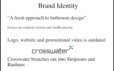
One comment picks up on my point of the line being too much which I agree with but I'm happy people were noticing the clean and modern design we were trying to achieve. Having feedback I've found is very helpful as it improves your decision making for later projects and its good to openly talk about your work. Below is the presentation we presented to the group.


No comments:
Post a Comment