Monday 29 February 2016

OUGD406
Studio Brief 02
Research

To start my research into this brief, I wanted to delve more into what exactly a banknote is, its history, issues which link to advantages and disadvantages and materials used. Banknotes are a type of negotiable instrument, also known as a note, bill or paper money which were originally used by commercial banks who were  legally required to redeem the notes for legal tender. 

Paper currency first developed in Tang Dynasty China during the 7th century, although real paper money did not appear until the 11th century. The usage of paper currency later spread throughout the Mongol Empire. European explorers like Marco Polo introduced the concept in Europe during the 13th century. Napoleon issued paper banknotes in the early 1800s. Paper money originated in two forms: drafts, which are receipts for value held on account, and "bills", which were issued with a promise to convert at a later date. When I was researching into the early history of money I found myself less interested in the earliest associations with the note because I was more eager to know about the future of money and less the past, then again it was helpful to learn the origins of a banknote to see it in a different way. 


The banknote raises a lot of issues and this is what I'm interested in for research, hightlighting key issues and maybe finding a way to address them through my work. One big issue is that the modern banknote rests the assumption that money is determined by social and legal status, when really a banknote is the reflection of the supply and demand society exchanging goods in a free market, when researching into this issue I was considering ways in which I could solve this solution and found that the economist Nicholas Barbon wrote that money "was an imaginary value made by a law for the convenience of exchange. So looking at it at money as an imaginary object with no real value could be an engaging way behind my banknote design.

Recently I came across an article online titled '€500 bills 'may be used by terrorists', EU warns' I decided to read the article as I knew I had a brief upcoming on money. A summary of the article is that EU is to launch an investigation into the the use €500 bills as concerns grow that high bills are funding drug dealing and the aftermath of the November attacks in Paris the EU will also look at the possibility that high-denomination bills have been used in terrorist financing. This was a brief but useful piece of research as its current but also a consideration to take when designing my note, whether or not to produce high denomination bills. 


Counterfeiting bank notes is another issue facing money at this moment but has always occurred. Especially since the introduction of colour photocopiers and computer image scanners, banks and nations have incorporated many ways in which to stop this but as technology improves and becomes more available, counterfeit notes keep appearing such as the famous 'Superdollar'. Cost can be a big issue for money too, bank notes are printed and typically have a high cost of issue especially in larger denominations. Another cost is acceptance, notes have to be checked for security features and confirming acceptability. A possible response for this brief could be to have a note that reduces costs and is efficient. 


Most banknotes are made from cotton paper with a weight of 80 to 90 gsm. The cotton is sometimes mixed with linen, abaca, or other textile fibres. Generally, the paper used is different from ordinary paper to make it much more resilient, resists wear and tear. The average life of a banknote is two years, i like this fact as I could see it being an interesting part of a design, almost like a best by date for money. For research I wanted to know the future materials which could possibly be used for money and discovered an article discussing why more countries don't use plastic money. Titled 

'Who, What, Why: Why don't more countries use plastic banknotes?' the article goes into the possible advantages of plastic money, in the long run they last longer and don't get dirty as quick, which works to great advantage to countries with high climates and humid air. This could be a consideration for material if I was to pick a nation with high temperatures and humidity. Also the production cost would be dropped as less bills would be produced, and the plastic is recyclable. The problems with plastic money could be you can't fold the money and some less developed countries may be unable to recycle.

Sunday 28 February 2016

OUGD406
Studio Brief 01
Idea development

The second idea I decided to develop was the concept of using grids to communicate the song, In the song ideas of hierarchy and rules are expressed so I imagined grids to keep order, also grids link with the track name 'art school', with the frequent use of grids in art and design.


Above is the first digitalised design I did for this idea, the type content I chose was the year of release for the song along with 'permission' and 'rules' to signify order. This idea is basic, with a limited colour palette so when developing it I considered more colour and imagery I'd already collected of an art school.


This development was highly influenced by my ideas crit feedback, as someone compared one idea to the art movement De Stijl. So I designed a grid that was similar to the famous De Stijl lines and added small boxes of colour that I took inspiration from Peter Saville designs for New Order. I think this is a strong design but lacks any content as its too similar to the style of De Stijl and The Jam or the song have no relation to the art movement.

The final development of the idea reuses the original grid but includes concepts from other ideas, the image is of the art school from my first initial ideas. The set of circles are to resemble students, the red dot is to resemble individuality. Throughout the song it encourages individuality as seen here 'Anything that you wanna do, anyplace that you wanna go
Don't need permission for everything that you want
Any taste that you feel is right
Wear any clothes just as long as they're bright'

The addition of these two add content behind the design, which I think was lacking in earlier developments. 

Friday 26 February 2016

OUGD406
Studio Brief 01
Idea development

For the first developed idea I decided to experiment with the art school imagery, at this point I'd already taken the pictures but I wanted to distort the pictures and combine ideas into this one.


I decided to choose this image I'd taken because I believe it resembles an art school with exposure of light and industrial aesthetics but the image remains ambiguous in my opinion. This picture alone doesn't communicate the song very well so I wanted to add other concepts. I had an idea of technicolored circles that represented each individual within the art school, influenced from the lyric 'wear bright clothes'.


With the addition the of the technicolored colours and the glitch effect I achieved using photoshop this idea started to take shape, It remained ambiguous but had the content of the lyrics behind it. I experimented with the layout of the technicolored circles but in the end I think the circles positioned centre aligned works the best as it makes the 'individuals' the centre of attention in the design.


Wednesday 24 February 2016

OUGD406
Studio Brief 01
Art School photography

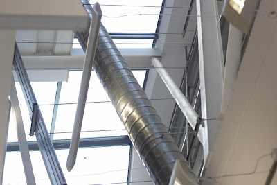
Following on from the feedback session I decided to collect my own photography of an art school, the aim was to find shots that had lots of light, large windows and an industrial feel. The stereotypical art school image in my opinion is large windows to allow light in, accompanied with exposed structures of the building as seen in some of the pictures.


Monday 22 February 2016

OUGD406
Studio Brief 01
Initial Ideas feedback

In a small crit group I presented my rough initial ideas to gain feedback on my ideas but also to find more research paths to help the ideas. Once I showed my ideas I received comments such as research into art movements and Roy Lichenstein as some of my ideas resembled the De stijl movement and the technicolour dots ideas reminded people of Roy lichensteins work. Mod culture was another possible research path that was recommended as The Jam was in the midst of the mod culture, so possible mod styles could influence my designs. The art school imagery ideas received positive feedback and I was encouraged to use my own photography for this idea and not just use stereotypical art school imagery from another source. Overall this feedback helped my process because it highlighted other research topics that maybe I wouldn't have looked at.
OUGD406
Studio Brief 01
Initial Ideas

For my initial ideas I took onboard the initial thoughts I had from the song after listening to it numerous times, a majority of my ideas are based on theme of stereotypical art school imagery but also I took inspiration from the lyrics that suggests rules and hierarchy, the use of grids and lines link with the art school theme but also relate to rules I think. Other initial ideas play with the lyric 'wear any clothes along as they're bright' I decided to represent individuals with bright colours in some of my designs, another lyric that heavily influenced my designs was 'say what you want' which I think also links with the idea of rules but this time indicates more freedom.


Wednesday 17 February 2016

OUGD406
Studio Brief 01
Album cover inspiration

For inspiration I looked at album artwork belonging to labels and artists I was familiar with, I did this because it is easier to understand the artwork if I'm a regular listener to the music. I explored at how certain tracks or albums are communicated through the covers, and what makes stand out from my opinion.


This artwork is from German music label, Magazine. Every release follows the same style which I believe is inspired by editorial design which would be no surprise due to the labels name. The use of white space and exposed content makes these covers very appealing. Barnt, one of the label heads who's style of production has been compared to Bauhaus architecture, believes artwork and packaging is just as important as the music and I totally agree with him because if you've never heard the artists or song before you tend to judge them on identity.


I looked at Phantasy records album artwork style, the label doesn't have a particular set style but all releases are ambiguous to say the least, the use of photography and paint strokes occur in nearly all the covers with the intention to communicate a darker style I think.


German label Innervisons, feature instantly recognisable colourful and abstract artwork and every year the label changes its artwork style by only releasing the tracks artwork as a set, so all the selected releases have a similar style. All of Innervsions releases rarely have type involved, its down to the imagery to communicate and express the identity of either the label, artist or tracks.

Thursday 4 February 2016

OUGD406
Studio brief 01
Track selection & Research

At this stage of the brief I believed it was time to pick a track from the seven available, I researched into the competition itself and designers and artist who specialise in album artwork, and at this stage I wanted to continue to research into these fields but with the focus of the chosen track in mind. The tracks I had to choose from are as follows:

Chvrches - Clearest Blue
Etta James - At Last
Jack Garrett - Worry
The Jam - Art School
John Lennon - Imagine
Max Richter - Dream 3
Tame Impala - The Less I Know the Better
When It came to picking a track I didn't want to spend too much time debating about it, or even listening to all them. In the end I chose Art School by The Jam, I would say the tracks name appealed to me the most, as it may have something to do with me attending an art school. From this point I read upon the track and listened to it numerous times, Art School was released as part of The Jams 1977 studio album, In the city. When I first listened to the track, thoughts that came to mind were imagery of a stereotypical art school and the students within. The lyrics are as follows:
Anything that you wanna do, anyplace that you wanna go
Don't need permission for everything that you want
Any taste that you feel is right
Wear any clothes just as long as they're bright
Say what you want, 'cos this is a new art school
Do what you want if it takes your mind
Better do it now, 'cos you won't have time
And never worry if people laugh at you
The fools only laugh 'cos they envy you
Time is motion and the hands are fast
Young words are mumbled, they don't always last
It's up to us to be sure they understand
Who makes the rules that make people select
Who is to judge that your ways are correct
The media as watchdog is absolute shit
The TV telling you what to think
Anything that you wanna do, anyplace that you wanna go
Don't need permission for everything that you want
Any taste that you feel is right
Wear any clothes just as long as they're bright
Say what you want, 
'cos this is a new art school
Do what you want, 'cos this is the new art school
I created an environment in my head based upon the lyrics, and the lyrics which say 'wear any clothes just as long as they're bright' along with 'cos this is the new art school' wear heavily influencing my thoughts. From here I wanted to continue possible paths of research then start initial ideas.  

Wednesday 3 February 2016

OUGD406
Studio Brief 01
Research

For this part of research I looked into designers and artist who specialise in album artwork, I wanted to focus on certain styles and the process each designer / artist goes through when designing a cover, to see if it could possibly help me when I come to designing my chosen tracks cover. 

Kero
Kero is a highly talented illustrator and visual artist from Italy, she designs intricate and detailed record sleeves and works as the in house illustrator for music label, Life and Death. Her work for Life  and death is what made me look into her work about a year ago, as the covers are a stitching of imagery with text in a collage type format, that prefer to exhibit marks of the artists rather than trying to achieve flawless or a cleaned up approach. The way she designs the covers is inspiring as for Secret 7, I have exhibit marks of the track but trying not to communicate in a obvious way. In an interview with Inverted Audio, Kero discusses what mediums and materials she uses 'I've been using almost all the materials and resources out there: ink, pencils, watercolours, acrylics, etching, collage... you name it, but I never liked oils, too slow and smelly' to see she uses a wide range of mediums and materials, made me consider which approach to take when producing the cover, too often I find myself printing digitally when I should be using the facilities around me at college more.


Jack Featherstone
Jack Featherstone specialises across art direction, animation and graphic design and I came across his work when I bought Simian Mobile Discos latest album 'Whorl'. He designed visuals not just for the album but also the live performances, the visuals are psychedelic created using digital and analogue technologies, so the ways in which you can create album artwork is ceaseless. In an interview I read that jack often likes to dream up certain environments or a language and explore it within a length of the track, this could be way in which I could create ideas for my chosen track.

Peter Saville
Peter Saville is one Britain's most well known designers, famed for his work for Factory records and  most notably Joy Divisions album Unknown pleasures. The first time I found out about Peter Saville was when I was watching 24 hour party people about one year ago, in which Saville is portrayed as a laid back designer constantly missing deadlines, after watching the film I went onto look at his work for the Hacienda nights and New Order, but for this research I wanted to know his process and after some extensive research it seems Saville likes to take imagery and almost recycle it, such as the 19th century oil painting used in New Orders album, Power, corruption and lies, he then finely added a technicolored coded system to the side to give the cover some essence. The process Saville used could potentially work for one of seven tracks for Secret 7 and could give a design true ambiguity.


Stefan Sagmeister
I follow Sagmeister on Instagram and on a daily basis he uploads a picture of four album covers to his feed, I'm not sure whether or not this is current project he's working on, or perhaps it could be the records he listens to during the day in the studio. Nonetheless, the constant feed of album cover designs can help with my research for this brief because he always credits the designer or artist in the description so to see other notable designers music related work can influence my designs.


OUGD406
Studio Brief 01
Research


Before this brief I had already had brief knowledge of Secret 7 due to my interests in music and graphic design but now that I'll be entering the competition I believe I need to explore more into what makes Secret 7 unique, for my Secret 7 research I decided to delve into the collaborators.

First of all I decided to check out the collaborators because they are the judging panel for the competition so it'd be intriguing and also constructive to see the collaborators visual style / identity to maybe to help influence my designs, for example Monotype who are one of the three collaborators perhaps might look out for entries that are heavily influenced by type.


Universal Music is the first collaborator and has been supporting Secret 7 since its launch in 2012. Universal Music is the UK's leading music company with signed artists such as Take That, Florence + the machine and The Rolling Stones. From looking up the company I gathered thats its a highly acclaimed label with a long list of artists but didn't pick up any particular style that the collaborating judges may be looking for.


Sonos Studios London is Secret 7s home this year and Secret 7 even say it 'looks and feels like our dream home if we had to built it'. Sons as a company provides luxury and quality wireless audio equipment, and if it was to say the collaborating judges were looking for a particular style it would be  a minimal look, something subtle but effective like the design of Sonos products.


And finally Monotype is the final collaborator, 'Our fonts and technologies bring the worlds words to the pages and screen'. When I was researching into Monotype on the Secret 7 website, they provide a link to download free Monotype typefaces so this may be indication to potentially use type to communicate the song, and that Monotype will be looking out for type heavy entries.

Tuesday 2 February 2016

OUGD404
Studio Brief 01
Folds, Stock and Binding inspiration


For this studio brief we had to take into consideration the folding, stock and binding and before I decided upon the styling of my publication I wanted to research into the possible finishes I could have. Firstly with folding techniques, I don't intend to use a intricate fold, I would prefer to have a booklet feel rather than a leaflet.


A smart bind can instantly enhance the appearance of a book, if the book has a simple design then the addition of bind like the image above aesthetically makes the design. For my publication I will take into consideration complex binds and I'll further research binding techniques.


G.F Smith will most likely be used for the stock, they other a wide range of colours which will make my publication professional, I believe the stock choice will be the one of the most important design decisions for the brief.
OUGD404
Studio Brief 01
Inspiration


When looking for inspiration for this brief, firstly I wanted to look a text alignment layouts. All the images above heavily focus on the way text is formatted, the second image particularly inspired me because it includes small shapes in the layout, it showed me that the subtle inclusion of contrasting shapes could work in my publication. To consider the style I was looking at would be minimal publications that are densely reliant on type, so this is a style I'm aiming to achieve and will place shape elements within the layout.
OUGD404
Studio Brief 01 
Content Research

I've decided to pick contrast to base my design principles publications of, but in particular contrasting shapes in graphic design. After learning about each principle in study tasks and lecturers, I think contrast interested me the most but I wanted to focus on a specific type of contrast,shape. In my own practice I've realised I commonly use subtle shapes to solve problems and use the simplicity of shapes to my advantage, so I believe I'll enjoy basing my work of contrasting shapes. I started researching contrast in graphic design, then from that point I found extracts on 'shape', so for the content I reworded a majority of the text content to be suitable for my design principles publication.

The chosen content:

Distinguishing by comparing / creating differences. Some ways of creating contrast among elements in  design include using contrasting colors, sizes, shapes, locations, or relationships. In this publication I'll be focusing on contrasting shapes.

A shape is an area that is contained within an implied line, or is seen and identified because of colour or value changes.

Shape contrast means making things notable in by their difference in physical shape compared to other things on a page. At a basic level this can used in things like adding rounded corners to a button, but taken to more extreme levels it can attract attention. 

Applying contrast in shape for any design can really help make things start out. It can allow to make things stand out. It can allow you to make the principal elements of your design stand out by creating noticeable difference in shape compared to the rest of the elements in the layout. Depending on how far you take this, you can create a very extreme level of contrast to attract attention to an area. For instance, if you have a layout where all the elements are made up of rectangles but right in the middle there's a circle, the viewers attention is going to go directly to the circle because its different to the rest of the elements.
OUGD404
Studio Brief 02
Content feedback

Following a small crit discussing content over style about second studio brief with second year students has given me the confidence to go ahead with my idea of using content from the resident advisor report on Innervisions : Lost in a moment. I showed my peers the interview content and the pictures that are included with it, and all them commented on how the heavy the content is and with me only having a limit of 10 double page spreads, I'll have to wisely consider which text and pictures to use. Overall my text content has 5429 words and altogether I've picked out roughly 20 potential pictures I could use, so the I'll take layout into serious consideration. Now that I've finalised my content, I'm now considering style over content and in particular the concept behind my publication, whether or not it'll be a music influenced journal or more focused on labels or lifestyle.

Monday 1 February 2016

OUGD406
Studio Brief 01 -  Study Task 01

Before jumping into the studio brief and starting designs for Secret 7 2016, we took a step back and looked at last years track entries, for this study task we had to choose a track then create an obvious and an ambiguous response. This task enabled me to realise the certain considerations to take into account when designing a cover. I chose the track 'Let forever be' by The chemical brothers, prior to the task I'd never listened to the song but chose it because I like the visual identity the chemical brothers have, so I thought I'd build on that.


This is my first idea for the track, the eternity symbol signifies 'forever' from the track title. Throughout my design the theme of time is used a lot as I believe it embodies the track.

The second response is simply the title of the track blurred out, later on when I received feedback someone commented saying it was like a 'timewarp' which related back to the time theme.

This idea also follows the time theme, with the obvious inclusion of an alarm clock that says the time 'forever'.


This is another obvious response that uses type to communicate the title of the track, the line connecting the 'B' to the 'E' is in fact a timeline.


This is by far the most ambiguous design I did, I photoshopped the two members of Chemical Brothers faces together then applied numerous effects to give an in sync effect.


The Chemical Brothers current album artwork influenced this design as I used the zig zag like lines then added the timeline idea to it to create obscure timeline.

When I presented my ideas to a small crit group that all did the same track, the obvious feedback I knew I'd receive was to include more colour but normally when I'm just producing ideas I prefer to produce the work in a small colour palette then later add more colour in development. The time theme received positive feedback which was also encouraging. Once the small crits were over, another group had to choose the best solution for the track and the feedback for my idea was ' We have chosen this design because it is ambiguous enough to make it intriguing but also relates to the song. The smudge / warped effect connotes time warp, forever. We also like that the title is hidden inside.' The feedback is referring to the second idea.
OUGD406
Studio Brief 01 - Design is about doing

Studio Brief / Secret 7 

I should aim to visually explore the artists and tracks, through the context of the secret 7 competition. I'm competing against 1000's of submission from all over the world, so my design/designs have to stand out. 100 designs for each track will be selected, pressed and printed to be exhibited at Sonos Studios in Shoreditch / London and sold for £50 to raise money for the Amnesty International. Creatives from around the world are invited to interpret the tracks in their own style for every 7”. The seven tracks to choose from are :


- Chvrches - Clearest Blue
- Etta James - At Last
- Jack Garrett - Worry
- The Jam - Art School
- John Lennon - Imagine
- Max Richter - Dream 3
- Tame Impala - The Less I Know the Better
Background / Considerations
I should aim to explore the visual semiotics of the track from a personal perspective, by interpreting the content, lyrics, genre, style etc in a visual sense. I need people to see my work and the essence of graphic design is communication. There is no value producing work for it to be placed in a drawer. Often the best work or best ideas are the ones that people have seen. 
Mandatory Requirements
Final resolution as specified in the competition brief, example of the four sleeves I didn't select to enter, a minimum of thirty thumbnail possible design treatments and supporting design development work and documentation on my blog and design sheets. 
Deliverables 
Five visual variations of my chosen record sleeve and design board that document my final design. 
Interpretation of the brief
My first interpretation of this brief is that i'll personally enjoy it because not only am I interested in graphic design in the music industry but I've designed album artwork before, not on the same scale as a live brief but I believe I can take certain parts of research / gained knowledge from the past brief and develop my understanding more. The brief is very self led in my opinion, so it'll be interesting to see my final outcome and how it relates to the brief but mainly how it relates to the chosen track.
Personal Aims
As this is the first live brief of the year, I'd like to measure myself to see how I progress throughout the brief and try to stick to a timetable of work. As graphic design in the music industry already interests me, an aim for me will be to further my knowledge of it, I could do this by extensive research and experimenting with how content, genre, style and lyrics influence and inform a design.