OUGD406
Studio Brief 02
Evaluation
To conclude on studio brief 02, I enjoyed the journey of this brief from research into Japanese design to screenprinting the final resolution. I researched throughly into money, Japanese denominations and Japanese design that helped inform my designs and practice along the way. I believe I managed my time accordingly for this brief, as I set achievable step by step tasks during a busy time, as I had a heavy workload from other modules but balanced my work well. One aim of the brief was to get more familiar with screen printing, and I've achieved this as I’m confident in the whole process of stripping a screen along with printing. When it came to printing the banknote I did come across one problem, the Japanese text I used was to small for the ink to get through so in the end print wasn’t as I expected but I know for next time to use a larger type size.
Showing posts with label Studio Brief 02. Show all posts
Showing posts with label Studio Brief 02. Show all posts
Friday, 29 April 2016
OUGD406
Studio Brief 02
Final
The final banknote came out as planned, the banknote is informative and educational as it informs about Japans industry of robotics. The final outcome worked well as a screen print but had a few small mistakes in it but I think this adds to the traditional feel to the note.


Studio Brief 02
Final
The final banknote came out as planned, the banknote is informative and educational as it informs about Japans industry of robotics. The final outcome worked well as a screen print but had a few small mistakes in it but I think this adds to the traditional feel to the note.


OUGD406
Studio Brief 02
Production


Above are the separate layers I used for screen printing, Only 4 colours would be used for the screen printing stage. The only worry I had was the japanese type that might have been to small to print.


Printing went smoothly I believe, some prints came out imperfect but I think this added to the traditional feel of the note. I printed on two traditional Japanese stock choices from gf smith for a informed Japanese style but the dotted stock I used added more character
OUGD406
Studio Brief 02
Development
I selected a few rough sketches to develop more, I decided to push the robot ideas further in development but also combined other ideas. The idea of mixing traditional and modern was the aim but too achieve this in a playful sense.


I created these illustrations in illustrator based on asimo the robot, In development I found a style that my peers called Japanese comic like. I feel these designs were also contemporary and simple, unlike a banknote.


The design above is the final development of the banknote, the yellow lines resemble the Japanese rivers found in tradtional designs but these rivers are simplified and made bolder with a yellow colour. Nipponginko which translates to bank of japan is spread across the note in helvetica. The illustrations of asimo show the manufacturing process of the robots and industry in japan. The text says that robotics contribute 15 billion to the Japanese economy so it remains educational. The denomination is a 1000 yen because it is the most common.
Tuesday, 12 April 2016
OUGD406
Studio Brief 02
Idea Feedback
For feedback for my initial ideas I asked my peers firstly if the rough sketches could be seen as educational tool? 'Even in rough form the ideas clearly have the purpose to educate on robotics etc' 'Simple icons / illustrations help educate for your ideas' 'I like the equation ideas as it straight away makes me think of education'. The feedback I received on this question was encouraging, even in rough sketch the ideas came across educational and informative. The second question was more upfront, as I wanted to know which robot idea worked best? 'My favourite robot idea is the one when it is in parts, as it comes across as guidelines, which could be educational' 'I really like the robot hands with the symbol, I feel it could look nice as just a centre piece in the banknote' The feedback was varied but it was helpful to see the robot ideas also had educational links that inform. And the last question I asked was which colours would work the best for my ideas? 'Red and grey, the red symbolises Japan then when I think of robots, grey colours come to mind' 'All depends on the idea but I would say red and green could work in most ideas' I knew that red would be a frequent answer but I wanted to see which other colours people would associate with Japan.
OUGD406
Studio Brief 02
Initial Ideas
At this stage it was time to sketch some rough ideas to see which ideas had the most potential and which ones I could later develop, most of the ideas are just thumbnails of what the banknote could possibly be like but the key was to include the focus of the idea for example a small robot illustration or landscape imagery.
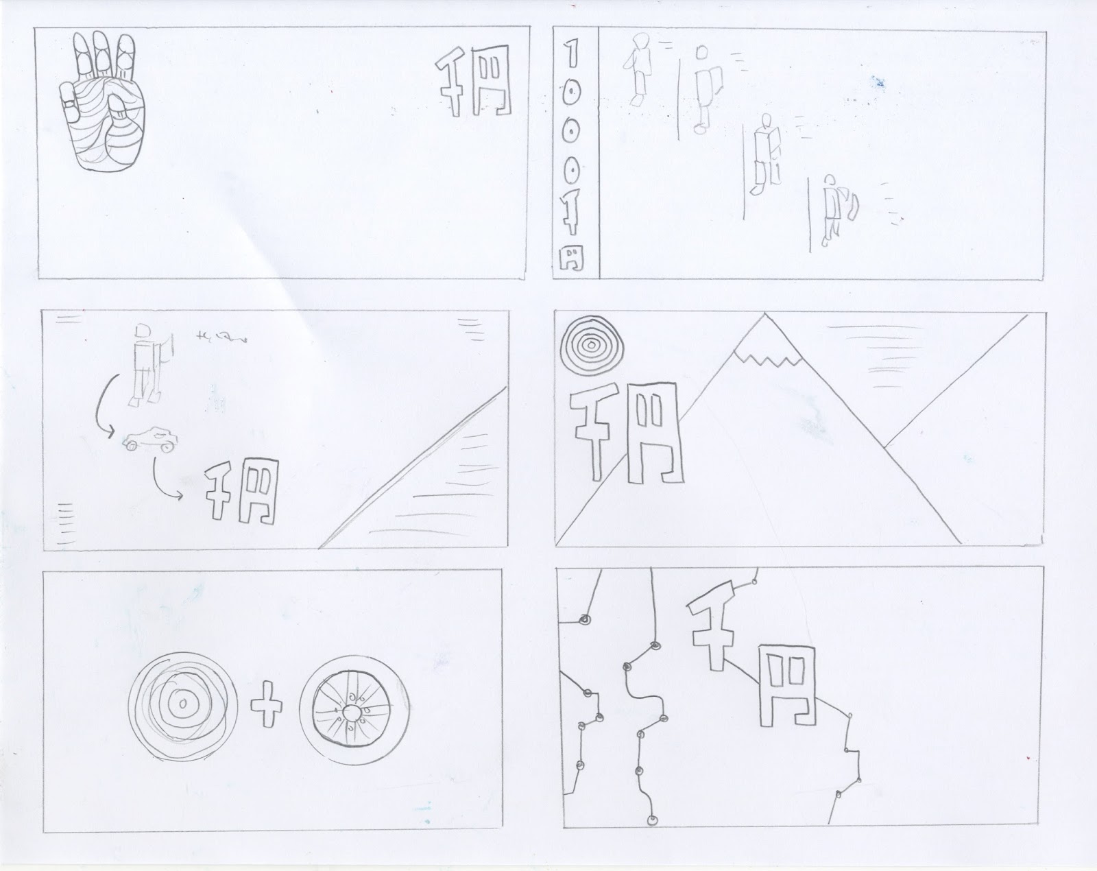
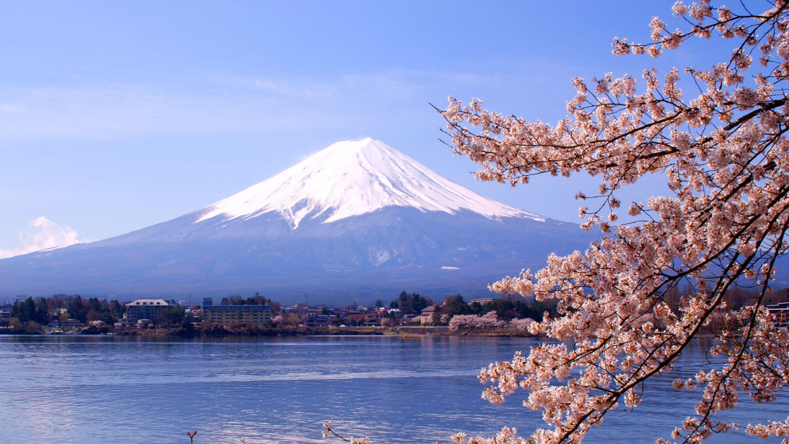
The focus of ideas is mainly on robotics and stereotypical Japanese landscapes such as Mt.Fuji, so a mix of modern and traditional. The first idea is to have a illustration of a robots hand yet have a humans hand print, to communicate that robots in Japan are seen as humans themselves, I think this idea would work well if it remained minimal as it is, with only the denomination and the hand on show. The second idea shows a robot in a manufacturing process to inform people of Japans large robotics industry, I think this idea has the most potential to be educational as it involves both robotics and manufacturing. The third idea involves both robotics and automobiles, I sketched this idea to make it come across as a equation of Japan industries with the outcome being Yen. The next idea is simple with an illustration of Japanese landscapes and the famous Japanese sun, this idea goes down the tractional route but could be made more current with a playful illustrative style. The idea which includes two circles, one is the red Japanese sun and the other a car wheel to represent Japans large automobile industry, again this idea is meant to be a equation of the two objects present on the banknote. The final idea on the page has electrical wiring to show technology, the wiring is intertwined with the Yen symbol to show industry.

The first idea is influenced by the 'I love NY' logo but instead of a heart Ive used a robots head then the text read 'I heart robots'. This is a simple idea yet the logo could be applied to various ideas in development. The design opposite is a close up of Asimo the robot, this idea may come across as advertising for Honda as my peers said in feedback. Once again landscape appears in my ideas but a more simplified illustrative icon version this time, I think this design has resemblances to a post card.
The sketch opposite shows robot hands piecing together the Yen symbol, in another link to industry.Then the two ideas below again showcase Japans landscapes, one showing the rivers then the other Mt.Fuji.
Monday, 11 April 2016
OUGD406
Studio Brief 02
Research
For this research I looked into tractional colours and typography of Japan as these will be big factors of my design and will inform a number of choices. The traditional colours of Japan are a collection of colours traditionally used in Japanese Literature, textiles such as kimono, and other Japanese arts and crafts. Before the research I associated variations of red with Japan due to the flag but later found out yellow, green and blue are just as prominent in Japan. The colours used in Japan are split into series such as the 'violet / red series' but what I needed to take into consideration is that I won't be able to screen print these specific Japanese colours when I print, most likely being limited to a basic red or blue, but it was helpful looking into the tractional colours associated with Japan as a part of my research.
For the typography research I looked into typefaces that are commonly used, looking at various typefaces was key as I believed type would be important part of my design, if one typeface didnt work then I'd have numerous ones to fall back on to use.
AXIS Font
AXIS Font Japanese design broke new ground in the history of Japanese typefaces as a modern sans serif with high visibility and readability characteristics. The typeface includes complementary Western character set designed by Akira Kobayashi. Using both the AXIS and AXIS Japanese font could work really well together as a type based piece of work.

Yu Gothic std
The Yu Gothic Std typeface is from Jiyu Kobo, a Japanese type foundry known for a collection of serif and sans serif designs used in corporate identity, publications and advertising. The Yu Gothic Std design is known for its legibility and readability.

Iwato Mincho Old
The Iwata Mincho Old typeface is a digitized version of the same typeface widely used in the era of letterpress printing. The design is more compact to make the typeface more readable. It’s frequently used for print, newspaper and textbook designs.

OUGD406
Studio Brief 02
Influences
The images below are just a small selection of my influences for the banknote, the influences are mainly Japanese graphic design and in particular type based work. I had numerous influences for the banknote including Japanese cultural imagery like architecture and landscapes but believed they'd be no need in showing these.


OUGD406
Studio Brief 02
Research
I looked more into Japanese graphic design I personally like along with designers work I find inspiring. I found 'From Japan' helpful as it gathers all the best current design from Japan in an informative book, it showcases everything from packaging to editorial so it was useful to see a range of designs that mix traditional and modern.
 Viewing a range of Japanese design in all formats furthered my understanding of how Japanese designers have learnt to mix past, present and future together to create an exciting visual mix, and this showed me ways in which I could do this.
Wang zhi hong
This is a designer I came across online while looking at eastern influenced, he's based in Taiwan but his work resembles the generic Asian graphic style but is heavily influenced by how Japanese graphic design unites traditional and modern aspects of design. I fathered my research into his work to see his work is spread across a number of formats but he mainly focuses on editorial, in particular book cover design. What I gained from his work also is how to combine western and eastern typography together and the basic colour palette he uses to great effect, this was important to take onboard because for my screenprint I'm limited to colours, so to see how a small palette works was helpful.
Nendo
Nendo is a design office founded by Oki Sato. The studio active in a wide range of fields, including interior design, product design, and graphic design. This is mainly the reason I chose to look into the studio because they specialise in a wide range of fields but still have a notably distinct style in all fields, "That’s why we want to reconstitute the everyday by collecting and reshaping them into something that’s easy to understand" this is Nendo's concept, and is notably seen in the work I believe, as everything is simply justified.
Grand Deluxe
Ran by Koji Matsumoto, Grand Deluxe has a illustrative style that I'm drawn to, with playful lines and shapes that catch the eye. Using simple line drawings is a style I like using and is easily achieved when screenprinting. Looking at the work of Grand Deluxe heavily influenced my ideas at this stage and made me think more of simplified responses to the banknote.

Studio Brief 02
Research
I looked more into Japanese graphic design I personally like along with designers work I find inspiring. I found 'From Japan' helpful as it gathers all the best current design from Japan in an informative book, it showcases everything from packaging to editorial so it was useful to see a range of designs that mix traditional and modern.

Wang zhi hong
This is a designer I came across online while looking at eastern influenced, he's based in Taiwan but his work resembles the generic Asian graphic style but is heavily influenced by how Japanese graphic design unites traditional and modern aspects of design. I fathered my research into his work to see his work is spread across a number of formats but he mainly focuses on editorial, in particular book cover design. What I gained from his work also is how to combine western and eastern typography together and the basic colour palette he uses to great effect, this was important to take onboard because for my screenprint I'm limited to colours, so to see how a small palette works was helpful.
Nendo
Nendo is a design office founded by Oki Sato. The studio active in a wide range of fields, including interior design, product design, and graphic design. This is mainly the reason I chose to look into the studio because they specialise in a wide range of fields but still have a notably distinct style in all fields, "That’s why we want to reconstitute the everyday by collecting and reshaping them into something that’s easy to understand" this is Nendo's concept, and is notably seen in the work I believe, as everything is simply justified.
Grand Deluxe
Ran by Koji Matsumoto, Grand Deluxe has a illustrative style that I'm drawn to, with playful lines and shapes that catch the eye. Using simple line drawings is a style I like using and is easily achieved when screenprinting. Looking at the work of Grand Deluxe heavily influenced my ideas at this stage and made me think more of simplified responses to the banknote.

Saturday, 9 April 2016


OUGD406
Studio Brief 02
Feedback
In crit groups we presented our initial concepts for the banknote designs, firstly I introduced the nation I picked and presented some research about the current banknote and the history behind it. I then went onto talk about my possible concepts including the banknote being used a educational tool to inform people about Japans main industries such as automobiles and robotics. On how I could retain the tradtional Japanese style but include modern aspects, when I mentioned including automobiles and robotics, it received positive feedback but one comment was useful as one of my peers mentioned that focusing too much on one robot such as Asimo could be seen as advertising for Honda and not relevant to Japan as a whole, so I took this on board and thought stereotypical illustrations and imagery would work better for automobiles and robotics. In the crit group I mentioned that I wanted to bring certain tractional aspects of Japan into my designs such as landscapes, and I was asked ways in which I could mix traditional with modern Japan, then I had the idea of having origami folded banknotes that fold into cars, relating to Japans large automobile industry.
OUGD406
Studio Brief 02
Research
I think the concept of the banknotes being informed by Japans economy is both educational and bringing the currency into the present. For this research I looked into Japans main sources of income, industries, and which ones could possibly be portrayed on a banknote.
Japan's Income
The economy of Japan is the third largest in the world by nominal GDP, the fourth largest by purchasing power parity and is the world's second largest developed economy. The country has numerous sectors of the economy including fishery, automobile manufacturing, mining, tourism and technology.
Industries
Japan's major export industries include automobiles, consumer electronics, computers, semiconductors, copper, iron and steel. Additional key industries in Japan's economy are petrochemicals, pharmaceuticals, bioindustry, shipbuilding, aerospace, textiles, and processed foods, Japanese manufacturing industry is heavily dependent on imported are materials and fuels. The industries I was most interested in researching more into was automobiles and robotics / electronics as I seen these as possible ways of portraying a futuristic Japan.
Automobiles
The automobile industry is one of the most successful industries in Japan, with large world shares in automobile, electrical machineries, parts, tire and engine manufacturing. Japan is home to six of the top ten largest vehicle manufacturers in the world and global Japanese motor vehicle companies include Honda, Toyota, Suzuki, Lexus, Nissan, Mazda and Mitsubishi. As I learnt in this research the automobile industry in Japan is without doubt the most influential in terms of modern cultural imagery.
Robotics
There are many variations of Japanese robotics. Some different types of robots are: Humanoid Entertainment Robots, Androids, Animal Robots, Social Robots and Guard Robots as this list proves, Japans Robotics industry is more important in Japan than any other country in the world. Japan employs over a quarter of a million industrial robot workers. In the next 15 years, Japan estimates that number to jump to over one million and they expect revenue for robotics to be near $70 billion by 2025. I looked more into Human robots and the most famous robot of all, Asimo who is manufactured by Honda. Introduced on 21 October 2000, ASIMO was designed to be a multi-functional mobile assistant. With aspirations of helping those who lack full mobility, ASIMO is frequently used in demonstrations across the world to encourage the study of science and mathematics, I found this interesting as the robot is used to educate as my money design is aiming to do.
Friday, 1 April 2016
OUGD406
Studio Brief 02
Concept ideas
Following some limited research into Japan, I felt this was the time to consider concepts for the currency then continue to research into what will influence my designs. What I gathered from initial research into Japanese currency is that it is reluctant to look to future of money, banknotes remain the common use of money instead of contactless or even credit / debit cards. Portraits and imagery pay homage to traditional Japanese cultural icons and landscapes instead of looking to the future. The Japanese pride themselves on tradition but as I researched into Japanese graphic design they mix tradition with modernity in design, so the inclusion of modern japan in banknotes was my aim. For concepts I highlighted Japan's main finical incomes to influence the designs, so people are educated on what actually funds the nation.
Thursday, 31 March 2016
OUGD406
Studio Brief 02
Research
I found it necessary to research into the current Japanese Yen design to see its general denominations and the history behind the currency. Firstly the Japanese Yen has been in production since 1870s, the Yen literally meaning "circle" or "round object" and from early research into the Yen I found out that Japan is mainly a cash based society, meaning that most everyday transactions such as credit card, check and as of recently Apple pay aren't commonly used, therefore Japanese take the Yen as part of their life. As with any currency, the Japanese Yen is divided into several different values, which makes the system easy and convenient to use.
Denominations
When I looked into the denominations I wanted to focus on the banknotes rather than the coins as I found them more relevant to my brief.
The One Thousand Yen Banknote


The front design has a portrait of Hideyo Noguchi who was a prominent Japanese bacteriologist and the back design has pictures of famous Japanese landscapes such as Mt. Fuji, Lake Motosu, and cherry blossoms. Like most currency today the colour has a blue overlay and also includes many anti-counterfeiting techniques such as holograms, intaglio printing, watermarking, latent images, and special ink that reacts depending on the lighting and angles seen. The empty center circle actually holds a mirror of Noguchi's portrait if held up to the light. As the lowest denomination of Japanese Yen banknotes, the one-thousand Yen note is the most common and useful to have.
The Five Thousand Yen Banknote


The front has a portrait of Ichiyo Higuchi, who was Japan′s first prominent woman writer of modern times. She wrote relatively little as a result of living a brief life, she died at 24. The back design has a Screen painting of "Kakitsubata Flowers" by Korin Ogata. The main overlay colour of the 5000 Yen banknote is purple. Although of a higher denomination than 1000 and a lower denomination than 10,000, the 5000 Yen note is probably the least commonly seen in Japan.
The Ten Thousand Yen Banknote


The front has a portrait of Yukichi Fukuzawa who was a Japanese author, writer, teacher, translator, entrepreneur and journalist who founded Keio University, the newspaper Jiji shinpo and the Institute for Study of Infectious Diseases. He was an early Japanese civil rights activist and liberal ideologist. His ideas about government and social institutions made a lasting impression on a rapidly changing Japan during the Meiji Era. He is regarded as one of the founders of modern Japan. The back focuses on the Chinese phoenix statue at Byoudou-in Temple in Kyoto. The main overlay colour of the 10,000 Yen banknote is brown. It is the largest denomination of currency available to the public in Japan. Although it is the highest, it is also readily seen and used by all classes as Japan is a cash-based society.
From researching into the Japanese Yen I discovered numerous factors to consider, such as the different colours used in each denomination along with which banknote is used the most. Seeing who each face on the denomination was interesting also but not that useful as at this stage I wasn't considering using the same portraits but maybe the inclusion of the famous landscapes would be more useful.
Saturday, 5 March 2016
OUDG406
Studio Brief 02
Research
At this point I've taken research into the development of banknotes along with the cultural history behind currency so at this stage its appropriate to choose a nation to pick for my proposed banknote. When I first considered which nation to pick, I considered which nation I'm solely interested in, and where i'd like to visit along with the culture. Currently I find Japan inspiring, it boasts a culture that prides itself on harmony, balance and exquisite design. Im interested in how after world war two the country experienced western influences and how eastern and western styles worked together not only in graphic design but also fashion.
A Japanese graphic designer has the problem of retaining national pride while incorporating new ideas from outside Japan. Japan has a strong legacy of design from when western influence first arrived, designers such as Ryuichi Yamashiro, Yusaku Kamekura and Tadanori Yokoo managed to achieve a balance between tradition and modernity which set a benchmark for graphic design and has went on to influence many Japanese designers in this field today. Japanese graphic design today is unique in that it unites traditional and modern aspects of design, the design contradicts itself but this is what makes it so unique. The ancient and modern, simplicity and splendour, eastern and western, handcrafted and mass produced, print and pixel. Past, present and future come together to create an exciting visual mix that I find inspiring. I believe that by redesigning currency for Japan that I have more freedom to experiment and mix styles.
Thursday, 3 March 2016
OUGD406
Studio Brief 02
Research
For this brief my proposed outcome has to be traditionally printed, so that could either be screen print, mono print or letterpress. At this stage I believe the best outcome would be to screen print my design, for its unique visual result it creates, have the choice of printing special inks and being able to print onto various materials / stock. I decided to research into screenprinting more but in particular artists and studios who specialise in this printing method.
French Fourch

French Fourch is a studio along with independent publishing house in Paris. The studio has a main project called 'Bastonnade' which simply means 'beating', the project aims to showcase talent by exhibiting their work, the directors at French Fourch have spent the last year travelling through seven countries collecting 50 exclusive prints to exhibit. This was helpful research as it was good to see other screen prints in exhibition, seen as my final outcome will be exhibited itself as a show.
Heretic

Heretic is a screenprinting and illustration studio based in London. Their work usually involves blending elements of collage and drawing which maybe an option to consider for my designs. I checked the studios website out and was instantly inspired by the combination of lines and experimental drawings they commonly do within the designs.
Jim O'Raw

A print maker, contributor and in-house artist of People of Print, Jim O’Raw has a distinct style of using fluro colours in a CMYK process, Jim’s artwork promises to be original and provides the feel of looking at faded film-developed photos.
OUGD406
Studio Brief 02
Research
I decided to research into currency redesigns to see processes and influences they followed. Not all the redesigns I looked at were actually picked to be used but it was interesting to see some paths designers chose to use as a subject matter for money when normally you'd expect former presidents or monarchy members but some are not what you'd expect.


Melbourne based artist believed that Australian notes were relevant in the past but don't strike a chord with modern Australia. In his own words he said "Money is the foundation and fabric that holds society and civilisation together. If someone's face is stamped on that money, it's a pretty big deal, right? So why don't we know who's on ours?" So he took it upon himself to reimagine the Australian note and firstly came up with a list of 100 famous Australians that had a connection with modern Australia and when researching he realised that not many people actually knew who it was on the notes, not only young people but also old didn't know who the faces on the notes were. This is a big consideration for designs as picking traditional names from notes could prove a step back for money as it'll just be repeating the same thing once again.


This was a competition entry for the redesign of US banknotes by Michael Tyznik. His proposed designs kept the important green colour of the US Dollar but introduces a brightly coloured strip to each denomination to make it easier to tell the difference between each. A subtle change but a change that solves a problem the US dollar currently has,as all denominations are the same, as the colour green is deeply interwoven into the nations culture. The designs rely heavily on type but what I like the most is the small anecdote on the back as it may help the owner of the note know a little bit more about the face on the banknote.

This design is all about seeing money as an educational tool, the dollar design is given a complete overhaul with usual faces of Lincoln and co gone. Purrington the designer wanted to introduce imagery that actually showed systems and not dated iconography. Each of his design has a etch esque feel to it to show scientific systems to educate. I took a lot from researching this redesign as it gave me the idea of maybe looking at a nations main sources of income to determine the designs on the notes, informing people of what funds the nation and what the money is really all about.

Lastly is actually a proposal that was accepted, the brief was to design submit designs for a sea themed Krone. The standout proposal was by Snohetta design who used abstracted language and pixels to depict the Norwegian coast. The pixelated banknotes are an example of how exciting future money can be with the use of subtle design. The notes are to be released in 2017 and will surely be most aesthetically pleasing bank note not only in Scandinavia but the world in my opinion.
OUGD406
Studio Brief 02
Research
For this part of research I looked into the future of money, new ways in which we can pay and is there a future for real money. Contactless payment is becoming more and more popular today with the ease of just waving a fob, card or handheld device over a reader at the point of sale, this is made possible by radio frequency identification and near field communication. Suppliers claim that contactless payment is making transactions twice as fast as no pin or signature is needed, even research shows that consumers are more likely to spend more using contactless payment. When looking into this I considered how this research could benefit me, and came to the conclusion that if contactless payment is to become ever more popular, the use of the note will decrease, so in my designs I need to consider ways in which I could persuade people to still use bank notes, this could be achieved through aesthetically pleasing elements but also making a easy to use note, as contactless payment is proving to be efficient.

Another popular option for the future of money is Apple pay, Apple has removed the wasted moments trying find your wallet or card by having your cards, store cards and reward cards just a touch away. I allows you to have all your cards on one device and the details aren't even stored on the device so its a safer and more private way to pay. Only recently I got a new iPhone and was eager to use Apple pay for quick transactions, its so simple and useful to have. One benefit for me is that it saves pocket space as it serves as a wallet. One current downside of Apple pay though is the limited shops you can use it in but that problem will only last for a certain time I'm sure.

Monday, 29 February 2016
OUGD406
Studio Brief 02
Research
To start my research into this brief, I wanted to delve more into what exactly a banknote is, its history, issues which link to advantages and disadvantages and materials used. Banknotes are a type of negotiable instrument, also known as a note, bill or paper money which were originally used by commercial banks who were legally required to redeem the notes for legal tender.
Paper currency first developed in Tang Dynasty China during the 7th century, although real paper money did not appear until the 11th century. The usage of paper currency later spread throughout the Mongol Empire. European explorers like Marco Polo introduced the concept in Europe during the 13th century. Napoleon issued paper banknotes in the early 1800s. Paper money originated in two forms: drafts, which are receipts for value held on account, and "bills", which were issued with a promise to convert at a later date. When I was researching into the early history of money I found myself less interested in the earliest associations with the note because I was more eager to know about the future of money and less the past, then again it was helpful to learn the origins of a banknote to see it in a different way.

The banknote raises a lot of issues and this is what I'm interested in for research, hightlighting key issues and maybe finding a way to address them through my work. One big issue is that the modern banknote rests the assumption that money is determined by social and legal status, when really a banknote is the reflection of the supply and demand society exchanging goods in a free market, when researching into this issue I was considering ways in which I could solve this solution and found that the economist Nicholas Barbon wrote that money "was an imaginary value made by a law for the convenience of exchange. So looking at it at money as an imaginary object with no real value could be an engaging way behind my banknote design.
Recently I came across an article online titled '€500 bills 'may be used by terrorists', EU warns' I decided to read the article as I knew I had a brief upcoming on money. A summary of the article is that EU is to launch an investigation into the the use €500 bills as concerns grow that high bills are funding drug dealing and the aftermath of the November attacks in Paris the EU will also look at the possibility that high-denomination bills have been used in terrorist financing. This was a brief but useful piece of research as its current but also a consideration to take when designing my note, whether or not to produce high denomination bills.

Counterfeiting bank notes is another issue facing money at this moment but has always occurred. Especially since the introduction of colour photocopiers and computer image scanners, banks and nations have incorporated many ways in which to stop this but as technology improves and becomes more available, counterfeit notes keep appearing such as the famous 'Superdollar'. Cost can be a big issue for money too, bank notes are printed and typically have a high cost of issue especially in larger denominations. Another cost is acceptance, notes have to be checked for security features and confirming acceptability. A possible response for this brief could be to have a note that reduces costs and is efficient.
Most banknotes are made from cotton paper with a weight of 80 to 90 gsm. The cotton is sometimes mixed with linen, abaca, or other textile fibres. Generally, the paper used is different from ordinary paper to make it much more resilient, resists wear and tear. The average life of a banknote is two years, i like this fact as I could see it being an interesting part of a design, almost like a best by date for money. For research I wanted to know the future materials which could possibly be used for money and discovered an article discussing why more countries don't use plastic money. Titled
'Who, What, Why: Why don't more countries use plastic banknotes?' the article goes into the possible advantages of plastic money, in the long run they last longer and don't get dirty as quick, which works to great advantage to countries with high climates and humid air. This could be a consideration for material if I was to pick a nation with high temperatures and humidity. Also the production cost would be dropped as less bills would be produced, and the plastic is recyclable. The problems with plastic money could be you can't fold the money and some less developed countries may be unable to recycle.
Subscribe to:
Posts (Atom)