Studio Brief 02
Initial Ideas
At this stage it was time to sketch some rough ideas to see which ideas had the most potential and which ones I could later develop, most of the ideas are just thumbnails of what the banknote could possibly be like but the key was to include the focus of the idea for example a small robot illustration or landscape imagery.
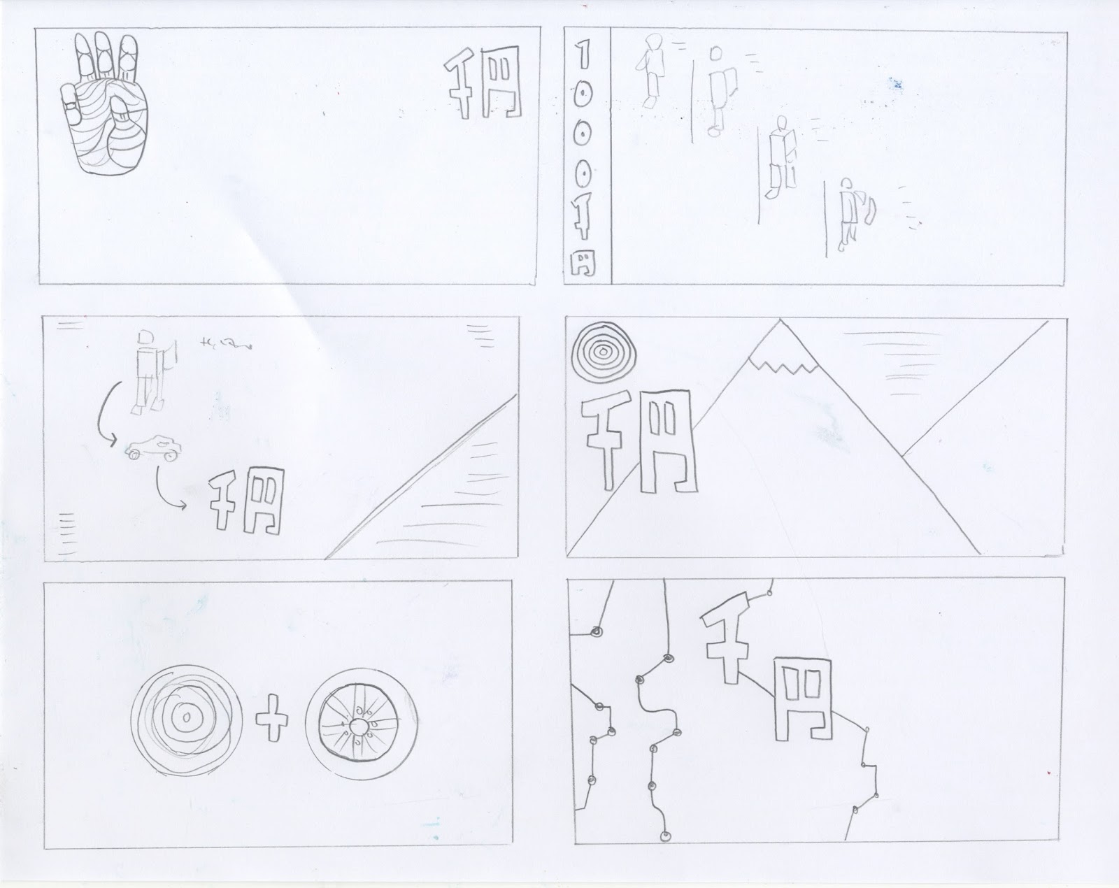
The focus of ideas is mainly on robotics and stereotypical Japanese landscapes such as Mt.Fuji, so a mix of modern and traditional. The first idea is to have a illustration of a robots hand yet have a humans hand print, to communicate that robots in Japan are seen as humans themselves, I think this idea would work well if it remained minimal as it is, with only the denomination and the hand on show. The second idea shows a robot in a manufacturing process to inform people of Japans large robotics industry, I think this idea has the most potential to be educational as it involves both robotics and manufacturing. The third idea involves both robotics and automobiles, I sketched this idea to make it come across as a equation of Japan industries with the outcome being Yen. The next idea is simple with an illustration of Japanese landscapes and the famous Japanese sun, this idea goes down the tractional route but could be made more current with a playful illustrative style. The idea which includes two circles, one is the red Japanese sun and the other a car wheel to represent Japans large automobile industry, again this idea is meant to be a equation of the two objects present on the banknote. The final idea on the page has electrical wiring to show technology, the wiring is intertwined with the Yen symbol to show industry.

The first idea is influenced by the 'I love NY' logo but instead of a heart Ive used a robots head then the text read 'I heart robots'. This is a simple idea yet the logo could be applied to various ideas in development. The design opposite is a close up of Asimo the robot, this idea may come across as advertising for Honda as my peers said in feedback. Once again landscape appears in my ideas but a more simplified illustrative icon version this time, I think this design has resemblances to a post card.
The sketch opposite shows robot hands piecing together the Yen symbol, in another link to industry.Then the two ideas below again showcase Japans landscapes, one showing the rivers then the other Mt.Fuji.
No comments:
Post a Comment