Friday 28 October 2016

OUGD504 - Studio brief 01 - Feedback & Timeplan

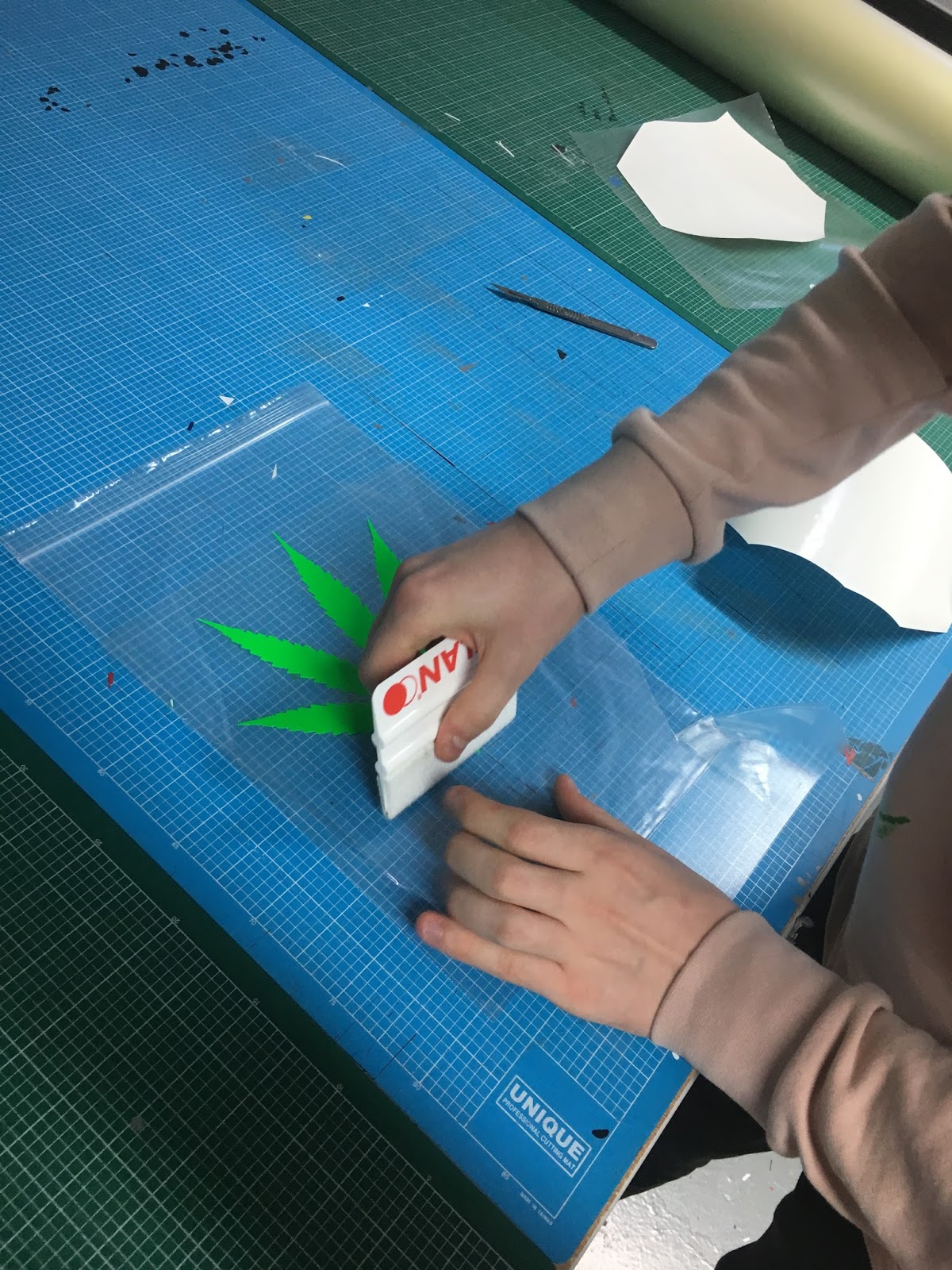
I wanted to gain feedback on the plastic bags I produced so I asked my peers a number of questions to help me make a decision on which one would be most appropriate. The first question I asked was which bag is the most durable, I handed each bag out to let my peers get a feel of each polythene bag. It was evident straight away that the vinyl sticker bag was the most durable because the screen printed versions ink flaked when you crumbled up the bag, unlike the vinyl one which kept its shape.
One peer commented saying would the bag have to be durable as they seen the bag as almost a collectors piece that wouldn't be used everyday. Which bag is more aesthetically pleasing? this was the second question I asked and my peers mainly said that the screen printed bag was more pleasing as the vinyl stickers was too vibrant, the vinyl sticker also doesn't let you see through the symbol unlike the screen printed symbol which has a low opacity, therefore you can view a possible cover. The last question I asked was does the bag achieve its aim of catching your eye and possibly attracting a specific target audience. My peers commented that the bag definitely attracts a 'stoner' audience due to the symbol and enquired what my plans for the cover were, if I was to stylise the cover in a way of attracting 'stoners' too. The cover could be either minimal, to help enhance the bags stature or be similar styled, I believe either way will attract an audience.

At this point in the brief, I need to stick to my timeplan to stay organised. Ive made numerous to do lists in notes on my laptop but also rough notes to keep me on track.


Thursday 27 October 2016

OUGD504 - Studio brief 01 - Final content 

The content chosen for the book will explain why I chose to do this book as well as help give context about what the book is all about. It will start with a quote by John Green the author “Some tourists think Amsterdam is a city of sin, but in truth it is a city of freedom. And in freedom, most people find sin" this quote is to introduce the content in an ambiguous manner but plots the idea of a perceived idea of Amsterdam into the viewers mind. Then the content is introduced with a small paragraph stating my concept, 'Amsterdam in a visual sense to many people symbolises Cannabis and the Red Light District. What I shot in the ‘Venice of the North’ is a far cry from that stereotype'. The book then begins showcasing another side of Amsterdam with imagery, as the book goes on the second part is introduced sectioned 'View' this section demonstrates what people think of Amsterdam, backing up the concept of a misinterpreted Amsterdam. 

A selection of peoples views Ive collected:

"Amsterdam is a relaxed place, both law wise and sit around stoned off your face / looking at weird museum stuff kinda place"

"If you ever decide against a wake and bake, you'll discover a whole lot more culture around the city" 

"Amsterdam is a hub for me. I have only stopped briefly en route to another destination. It's a bit of a mystery to me, I've heard a lot but I'm yet to expierence it first hand"

"What comes to mind is drugs and dance"

"A city of culture, nightlife and full of surprises ;) "


"The first time I planned a trip to AMS, it was purely a boozey, very smokey lads holiday. I was aware of the beautiful city scape and richness of design, but I just wanted to get fucked up on green and shrooms and watch my stupid mates fuck prostitutes"

"A laid back city with a rather quaint smelling atmosphere"

"The one sight I can never erase from my mind of Amsterdam is a neon light cannabis leaf" 


Tuesday 25 October 2016

OUGD504 - Studio brief 01 - Typeface decision

Typography may seem like a design decision that doesn't need that much attention in a photobook but Typography is what gives a book a style and tone of voice, I'll be using type to engage the viewer as much as the images do. I can do this through the cover design as well the content type in the book, therefore considerations about which typefaces to use is crucial to the development of this book. As the concept is all about how Amsterdam is misinterpreted by youth, nothing really informs the typeface in that sense but what the images show is a design orientated city with a rich history in type and architecture but also a clean and contemporary future in design. Below are some pairing experiments I did with typefaces.


After pairing numerous typefaces together, Akzidenz and Doulos are the two that stand out, they work well together with both being able to be used as either title or body copy text, as well as being legible and readable. Akzidenz resembles a modernist type which offers versatility, in contrast Doulos's thick and fine strokes represents a more traditional type for this book.

Sunday 23 October 2016

OUGD504 - Studio brief 01 - Canons & Grids experimentation

In research I looked into canons and one of the canons I looked into was the Van De Graaf, therefore in experimentation I tried out the canon which is prominently used for type. When using the canon you have to resize the images to fit the grid so it doesn't allow much variety for layout unless you are mainly using type, which is a disadvantage to this brief as the final piece will be a photobook. The image below shows the layout I experimented with, the outcome is a modernist style which provides consistency but can only work for portrait images. The second image uses a landscape image, but the end result doesn't create an effective layout, the use of white space doesn't help isolate the image either.


I created a 10 x 10 grid, this grid allows consistency along with more freedom to move images around which suits my landscape imagery for this brief, I also believe this grid helps the text flow better throughout the spread. Below are some examples of the grid in use.


I then went onto creating another grid which is 20 x 20, this grid acts in the same way as the 10 x 10 grid but allows even more manipulation of type and image, I believe this one would be most suitable for type content.


OUGD504 - Studio brief 01 - Vinyl sticker process

The vinyl process started with setting the symbol up in Illustrator ready for vinyl cutter to etch out the symbol, for a 40cm roll of vinyl which was able to fit four symbols onto cost £3.50, so it's a costly process for the book but a very quick process in terms of the vinyl cutting. Once the cutting process was complete I had to individually separate each symbol from the vinyl then use transfer tape to place the symbol onto the polythene bag, placing the symbol center then applying pressure using a squeegee to make it flat on the substrate. Then I simply peeled the transfer tape off the polythene bag and the process was complete, this process went smoothly without any obstacles but has a higher run cost compared to screen printing onto the bag.


Friday 21 October 2016

OUGD504 - Studio brief 01 - Screenprinting process

The cannabis leaf symbol was exposed onto a paper screen in tradtional print ready for the screenprinting process, before I did this process I was unsure whether it would actually work because when I was researching this process, special inks would commonly be mentioned to be used for the ink to stick to the polythene bag. Another worry was if the bag would stretch or slip under the screen and whether or not it would dry properly.

The start up time for traditionally printing in college is relatively short for a small print such as mine so I was able to complete this process in a short time. The process started with placing the screen onto a small bed and lining the symbol up with the kodetrace to enable me to place the polythene bag under the screen. Then I mixed a dark green acrylic ink with binder, at this stage I was debating how much binder to mix with the ink due to printing onto plastic, normally when printing onto paper you'd mix half ink, half binder to help the ink go through the screen. Mike in traditional print advised me to put less binder in with the ink, which may help it dry.


I then started the screenprint process, the first print was encouraging as the ink stuck as well not stretching the bag, as I continued printing onto the bags each one was consistent but with some being faded. The only concern was whether or not it would dry, Mike advised me to possibly turn the bag inside out to print, therefore the ink may dry better.


Once the ink had dried I tested the durability of the bags, the ink is easily removed if you scratch off the symbol and if you crumble the bag the ink eventually comes off. The screenprint does create a aesthetic that is pleasing, it creates an opacity that allows you to see through the symbol.  
OUGD504 - Studio brief 01 - Photo editing

A consideration for this brief is photo editing, to achieve and maintain a consistent style throughout the book, small changes had to be made to my images. When I shot the images in Amsterdam I shot RAW and JPEG so when it came to editing I had the option of editing my images with more control through RAW but I found it simpler to edit the JPEG images, as I simply altered the curves on each image to achieve a consistent image style throughout.


OUGD504 - Studio brief 01 - Bookbinding workshop

Exploring various methods of book binding is crucial to producing a book so for this brief I signed up for the bookbinding workshop to explore a different way of binding. Even though at this point in the brief I've decided on the bind I'll be using already, its useful to explore another option incase the perfect binding goes wrong. In the workshop I made a small pamphlet sewn hardcover book which I made last year but it was helpful refreshing on certain techniques that can be used on other types of binding.


Thursday 20 October 2016

OUGD504 - Studio brief 01 - Initial sketches

With research and some initial ideas down, I decided to sketch some initial visuals of layout to get a rough idea of what the book may look like but also a reference point for constructing the grid in Indesign. The cannabis leaf illustration will be placed central onto the polythene bag, the symbol symbolises the drug culture that looms around Amsterdam and its a great addition to stylise the book in a way that attracts the target audience and has meaning but also makes it aesthetically pleasing.

OUGD504 - Studio brief 01 - Book size idea

Following on from the purchase of the polythene bags, considerations about the size of the book need to be taken. I mocked up three small books which I perfect binded to get a rough idea of shape of the book, the first size was 25cm x 20.5 cm which is the smaller of the two mockups. This size is more square and allows more room between the book and bag at the top but the second size one is closer to A4 so is more flush to the bag. Finally the the last size I experimented with is A4 which fits perfectly with the bag size and makes the bag more compact and durable in my opinion. I asked my peers about their preferred size of the book and a majority said the smaller works better with the bag size but I disagreed as the square layout restricts the layout of my landscape images. Further in the week when I was able to place the mockup book in the bag, I asked for feedback once again and people said the A4 works the best but had concerns whether or not it would fit into bag smoothly if the book was big in page size. I placed roughly 30 A4 sheets into the bag to check if they got caught on the sides of the bag but the sheets slid in perfectly.


Wednesday 19 October 2016

OUGD504 - Studio Brief 01 - Screenprinting onto plastic process idea / Vinyl sticker process idea

In order to achieve the style I'm after, research into how to print onto a plastic bag or applying vinyl is required and the bag used for the book. The way in which I'm going to experiment with printing onto a polythene plastic bag is screenprinting, this process is usually used for rigid or banner materials and the quality of screen printing is not suitable for high resolution graphics that need to be viewed from a short distance, but it is usually fine. Screen printing is a type of UV printing so it requires special inks and UV drying units. In development experimentation of screenprinting onto plastic will take place, as ive research into it I see that it isnt an easy process as the plastic can often slip or the ink will not dry properly.

Another option is to apply a vinyl sticker to the polythene bag, doing this process will be easier not just in producing the book here at the college but also if the book was to be commercially printed.  Applying vinyl to polythene requires special adhesives, high temperatures and a dry application method to ensure a solid bond but this all depends on the thickness of the polythene. The polythene bags i'll be using will be seal bags which are a low density polythene. 


The size of the bags dictate a lot about the size of the book, I purchased 100 12.75 x 9.0 polythene bags that fit A4. 


Tuesday 18 October 2016

OUGD504 - Studio brief 01 - Time plan

At this stage of the brief it is crucial to stick to a time plan in order to reach the deadline without any difficulties. I've booked out a print slot for digital print on the 28th October,which is one week before the deadline and at this stage everything is on course to meet that slot. Later on in the brief, a photography studio will be booked out to capture images of the finished book.


Friday 14 October 2016

OUGD504 - Studio brief 01 - Research / Inspiration & Influences

For visual inspiration for this brief I looked into existing photobooks, page layout design and contemporary graphic design I'm influenced by. I looked at fresh present graphic design because of Dutch graphic design having fresh influences, combined with the openness to new developments.


Kinfolk magazine has a clean and minimal layout to reflect its message of exploring ways for readers to simplify their lives. Ive always admired Kinfolks simplified layout, I like how the images are centralised making them prominent in the spread and makes it easy to view. The type follows a simple grid making the type legible and viable to scroll down.

When I was in Amsterdam I visited the Stedelijk Museum, which is dedicated to modern and contemporary art and design. The museum is packed full of design I admire such as De Stijl but what caught my eye the most was the visual identity of the museum itself, so once I returned home I decided to research more into visual identity of the museum. In 2012 the museum had a radical rebrand, new logo, website design, publications, newsletter, stationery and posters, among other applications, all of this was in anticipation of the reopening of the museum that year. Behind the rebrand was Mevis & Van Deursen who are internationally renowned as one of the most inventive and acclaimed design agencies in the Amsterdam as well as the Netherlands, they created a identity that reflects the aspirations and core values of the museum: open, distinct, fresh and original, in keeping with the Stedelijk's distinguished modernist graphic design heritage which is thanks to pioneering designer Wim Crouwel. The rebrand is fresh and contemporary but has strong links to the Netherlands rich design history, I take inspiration from this because while I was there it was the most striking image of graphic design in Amsterdam, simple contemporary design that is recognisable and cohesive as an identity. Below is some printed material I took away from the museum which acts as inspiration for this brief. 


One influence of mine for this brief is the dutch design studio Experimental Jetset and one of Experimental Jetset's biggest influences is Wim Crouwel, so my influences interlink throughout this brief but what holds the key is modernism that went through the Netherlands in the 70s. Due to this many dutch designers are products of that particular graphic environment, they regard late modernism as a language and It is a language in which they have been brought up. So Experimental Jetset have explored it, expanded it, interpreted it in they're own way to tell stories and express themselves. The studio has often been critiqued for being a pastiche act but continue to create innovative work that they regard as expressing themselves. The studios work inspires me incredibly as its new approach on modernism, that is inspired by they're upbringing in a 1970s Netherlands that was shaped by modernism. 


OUGD504 - Studio Brief 01 - Final Idea

Following some research and feedback, a final idea has been selected for the book. The concept is all about how Amsterdam is misinterpreted by youth, Amsterdam in a visual sense to many people symbolises Cannabis and the red light district but what I shot in the 'Venice of the north' is a far cry from that stereotype. My images show a different side to the capital of Holland, a side that shows a design city and culture beyond the norm associated with the city with many youngsters.

The context of my book will be a mix of a coffee table book and a visual guide of design in Amsterdam, the content will be limited therefore the images will the main focus of the book. The target audience is incredibly important to this book because its aim is to make youngsters aware of Amsterdam's different side, yet showcase design to people who already appreciate and know of design in the city. Engaging a target audience who are oblivious to design may come across hard so the idea is to trick an audience through the identity and style of the book, yet make it subtly pleasing to say a designers eye. In terms of product placement the book will be advertised as a design book on type, promoted on blogs such as Itsnicethat, Grafik, Aisleone and Visuelle. By promoting the book on design blogs, one half of the target audience is reached then on the other hand having the book stylised in such a rashness way associated with drugs, attracts another audience. 

Production is key to the book, in terms of style I've had the idea of placing the book into a large plastic seal bag with a cannabis leaf screen printed or stamped onto it. Having the book stylised like this will fit into the stereotype style I'm aiming to achieve, then for the book itself it will be a clean look book showcasing the images. In terms of size, I'm thinking of making the book roughly 21 cm x 15 cm but sizing will be experimented with in development, as I'll be placing the book into a bag, sizing at this point is varied. Stock for this book will be most likely be GF Smith white stock to help isolate the images on each page but for the cover stock choice, I'm undecided at this point. The book will be a softcover with a perfect bind, soft cover books are mostly bound using perfect binding. It is fairly inexpensive and fast to produce large quantities of perfectly binded books with fairly minimal risk, but what has informed this choice is the target audience, having a book that is easily produced and cheap to produce makes it affordable for youngsters. With a price point of £8, being sold at independent book stores such as Village, Colours may vary and Magma. For this book to succeed it must be placed in the right environment for people to truly appreciate it, a trendy alternative book store such as the ones ive named previously would help the book reach its audience.

In terms of printing the book here at the college, it will be digitally printed using an inkjet printer. Then the plastic cover bag will either be screen printed or stamped, experimentation will take place in  development but I've already held initial talks with Mike in the traditional print room about the possibility of printing onto a thin layer of plastic and its possible. If I was to print this book commercially I don't  believe I'd change the production method because its economical for short run publications such as photo books or small runs of books, I would find an alternative way of printing onto plastic for commercial printing though as screen printing would prove to be a timely production method.

Feedback

I presented my final idea to my peers to receive feedback, the one question I was most concerned about was how to appeal more to the youngster target audience. I explained how i'll stylise the book in a way which will appeal to youngsters, which my peers liked as they believe they'd be intrigued by the stylisation. People agreed that placing a drug related image onto the book would draw in an audience who instantly associate this with Amsterdam so it was a clever way of targeting an audience.

Wednesday 12 October 2016

OUGD504 - Studio brief 01 - Research

Last year we touched upon page canons of construction but for this brief I need to fully consider the construction of each in this book. Canons are systems and when applied in graphic design, it is about the organisation of type and image on a page. Canons allow you to easily construct a book and offer consistency throughout the production. During a lecture for this brief, we looked into Jan Tschichold's laws on producing a book and how he believed certain ratios are perfect for book production. So for this part of research I look into famous canons / ratios, and why Tschichold believes they are the best.

Van Der Graaf Canon


The Van de Graaf canon also known as the "secret canon". The canon works for any page width:height ratio and enables designers to position text body in a specific area of a page. Using the canon, the proportions are maintained while creating pleasing and functional margins of size 1/9 and 2/9 of the page size. This method was discovered by Van de Graaf, and used and popularised by  Tschichold and other contemporary designers. The page proportions vary, but most commonly used is the 2:3 proportion which Tschichold thinks works the best. In this canon the text area and page size are of same proportions, and the height of the text area equals the page width. One problem of this canon is that it is based around type and not image which may cause a problem for the margins. 

Golden Canon


Tschichold's "golden canon of page construction" is based on simple ratios, its the equivalent of Rosarivo's typographical divine proportion. Rosarivo's work established the the harmonic relationships between the diverse parts of a piece of work, Tschihold interprets Rosarivo's work by  relying on the 2:3 page ratio to give a type area height equal to page width as demonstrated by the circle above.

Tuesday 11 October 2016

OUGD504 - Studio brief 01 - Research

Binding is another production consideration for this brief, the binding selection is crucial to a book, it affects the books aesthetic but most importantly how it functions. For this research I have looked at possible binding techniques for my book.

Coptic stitch binding

A coptic stich is the one of most traditional types of stitch, book that is bound by coptic stitch is done by sewing through each signature and fold, then attached to the preceding signature. A benefit of the stitch is it can lie flat when opened unlike other stitches like a saddle stitch.


Saddle stitch binding 

Saddle stitching ( a fancy way of saying stapling ) is very popular in the printing industry, folded sheets are gathered together one inside the other and then stapled through the fold line with wire staples.  The staples pass through the folded crease from the outside and are clinched between the center pages.  Two staples are commonly used but larger books may require more staples along the spine. It has a number of benefits including,  it is the least expensive binding method, the turn around time is generally quite fast, it can be used for very short production run for example 150 books. Common problems are if the book has too many pages it can be hard to fold it properly and because it is folded sheets, the page count must be in multiples of four. 


Perfect bind

Paperback or soft cover books are mostly bound using perfect binding. It can be far from perfect if a strong glue isn't used to bind the paper, they consist of various sections with a cover made from heavier paper, glued together at the spine with glue, also it is fairly inexpensive and fast to produce large quantities of books with fairly minimal risk. Perfect bound magazines have a flat spine which a title can be printed but the process is slower and more expensive than saddle stitching.


OUGD504 - Studio brief 01 - Research

A necessary path for research in this brief is to look at print finishes, a print finish can  increase the quality and aesthetic of work. However, overusing or selecting a print finish that has no relevance or adds additional quality to the design is pointless. 

Varnish 

A varnish is often associated with wood but can also be applied to paper stock. This finish achieves a smooth and consistent texture when applied to stock, as well as preserving it better as it seals the paper. Most commonly used in high quality books and magazines, the finish can either be glossy or matte. The varnish adds a layer of protection without making the stock too heavy making it suitable for magazines. 


Foil stamping

Foil stamping is the use of metallic material applied to a print surface using heat and pressure. It adds a reflective aesthetic and a more luxurious feel to the work. Foil stamped areas of work draw the viewers eye, I believe this is the designers desire when applying metallic foil. Below is an image of 'Icons of mens style' the title on the cover is foiled by the designer to prompt a rich style that reflects mens high fashion.


Embossing

Embossing is the finish of raising parts of a page for a desired texture, it adds depth which highlights shadows and a dimension in a design. Embossing works well with foil stamping as it brings out the most in both finishes. 


Letterpress

Letterpress is one of the oldest printing techniques, also known as debossing. A letterpress is used to depress or indent certain portions of the page, it can also be used to apply ink to a page. It is most commonly used for logos on pieces of design. 


OUGD504 - Studio brief 01 - Research

For research I want to look at printing processes used in commercial graphic design, to see the impacts and issues of each process as it will further my knowledge of the techniques but also help me consider each one for this brief. 

The first process I looked into was Offset Lithography, in offset an aluminium plate with a image of the content is used, then inked and placed onto the printing surface. The process can be used to print on paper, cardboard, plastic or other materials, but these have to have a flat surface. Today it is the most commonly used printing technique for a range of products such as books, newspapers and posters. It is extremely flexible with a short set up time and cost effective for most jobs but a higher set up cost than digital.


The second was Digital printing which can be done two ways, Inkjet and Xerography. I decided to focus on Inkjet as its available here at the college. An inkjet printer prints the image that needs to be printed by creating small droplets of ink that are from one or more print heads. Inkjet devices can print on a wide range of materials such as paper, plastic and canvas. Inkjet printing is used a lot for posters and signage. It is also economical for short run publications such as photo books or small runs of books.

In the commercial world of printing, digital printing is increasingly used for print jobs that were previously printing using offset, flexo or screen printing. In short run small sizes such as A3 and A4 are now printed using digital printing, digital is taking over from offset for both colour and black and white printing. This is mainly down to print shops and studios offering print on demand digitally printed to publishers etc. 

Another process I looked at was screen printing as its available at the college too, this  technique relies on a screen, which is a piece of fabric. Certain areas of this mesh are coated with a non-permeable material. In the remaining open spaces ink can be pushed through the mesh onto a substrate. The advantage of screen printing is that the surface of the recipient does not have to be flat and that the ink can added to a wide range of materials, such as paper, textiles, glass, ceramics, wood, and metal. Another advantages are that its a non impact process and versatile but one common disadvantage is being unable to print small type size. Similar to Offset, screen printing is being replaced by Digital but with digital you can't achieve a certain style that'd you'd only achieve with screen printing, plus you can print onto numerous type of materials. 


After some initial research into printing processes, I wanted to know the best way to determine a print job, which process would be best suited for this brief if I was to commercially print it. I started with the run length of a job, digital printing is the most available and cheap option because other processes such as offset have a bigger start up cost, which makes it a larger job. The run length of a job links to a possible deadline in commercial print, digital is good for when you need something urgently becuase it has a small start up time. On the other hand larger web presses have integrated folding and cutting machines that makes it more efficient, unlike digital printers. Each process has a price, some processes are expensive which makes them only viable for big jobs but digital print can offer a large print job at a small cost.