OUGD504 - Studio brief 01 - Typeface decision
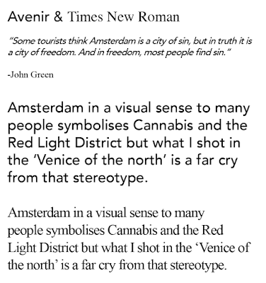
Typography may seem like a design decision that doesn't need that much attention in a photobook but Typography is what gives a book a style and tone of voice, I'll be using type to engage the viewer as much as the images do. I can do this through the cover design as well the content type in the book, therefore considerations about which typefaces to use is crucial to the development of this book. As the concept is all about how Amsterdam is misinterpreted by youth, nothing really informs the typeface in that sense but what the images show is a design orientated city with a rich history in type and architecture but also a clean and contemporary future in design. Below are some pairing experiments I did with typefaces.
After pairing numerous typefaces together, Akzidenz and Doulos are the two that stand out, they work well together with both being able to be used as either title or body copy text, as well as being legible and readable. Akzidenz resembles a modernist type which offers versatility, in contrast Doulos's thick and fine strokes represents a more traditional type for this book.


No comments:
Post a Comment