OUGD503 - Studio brief 01 - Penguin student design award briefs
The brief has three categories, adult fiction, adult non fiction and children book cover. It is my decision to pick one then continue my research into penguin, the book title, book cover design and other research paths relating to the brief. The book titles to choose include To Kill A Mockingbird by Harper Lee, In Cold Blood: A True Account of a Multiple Murder and Its Consequences by Truman Capote and The Secret Diary of Adrian Mole Aged 13¾ by Sue Townsend. I believe the best and most efficient way of selecting a title is to read all the synopsises of the books, then choose one judging from the short passages. By doing this it'll skip past the process of researching all the books thoroughly, for me to only select one in the end.
To Kill A Mockingbird
In To Kill a Mockingbird, author Harper Lee uses memorable characters to explore civil rights and racism in the segregated Southern United States of the 1930s. Told through the eyes of Scout Finch, you learn about her father Atticus Finch, an attorney who hopelessly strives to prove the innocence of a black man unjustly accused of rape; and about Boo Radley, a mysterious neighbor who saves Scout and her brother Jem from being killed.
In Cold Blood: A True Account of a Multiple Murder and Its Consequences
On November 15, 1959, in the small town of Holcomb, Kansas, four members of the Clutter family were savagely murdered by blasts from a shotgun held a few inches from their faces. There was no apparent motive for the crime, and there were almost no clues. As Truman Capote reconstructs the murder and the investigation that led to the capture, trial, and execution of the killers, he generates both mesmerising suspense and astonishing empathy. In Cold Blood is a work that transcends its moment, yielding poignant insights into the nature of American violence.
The Secret Diary of Adrian Mole, Aged 13¾
The Secret Diary of Adrian Mole, Aged 13¾ is the first book in the Adrian Mole series of comedic fiction, written by Sue Townsend. The book is written in a diary style, and focuses on the worries and regrets of a teenager who believes himself to be an intellectual.
From reading the short synopsises I gained a brief insight into each title, learning themes, motifs and symbols that may inform the design of the book cover. One title that stood out was To Kill A Mockingbird by Harper Lee, the theme of good and evil coexisting and social inequality are something I'd be interested portraying in a book cover. Further research will continue to inform the design but at this stage To Kill A Mockingbird is the most appealing title to design for.
Thursday, 3 November 2016
OUGD503 - Studio brief 01 - Penguin Student Design Award
The aim of this brief is to nurture and encourage anyone who is interested in following a career in design, which includes but is not exclusive to students on design courses. I can submit a design for either adult fiction, adult non fiction or a children's book but before I select a book I need to research Penguin to gain a scope into the famous book publishing house.
Penguin Books is a British publishing house, founded in 1935 by Sir Allen Lane. Penguin revolutionised publishing in the 1930s through its inexpensive paperbacks, sold through Woolworths and other high street stores for sixpence. Penguin's success demonstrated that large audiences existed for serious books, Penguin also had a significant impact on public debate in Britain, through its books on politics, the arts, and science. They seek out and champion diverse author voices and bring their stories to readers everywhere, readers tastes are constantly changing so they have to engage with information in new and exciting ways. They aim to lead the field, creating formats that bring ideas and stories to life in compelling and contemporary ways. From traditional printed books, ebooks and audio books to interactive apps, blockbuster films, TV shows, radio, theatre productions, live events and social media.Penguin is the place where people who love books, ideas and writing can do the best work of their lives. Creativity drives everything they do.
The Penguin timeline:
1915: The first Ladybird children's books published. Their low price and distinctive design are key selling points.
1935: Allen Lane publishes the first Penguin books, realising his vision to make quality books available to all at low prices. The books cost sixpence (the same as a packet of cigarettes) and are colour-coded: orange for fiction, blue for biography and green for crime. The first batch includes books by Ernest Hemingway and Agatha Christie.
1936: By March 1936 - 10 months after the company’s launch on 30 July 1935 - 1 million Penguin books have been printed.
1937: Allen Lane launches a non-fiction imprint after overhearing someone at a King’s Cross station bookstall mistakenly ask for “one of those Pelican books”. The first Pelican book is George Bernard Shaw’s The Intelligent Woman’s Guide to Socialism, Capitalism, Sovietism and Fascism.
1940: The first four Puffin Picture Books are published with the aim of helping evacuated city children adjust to life in the country. Titles such as War on Land are such a success that they are quickly followed by fiction. One title is Worzel Gummidge, which, like many of Puffin’s books, go on to become a popular TV programme.
1942:Penguin sets up the Armed Forces Book Club, to bring entertainment and comfort to soldiers cut off from friends and family.
1946: Launch of Penguin Classics with Homer’s The Odyssey, translated by E.V. Rieu, who becomes the first editor of the Penguin Classics list.
1959–60: Penguin Books faces trial under the Obscene Publications Act for publishing D.H. Lawrence’s Lady Chatterley’s Lover.
1964: Roald Dahl’s Charlie and the Chocolate Factory is published.
1969: Eric Carle’s The Very Hungry Caterpillar is published; a copy has been sold somewhere in the world every 30 seconds ever since.
1985: Penguin publishes Allen Carr’s The Easy Way to Stop Smoking, which becomes number 1 in the non-fiction book charts in nine countries and remains the highest-selling book on quitting smoking worldwide.
1995: Penguin launches its first website (www.penguin.co.uk) and brings out Penguin 60s to celebrate the company’s 60th anniversary.
2008: Penguin publishes its first-ever ebooks. Titles include A Room of One’s Own, King Lear and Utopia.
2009 : Kathryn Stockett’s The Help is published and goes on to sell over 7 million copies.
2010: Jamie Oliver’s 30 Minute Meals becomes the fastest selling non-fiction book ever in the UK.
2012: Penguin Ventures launches a new animated series of Peter Rabbit, which sells into 15 territories globally.
From researching into Penguin I gained a number of key words and ethos of the publishing house, such as inexpensive paperbacks, books on politics, the arts, and science, diverse author voices, bringing their stories to readers everywhere and bringing stories to life in compelling and contemporary ways and creativity drives everything. These ethos have left an impression on me that Penguin are the past, present and future of book publishing, their innovative ways have meant that people continually read their books today and will continue to do so.
Whilst browsing Itsnicethat I came across an article that is relevant to this brief I believe, Penguin recently reissued Richard Dawkins books with unique covers which illustrate evolutionary variation.
Three of Dawkins ethologist and anthropologist seminal works are wrapped in one of thousands of unique jacket covers, in support of an online interactive creative project designed to explain the topic of genetic variation and “witness evolution in action.” The simple, bold designs communicate the singularity of genetic selection, with each and every copy of the three books in question carrying a unique variation of its respective motif, The Blind Watchmaker will carry unique “biomorph” insect wireframes; Climbing Mount Improbable features shell designs; Unweaving the Rainbow bears the design of light wavelengths, varied in pattern presented in their appropriate corresponding colours.
Lead creative technologist at Penguin Mathieu Triay has intentions to engage audiences, using the covers as both a clever marketing tool and as “an interactive entry point to Dawkins books to entertain and inform a new generation of readers, gamers, designers and curious minds,” tying together the ideas expressed in the books by offering a visual and practical tool towards understanding the complex processes of evolution tackled throughout Dawkins’ prolific career.
Reading through the article was profound evidence that Penguin engage with information in new and exciting ways as I found out in previous research, when looking at the covers of Dawkins three books I imagined an interactive book cover design that communicates numerous messages. This also opened my eyes to the possibilities of this brief, Penguin are looking for innovative ideas that are aiming to lead the way in book publishing and change the way people look at books.


OUGD503 - Studio brief 01 - Smaller/quicker brief
As a part of the brief I have to select a smaller brief such as Secret 7, Penguin book cover design or Feathr. These briefs will help me demonstrate my ability to develop effective responses within professionally realistic deadlines. Early on in the brief I've highlighted Penguin book cover design award as one smaller brief I'd like to undertake, the Penguin Random House Student Design Award is an opportunity for students interested in pursuing a career in design to experience real cover design briefs first-hand.
Important details and dates about the brief:
1. Deadline for entries
Entries will be accepted through the website between 00:01 (GMT) on Wednesday, 18 January 2017 and 12:00 (GMT) on Tuesday, 7 March 2017.
2. Eligibility
To be eligible for the 2017 competition, you must be a student on a Further Education or Higher Education course (part time or full time) in any subject and at any level. Entrants must be aged 18 or over by 1 July 2017. The competition is open to amateur designers not currently or previously employed in the graphic design field.
Entrants must be eligible to work in the UK. We regret that Penguin Random House UK is unable to provide a certificate of sponsorship should a work visa be required in order to take up the first prize work placement.
Advise entrants that ideally they should have a reasonable standard of English so that, if they win the first prize, they are able to get the most out of their work placement.
There can be only one named entrant per entry.
3. Designs
Entrants may submit one design into each of the following categories: (i) the Adult Fiction Cover Award; (ii) the Adult Non-Fiction Cover Award; (iii) the Children’s Cover Award. You may not submit more than one design for each category.
4. Submissions
All entries must be supplied digitally via the link which will be available on this site from Wednesday, 18 January 2017. Entries submitted in any other way, including by email or hard copy, will not be accepted.
Entries must be supplied as a high-resolution PDF, 300 dpi, CMYK.
OUGD503 - Studio brief 01 - Intro / Live competition
For responsive I need to identify and respond to a range of competition briefs that reflect my emerging creative interests and professional ambitions within Graphic Design. I will need to select one main brief that will become the focus of the taught sessions and studio workshops for the duration of the first part of this module.
In addition to this I will need to select a number of smaller/quicker briefs that will allow me to demonstrate my ability to develop effective responses within professionally realistic deadlines
When selecting and responding to briefs I will need to consider the following:- How do I balance what I want to do, design or produce with what the brief requires?
- Do the briefs offer enough breadth and scope for the development of a range of responses whilst at the same time allowing me to focus your practice?
- What are the realistic timescales for completing the brief? Am I working to these?
- Have I clearly identified what the problem is before I start?
- Where is the challenge in the brief and what will I get out of doing it?
- What do you need to present and how will I present it?
Tuesday, 1 November 2016
OUGD504 - Studio brief 01 - Test prints & Cutting process
The book was printed using the digital inkjet at college, the first test print didn't go to plan as I trimmed the stock using a stanley knife and ruler, I made a few minor mistakes that resulted in the book being out of alignment which wouldn't allow perfect binding, this was because I rushed this process which resulted in the first test print being poor. What I did get from this test print was seeing how the layout looked once printed, and how block black ink would work on the stock. If I was to commercially print this, I would be able to use white ink instead of printing block black ink onto stock, and possibly using double sided colour paper. I was happy with the layout at this point but just needed to perfect the trimming for next time around to enable the binding process to begin.


The book was printed using the digital inkjet at college, the first test print didn't go to plan as I trimmed the stock using a stanley knife and ruler, I made a few minor mistakes that resulted in the book being out of alignment which wouldn't allow perfect binding, this was because I rushed this process which resulted in the first test print being poor. What I did get from this test print was seeing how the layout looked once printed, and how block black ink would work on the stock. If I was to commercially print this, I would be able to use white ink instead of printing block black ink onto stock, and possibly using double sided colour paper. I was happy with the layout at this point but just needed to perfect the trimming for next time around to enable the binding process to begin.

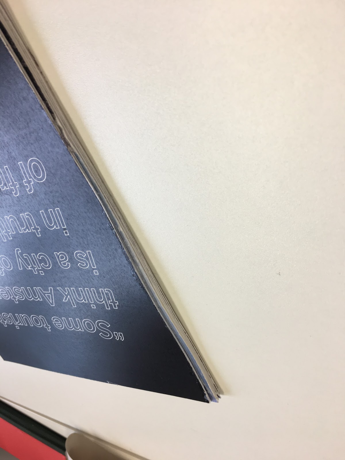
For the second test print I decided to use the power guillotine to stop the possibility of cutting uneven pages like the previous print. Before this I'd never used this piece of equipment so I had Mike in traditional print introduce me to the guillotine which would be close to what is used in commercial print. The process started well with all the pages being aligned unlike the last print, not until I removed the pages from the guillotine I realised the pages were in the wrong order, some being upside down which resulted the guillotine cutting off the page numbers or the page titling. If I was to cut the spreads in the commercial world, large printers often cut and fold the work in one, so this problem wouldn't occur.


At this stage of the project I didn't want to repeat this process for it to only happen again so I printed the spreads again and carefully placed them into the power guillotine, measuring each side precisely and placing them in order to prevent this problem happening again. For the third time of cutting the spreads it went well, not perfect but the best that could be achieved with the resources here at the college, if I was to print commercially it would most likely come out perfect.
OUGD504 - Studio brief 01 - Stock choice
Stock consideration is crucial to a book for many reasons, it can enhance the aesthetic, add durability as well as versatility. My book will be 40 pages so a lower gsm is needed to allow the pages to flow better. At first I looked into G.F Smith specialist papers but I realised I didn't need an expensive stock that would be no different to something that is offered at the college. For the main pages I chose a 120 gsm white matte stock, this stock is a clean white paper which can help highlight the images more. 120 gsm weight is commonly used for books too so this informed the decision. For the cover I chose the same stock but in 200 gsm, the white cover will allow the cover design to be more prominent in the polythene bag, the higher gsm serves as the softcover for the book.
Stock consideration is crucial to a book for many reasons, it can enhance the aesthetic, add durability as well as versatility. My book will be 40 pages so a lower gsm is needed to allow the pages to flow better. At first I looked into G.F Smith specialist papers but I realised I didn't need an expensive stock that would be no different to something that is offered at the college. For the main pages I chose a 120 gsm white matte stock, this stock is a clean white paper which can help highlight the images more. 120 gsm weight is commonly used for books too so this informed the decision. For the cover I chose the same stock but in 200 gsm, the white cover will allow the cover design to be more prominent in the polythene bag, the higher gsm serves as the softcover for the book.
OUGD504 - Studio brief 01 - Layout development
After experimenting with canons and grids a final decision was made on which one to use for the book. The custom 20 x 20 grid was used as it allows the most control over type and image but still keeping consistency, the reason I didn't choose the other canons was mainly down to them being focused solely on type.

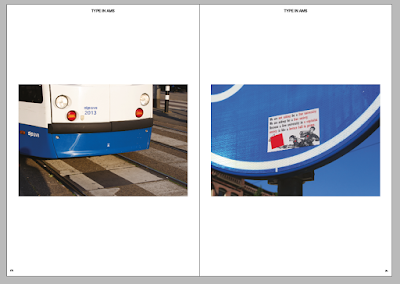
For image layout in the book I created five possible layout for the images that allows consistency but doesn't make it boring for the viewer of the book, as sometimes book layout spreads can be too similar which causes less engagement. The layout has been influenced by Kinfolks simple layout which works well with my landscape imagery. Below are examples of the image layout.


When setting up the layout for type I had to consider consistency with the image layout and how the two can work together. I wanted set the type to be simple yet bold, inspired by Kinfolk type layout as well as Experimental Jetset's contemporary modernism. The type is aesthetically very pleasing as well as being bold due to italic setting being applied, I applied italic because of its current use in contempoary graphic design, the italic type also allows the type to flow better as its 61pt and 32pt, the use of large type in books is unusual so to make this work I had to personalise the type and make it consistent throughout the book. The layout is both aesthetically chosen and informed, the 'AMS' in both sans and sans serif typeface is a informed choice that shows the variation of type in Amsterdam, from the rich serif typefaces to the modernist typography. The 'AMS' also is also chosen for its aesthetic value as its a contemporary style I'm drawn to in current graphic design. The page numbers and titling sticks to a modernist layout with the numbers being aligned flush to side of the page and the titling centre aligned at the top. When an image is full bleed the titling and page numbers are removed to not distract from the image


Feedback
I wanted to gain some feedback on my layout design so I asked my peers in a crit what they liked and disliked about the layout. My peers liked the bold type and said it didn't look out of place due to the large size of the book, as it looked like a publication, once I explained the informative decision behind most of the type they understood more why I chose to set the type larger. I wanted to know if they found the layout tedious or engaging, I used five different image layouts to make it consistent and engaging for the viewer. The feedback was positive as they looked through the book with ease and felt the type pages broke up the book nicely.
After experimenting with canons and grids a final decision was made on which one to use for the book. The custom 20 x 20 grid was used as it allows the most control over type and image but still keeping consistency, the reason I didn't choose the other canons was mainly down to them being focused solely on type.

For image layout in the book I created five possible layout for the images that allows consistency but doesn't make it boring for the viewer of the book, as sometimes book layout spreads can be too similar which causes less engagement. The layout has been influenced by Kinfolks simple layout which works well with my landscape imagery. Below are examples of the image layout.


When setting up the layout for type I had to consider consistency with the image layout and how the two can work together. I wanted set the type to be simple yet bold, inspired by Kinfolk type layout as well as Experimental Jetset's contemporary modernism. The type is aesthetically very pleasing as well as being bold due to italic setting being applied, I applied italic because of its current use in contempoary graphic design, the italic type also allows the type to flow better as its 61pt and 32pt, the use of large type in books is unusual so to make this work I had to personalise the type and make it consistent throughout the book. The layout is both aesthetically chosen and informed, the 'AMS' in both sans and sans serif typeface is a informed choice that shows the variation of type in Amsterdam, from the rich serif typefaces to the modernist typography. The 'AMS' also is also chosen for its aesthetic value as its a contemporary style I'm drawn to in current graphic design. The page numbers and titling sticks to a modernist layout with the numbers being aligned flush to side of the page and the titling centre aligned at the top. When an image is full bleed the titling and page numbers are removed to not distract from the image


Feedback
I wanted to gain some feedback on my layout design so I asked my peers in a crit what they liked and disliked about the layout. My peers liked the bold type and said it didn't look out of place due to the large size of the book, as it looked like a publication, once I explained the informative decision behind most of the type they understood more why I chose to set the type larger. I wanted to know if they found the layout tedious or engaging, I used five different image layouts to make it consistent and engaging for the viewer. The feedback was positive as they looked through the book with ease and felt the type pages broke up the book nicely.
Subscribe to:
Posts (Atom)