After experimenting with canons and grids a final decision was made on which one to use for the book. The custom 20 x 20 grid was used as it allows the most control over type and image but still keeping consistency, the reason I didn't choose the other canons was mainly down to them being focused solely on type.
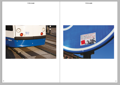
For image layout in the book I created five possible layout for the images that allows consistency but doesn't make it boring for the viewer of the book, as sometimes book layout spreads can be too similar which causes less engagement. The layout has been influenced by Kinfolks simple layout which works well with my landscape imagery. Below are examples of the image layout.
When setting up the layout for type I had to consider consistency with the image layout and how the two can work together. I wanted set the type to be simple yet bold, inspired by Kinfolk type layout as well as Experimental Jetset's contemporary modernism. The type is aesthetically very pleasing as well as being bold due to italic setting being applied, I applied italic because of its current use in contempoary graphic design, the italic type also allows the type to flow better as its 61pt and 32pt, the use of large type in books is unusual so to make this work I had to personalise the type and make it consistent throughout the book. The layout is both aesthetically chosen and informed, the 'AMS' in both sans and sans serif typeface is a informed choice that shows the variation of type in Amsterdam, from the rich serif typefaces to the modernist typography. The 'AMS' also is also chosen for its aesthetic value as its a contemporary style I'm drawn to in current graphic design. The page numbers and titling sticks to a modernist layout with the numbers being aligned flush to side of the page and the titling centre aligned at the top. When an image is full bleed the titling and page numbers are removed to not distract from the image
Feedback
I wanted to gain some feedback on my layout design so I asked my peers in a crit what they liked and disliked about the layout. My peers liked the bold type and said it didn't look out of place due to the large size of the book, as it looked like a publication, once I explained the informative decision behind most of the type they understood more why I chose to set the type larger. I wanted to know if they found the layout tedious or engaging, I used five different image layouts to make it consistent and engaging for the viewer. The feedback was positive as they looked through the book with ease and felt the type pages broke up the book nicely.


No comments:
Post a Comment