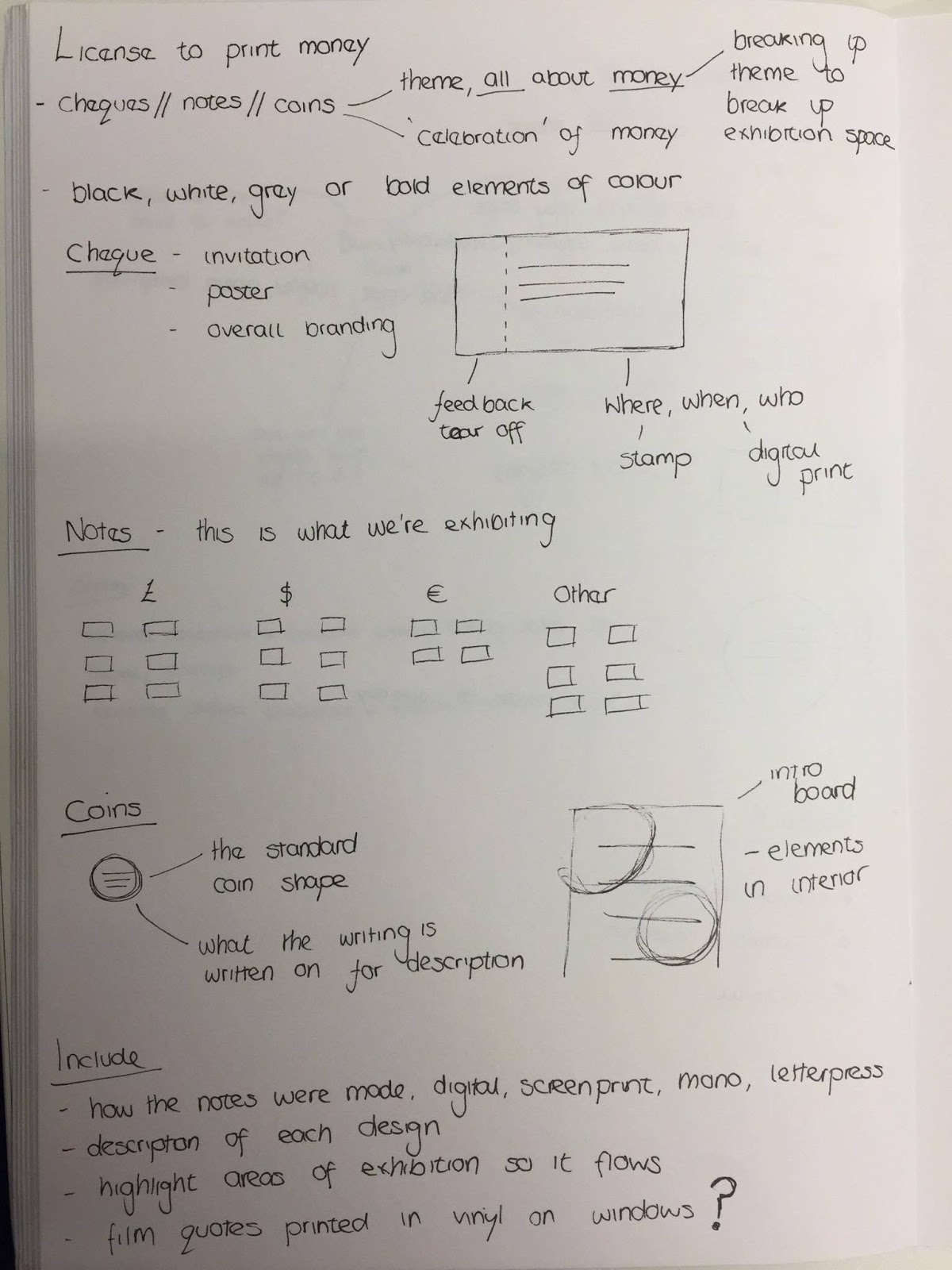
Wednesday, 27 April 2016

OUGD406
Studio Brief 03

I produced the video in After effects and with my prior knowledge and understanding of After effects it went smoothly,coming up with descriptive words for the video towards the end became harder, I found myself scrolling through a dictionary for more words to describe money.


OUGD406
Studio Brief 03

At this stage everyone in the group started producing work relating to their roles. The first stage I took for producing the video was looking at other videos that inspired my idea for the video. My  initial aim for the video was to have fast paced type provoking a response about money then have imagery relating to wall street and money behind it.


Above is screenshots from Madebyalphabets showreel which in drawn inspiration from, the bold use of colour and type is playful and keep you engaged throughout the video. The words used by Alphabet represent what they are, which is similar to what the words used in the video representing  money. Alphabets video communicates the studio in a good light, showing how diverse they are, I was hoping to achieve this for the exhibition video.


The latest Paypal advert inspired me because it asks the question of what money is but also relates to studio brief 02 about the future of money. The video is fast paced like the Alphabet video, this is key to keeping the viewer engaged.


I collected videos of wall street imagery, using films such as the wolf of wall street, wall street, american psycho and the big short. I closely watched each one making notes at the time of individual clips I could use, so I'd know when to cut the video in editing. I started making notes about the potential words to use in the video, I knew I'd need hundreds of words for this video to be effective as the frame rate had to be certain speed for it to work in a fast pace.
OUGD406
Studio Brief 03

Once we returned from Easter, the groups workflow from other briefs effected this one but this wasn't considered a failure I believe, because the work may have been disjointed if we proceeded with it over the easter break. We refined our concept more, considering what imagery to include and tone of voice. We decided upon using imagery of Bank House because of its relatively bold stature and wanted to have a playful tone of voice that was straight to the point. At this stage we decided to keep the name 'License to print money'.


OUGD406
Studio Brief 03

During the easter break Luke visited the design museum in London and found some engaging exhibition designs that are current but also stick to a simple colour palette similar to ours. The way the vinyl lettering was presented was also useful to see, as it didn't stick to the norm but was applied to the floor and arched walls. With Luke sending these pictures to the Facebook chat, I think it refreshed everyones approach to the brief, as over the easter break we had other briefs to be completed.


OUGD406
Studio Brief 03
Group Discussion

Before the easter break we found it necessary to make guidelines for everyone to ensure the work related after we returned from the break.


Above is the colour palette selection we had to choose from, we decided upon green and orange because of they subtly work well together but also when we were looking at colour related to the stock market, green often represented positive ( when the stock is up) and orange for negative.

For typefaces we picked Helvetica and Bp dots. Helvetica for its versatility and readability but as we were using Wall Street as a concept, it was relating to New York's branding I believe with the use of Helvetica. Bp dots was chosen because of its similarities to typefaces found on the stock market boards.
OUGD406
Studio Brief 03
Group discussion

It was time to start producing concepts for the exhibition and after showing each other visuals it was clear everyone was on the same path so we could push on.


In discussion we came up with six possible concepts for the exhitbtion, the first being Wall Street. I believe we had the concept of Wall Street because when we imagined stereotypical imagery of money , it came to mind. The ever busy stock market rooms bustling with bankers like scenes from the wolf of wall street. This concept at this stage had potential because it could be linked with all the other concepts such as films, bankers and office party as they seemed like underlying concepts below Wall Street. A number of films are based on Wall Street, to name a few: wolf of wall street, american psycho, wall street and the big short. As a group we decided upon Wall Street as our overall theme but to include films as well, as I believe people can relate more to films and money in a playful sense.
OUGD406
Studio Brief 03
Group discussion & Visual inspiratons

Once the group got back together to share personal inspiration we started to share similar ideas through visuals we collected at at this stage it was necessary to piece together a team contract so everyone knew their roles but also to make sure people didn't do too much or too little.


Connell - Wayfinding/Floor Plan

Luke - Book & Social Media
          

Kathryn - Poster

Shelley - Invitation

Arrabella - Leaflet


My role was to produce a video that would be showed at the event but also on social media. A contract gave everyone a role so no one felt left out but it didn't restrict people too, everyone was able to contribute to other ideas that didn't regard their role. Once the group contract was made, we set up a google drive as a way of sending each other ideas and work and a Facebook chat that kept us communicating outside of college. Google drive proved a very helpful tool for this brief, as it let us transfer files and makes changes easily. 


Below are a selection of the visual inspirations I brought to the group, I mainly looked at invites and posters as I instantly associated these with exhibitions.