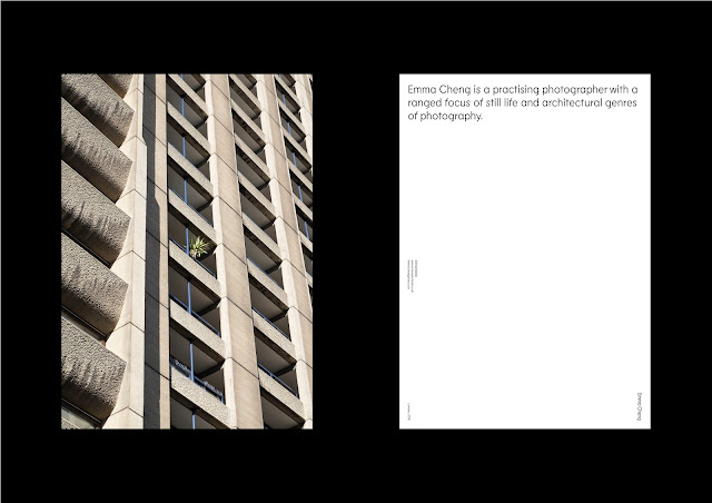
I brought the test net of the promo pack I created and showed visual variations which use the same net and Emma approved of the promo pack net as it was what she was expecting. And approving the idea of having slits which can accommodate different post card designs, as Emma liked the idea of personalising individual packs. Prior to the meeting I made a varied selection of stock choices from a G.F Smith sample book to run past Emma. I approached the stock and colour with not wanting to use too much colour for the identity, as this would allow the images stand out. However, I didn't want the identity to look to clinical and soulless so the correct stock and colour application was crucial. I thought back to my research on still life photography and remembered how texture, balance, and colour interactions play big parts in this style of photography. I wanted to replicate this in Emma's identity through stock choice to give the same sense of importance it would have in a still life set. The colours I selected were subtle but complementary and I decided to present Emma a selection of four different stocks to use for her identity, hoping she'd agree.
For the business card I chose Colorplan Candy Pink with a Moroccan embossing which creates a leather effect. I chose this colour as I noticed Emma uses this Colorplan option a lot in her still life shoot as a backdrop. The business card is most likely the first contact someone will have with the identity, so its visually impactful for it be pink and have a nice leather like embossing.
For the stationary such as cv, letterhead and invoice I chose Peregina Majestic Marble White which has a pearlescent effect. I liked the idea of stock interacting with light so this is best option, but it also works well with Candy Pink.
For the post cards I decided to select two options to have the option of experimenting with. The first option is Peregina Majestic Marble White again and Cranes Crest Pearl White.
Finally for the promo pack I selected Colorplan Cool Grey as it compliments all the stocks selected and will allow whicever image situated on the front cover of the pack stand out.
For the stock and colour Emma trusted my opinion and believed the colours chose are not too overwhelming and subtly representative of her. Testing of these stocks at a later stage would determine whether or not they are the best option, but for the time being a selection was agreed on and I could place a G.F Smith sample order.
For the website I showed a number of examples of the site in use in XD to show how it'd flow and Emma was happy for me to continue with the layouts in Cargo Collective.


No comments:
Post a Comment