
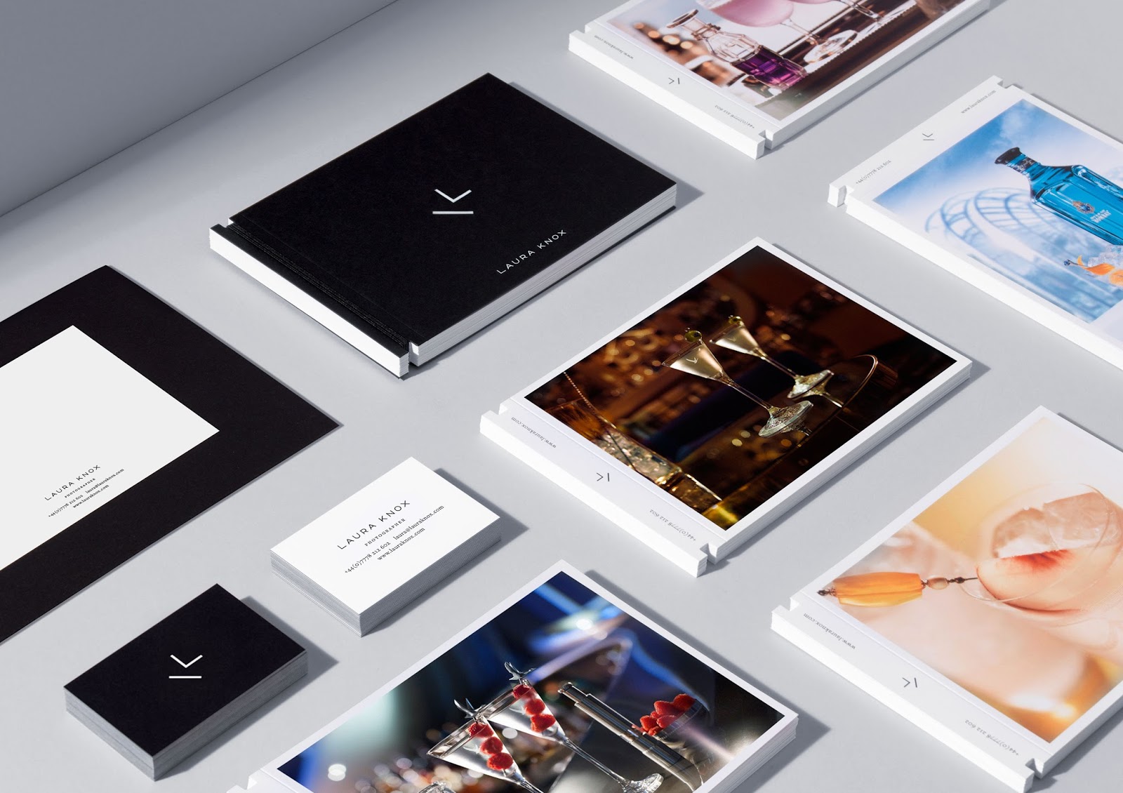
Laura Knox's identity by Ragged Edge is a great example of finding new ways around the 'cliche' photographers identity. The studio looked into her way of photography and her reputation of use of light in her work, from this it led them to looking at the technical side of photography. From Ragged Edge's technical research they discovered that the cross section of a single lens reflex mechanism in a camera creates the photographers initials. The research enables the identity to be clever and informed which art directors and creative agencies will definitely appreciate and engage with more.
What I like from the identity is how the word mark forms a strong basis for the rest of identity such as the website and stationary. Additionally, the logo can be conceived as cliche by directly referencing a photographers camera. Yet it does it in very clever way, as the logo mark is visually engaging even if you don't understand the reference.

To carry on looking at cliche yet clever identities I looked at Ryan Edy's identity by Founded. Maybe having the chance to include subtle references is a opportunity to good to turn down for this project. The photographers name provided Founded the idea of using framing as part of letterforms which show the reference of photo framing but also photo editing.

This identity stays away from photography altogether and directs its attention on the industry she works in, and it shows as it has a high end fashion editorial feel to it. Florencia Owen is a photographer, whose work ranges from fashion campaigns to editorial for magazines. The identity alone highlights her work in the fashion industry as the logotype is similar to say a fashion magazine logotype. Her imagery is also rather surreal and obscure with the identity delivering a bold message through its outputs that are similar to surreal imagery.
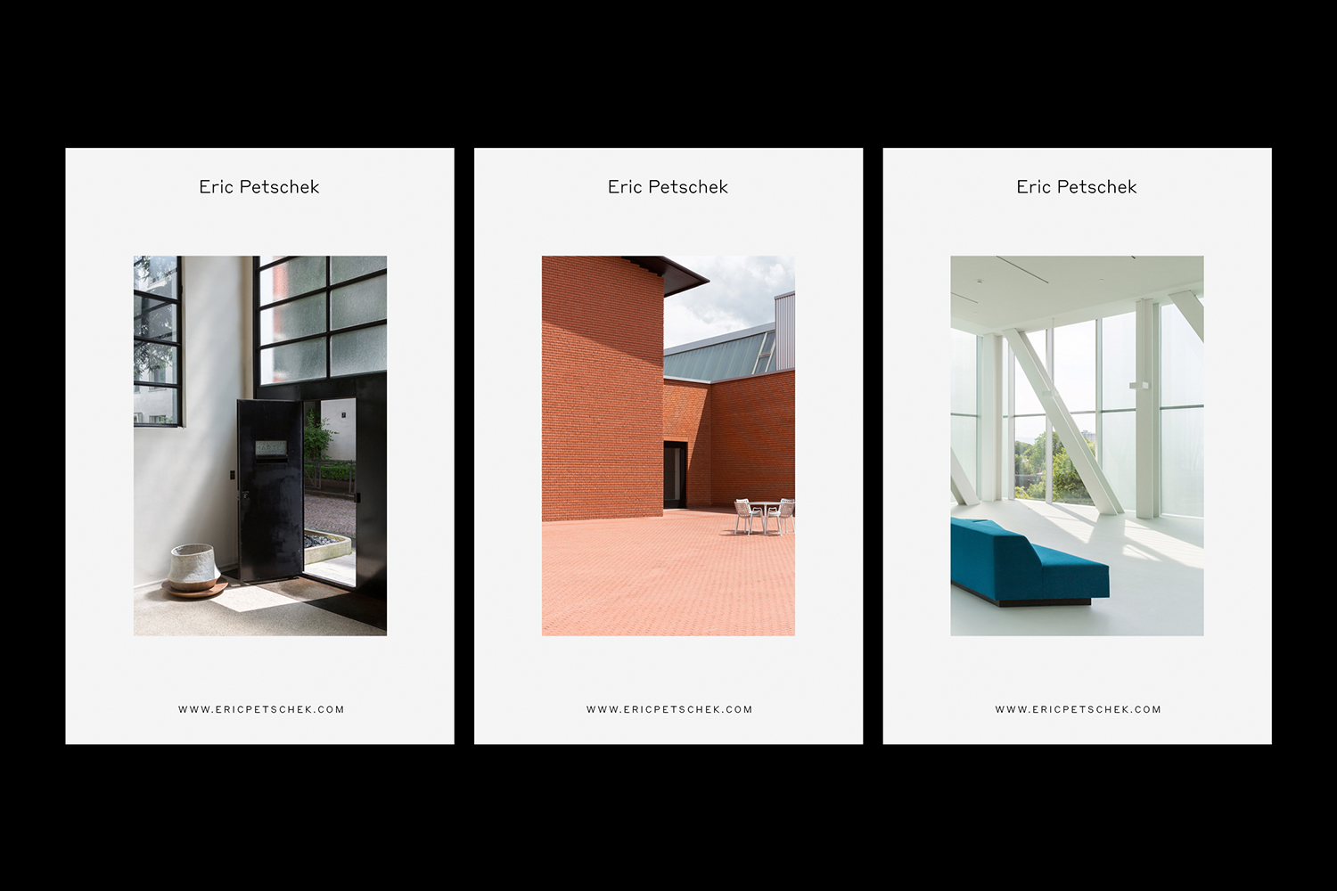
Eric Petschek is a freelance photographer and designer whose work is largely inspired from his background in interior architecture. His work, photographic and built, emphasises exaggerated proportions, strong, clean lines, and simple subjects. Eric’s work is captured in a typeface and word mark that, while inspired by a Flemish type specimen from the early 20th century, is relevant and modern.
No comments:
Post a Comment