After receiving the brief I dissected it and highlighted the key words such as still life, minimal street photography, open, modular etc. From here I decided to look more into these key factors to see how they may inform the design decisions behind the identity.
A good start was to look at what Emma currently focuses on which is digital still life and minimal street photography. As I look at photography in a different perspective to the client, it is necessary for me to get more an insight into the styles and processes involved.
I noted that still life gives the photographer more leeway in the arrangement of design elements within a composition compared to other photographic genres, such as landscape or portrait photography. Lighting and framing are also important aspects of still life photography composition so these are all aspects which can inform ideas. Still life improves how light and shadow affect a photograph and how form comes into play, composition, harmony, and on and on. Texture, balance, and colour interactions play big parts too.
Looking at open and modular graphic identities was also crucial as Emma states in the brief to create something open and modular, that doesn't pin her style down. I looked a broad range of identities to see how designers create cohesive systems which allow flexibility and adaptivity.
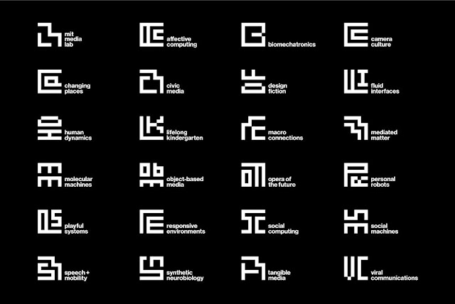
Pentagram designed the MIT Media Lab logo which was based on using the same grid, and the designers extended that identity to each of the 23 research groups that lie at the heart of the Lab’s activity. The result is a system of glyphs that at once establishes a fixed identity for the Media Lab, but also celebrates the diversity the company in one identity.
Build created the identity for Plæy, and achieved a modular identity that can adapt as the company develops.The icon uses geometric shapes to form an abstract face, giving personality to the identity. Similarly the work mark and typography conveys a fun persona for the brand with its rounded letter forms at different levels. With the identity being modular it can have a number possibilities and allows it to stay fresh.


No comments:
Post a Comment