A relevant start to Product Range Distribution was looking at graphic design outputs relating to social, political and ethical change and it was key to look at historical examples plus contemporary practice.
4 Corners Project
Syrian-American graphic designer Rima Massasati, who volunteered as an art teacher at a refugee camp in Thessaloniki, Greece for several weeks last year produced a poster series to helping the refugee crisis. Instead of attending marches and protests which are both worthwhile causes she designed a series of posters depicting the dangerous boat journey from Turkey to Greece. It set out to raise funds for medical assistance and blankets, with 30% of donations earmarked towards providing art supplies for children. The distribution of these posters is a great way of helping refugees in a different way, and the message can be even more spread as the the next step is to invite the design community to create and donate their own posters to sell on the 4 Corners Project website, maybe stage an exhibit, and sell merchandise like totes and T-shirts.

David Hockney The Sun logo
On February 3rd The Sun had a masthead designed by the prolific artist David Hockney, it was a special one-off edition that also featured an interview with Hockney in the run up to his exhibition of never-before-seen works at the Tate Modern. When I seen that Hockney designed the logo, I questioned his ethical decisions behind doing the work. The Sun is Britains best selling newspaper, yet its most likely the most hated and least trusted. The Sun is notorious for homophobia, xenophobia, racism and outward misogyny. Yet Hockney, who pushes societal boundaries in his work, somehow designed a logo for them. Personally I believe this gives off a bad message of Hockney and in a statement he revealed he was he delighted to be asked.“I was delighted to be asked. Once I thought about the idea it didn’t take me long. The sun and The Sun. I love it,” he said in a statement.

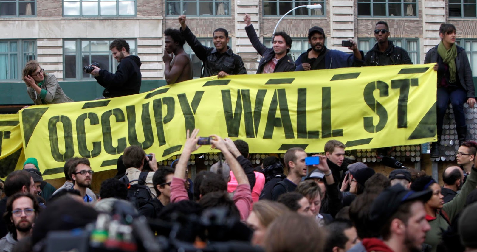
Adbusters
The Adbusters Media Foundation is a Canadian-based not-for-profit, anti-consumerist, pro-environment organization founded in 1989 by Kalle Lasn and Bill Schmalz in Vancouver, British Columbia. Adbusters describes itself as "a global network of artists, activists, writers, pranksters, students, educators and entrepreneurs who want to advance the new social activist movement of the information age. I've only been aware of Adbusters while at university as Richard Miles is a big fan of the anti-capitalist group, so much he likes to regularly reference them in lectures. So for this research it was good delve more into them. Its mainly characterized by some as anti-capitalist or opposed to capitalism, it publishes the reader supported, advertising free Adbusters, an activist magazine with an international circulation of 120,000 by the late 2000s devoted to challenging consumerism. To be more specific for research into Adbusters, I looked one of the famous campaigns from the group, 'Occupy Wall Street'.
In 2011, Adbusters proposed a peaceful occupation of Wall Street to protest corporate influence on democracy, a growing disparity in wealth, and the absence of legal repercussions behind the recent global financial crisis. They sought to combine the symbolic location of the 2011 protests in Tahrir Square with the consensus decision making of the 2011 Spanish protests. Adbusters' senior editor Micah White said they had suggested the protest via their email list and it "was spontaneously taken up by all the people of the world." Adbusters' website said that from their "one simple demand a presidential commission to separate money from politics" they would "start setting the agenda for a new America." They promoted the protest with a poster featuring a dancer atop Wall Street's iconic Charging Bull.
Public postions
Once again in research I found another example of the graphic design community fighting to push back against the anti-refugee efforts. Its clear that graphic designers are using their skills to make a difference in a new way and I found a project by a group of recent visual communication graduates from Germany. They set it the project up because they felt its very easy to design something excellent that has social conscience, so why not invite a lot of graphic artists to do something sustainable and to become more aware of their public position
Public positions is a creative platform featuring graphics artists which seek to combine design with a social conscience, with one project being designed and produced by 18 refugee children for their own original collection of football apparel to raise funds for their football club.

More recently it’s featured posters designed to combat feelings of dislocation and alienation in young refugees in Germany. And another design and refugee output in Germany being a magazine called Cameo, which tells stories about refugees in Germany, written and documented by refugee contributors. What I find really interesting about researching into refugee related pieces of design, is learning how enthusiastic refugees are about graphic design itself. A majority of the time the final outcome is actually designed by the refugee themselves such as the football apparel from Public positions and the 4 Corners project.
The Smudge
After 2016 turning out to be a turmoil of year concerning politics, two designers turned to the activism of the 1960’s and ’70s for answers, drawing inspiration from Chicago’s underground publishing scene. From this a new project started, The Smudge, a monthly newspaper with a
radical side. When setting Smudge up the designers weren't exactly sure what the focus should be but two weeks later the US election happened, and all of a sudden it became very clear what they needed to do. By having Smudge as a platform for people to vent these emotions, and provide some concrete advice on how to get a little more involved in their communities. And with the Northern American design community helping along the way with contributions they plan to grow this network with each issue.
With the project being about societal change and political reform it has to have the biggest possible audience for it to work and make a change, therefore I do question the distribution of Smudge. Maybe an online platform would reach a larger audience as it would be quicker and more easily accessed.

Migrant Journal
A six-issue journal exploring the circulation of people, goods and information around the world and the transformative impact they have on contemporary life. The journal aims to explore the relationship between elements, events, journeys and spaces bound under the idea of 'migration' in all its forms, crucial to understand today's society. While I was in Berlin I bought issue 1 which is all about the refugee crisis and how the crisis is affecting European countryside.
Similar to the other refugee related graphic design I looked into, it aims to break the prejudices and clichés of refugees and migration, Migrant Journal asks artists, journalists, academics, designers, architects, philosophers, activists and citizens to rethink the approach to migration and critically explore the new spaces it creates. The content may seem dry as it mixes migration and nature but the beautifully designed editorial of the journal makes this publication so visually engaging. From reading the introduction in the first issue it is clear that the makers of this journal want the readers, designers and editors to come together and reimagine the perceptions of migration.

No comments:
Post a Comment